You May Also Like :
Ever stared at a design, wishing the color on your screen perfectly matched the vibrant hue you envisioned? That’s where the magic of Pantone colors comes in. They’re the industry gold standard for color consistency, ensuring your brand’s signature shade of blue looks the same on a business card as it does on a billboard. And the best part? You can harness their power right within Photoshop.
Imagine a world where every designer, printer, and manufacturer speaks the same color language. No more guessing games or frustrating mismatches! That’s the power of Pantone. These standardized colors, identified by a unique number, are the key to consistent branding and design across any medium. Whether you’re working on a logo, a website, or a packaging design, using Pantone colors in Photoshop ensures that your final product perfectly reflects your vision.
What are Pantone Colors and Why are They Important?
Before we jump into the technicalities of using Pantone colors in Photoshop, let’s take a moment to appreciate what they are and why they’re so vital. The Pantone Color System, established in the 1960s, is essentially a universal language for color. It’s a standardized system of numbered colors, each with a unique code, ensuring that everyone involved in the design and production process is on the same page (or, should we say, the same color chip?). Think of it as the Rosetta Stone of color communication.
Why is this so important? Imagine designing a logo with a specific shade of green. Without a standardized system, that green might look slightly different on your screen, on a printed proof, and on the final product. This inconsistency can be a branding nightmare! Pantone colors eliminate this guesswork, providing a reliable way to specify and reproduce colors accurately, regardless of the medium. Whether it’s ink on paper, dye in fabric, or paint on a wall, a Pantone code guarantees that the color will be consistent.
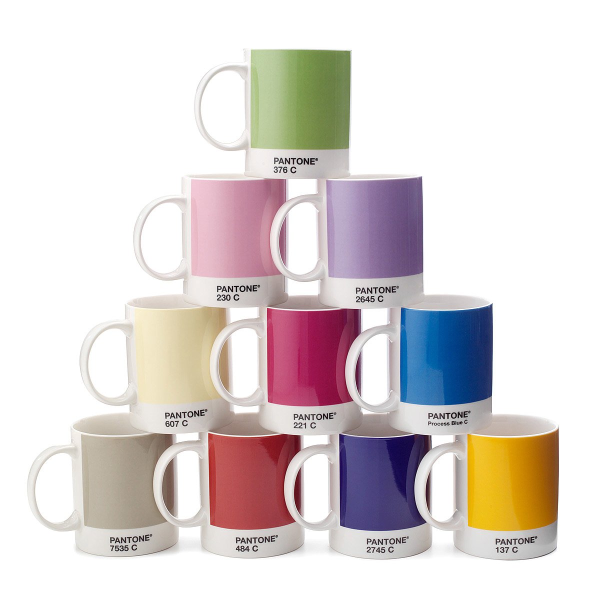
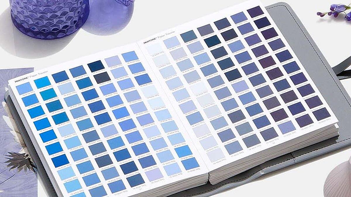
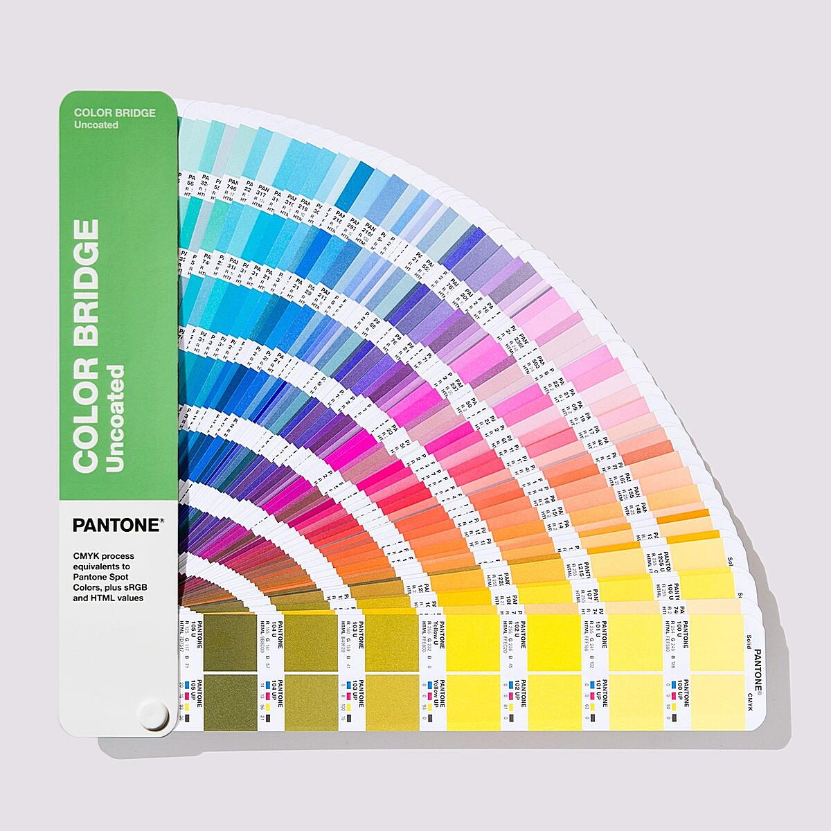
Pantone offers a variety of color libraries, each catering to different needs. You’ll find solid coated and uncoated colors (for print), metallic colors (for special effects), pastel and neon colors (for vibrant designs), and more. These libraries are typically available in physical books (Pantone Guides) and digital formats. While those physical guides are a designer’s best friend, we’re focusing on how to integrate these colors into our digital workflow in Photoshop.
Pantone colors are the industry standard for color consistency. They provide a universal language for color, ensuring accurate reproduction across different mediums and eliminating the guesswork in color matching. This is especially important for maintaining brand identity and ensuring that your designs look exactly as intended, every time.
Accessing Pantone Colors in Photoshop
Now, let’s get down to the nitty-gritty: how do you actually access and use these coveted Pantone colors within Photoshop? There are a couple of primary methods, each with its own pros and cons.
Using Pantone Connect in Photoshop
Pantone Connect is Pantone’s subscription-based digital platform, and it’s arguably the most up-to-date and convenient way to work with Pantone colors in Photoshop. Think of it as having the entire Pantone library at your fingertips, constantly updated with the latest shades.
How does it work? You’ll need to subscribe to Pantone Connect and install the Photoshop extension. Once installed, you can access all the Pantone libraries directly within Photoshop. This means no more searching for outdated swatch files or worrying about color accuracy. Pantone Connect also offers some nifty features, like creating custom palettes, collaborating with team members, and even suggesting complementary colors. It’s a powerful tool for any designer serious about color consistency.
Benefits of Pantone Connect:
- Up-to-date libraries: Access the latest Pantone colors and updates.
- Cloud-based access: Your palettes and projects are accessible from anywhere.
- Collaboration features: Share palettes and collaborate with team members.
- Color intelligence: Get suggestions for complementary colors.
Loading Pantone Swatches in Photoshop
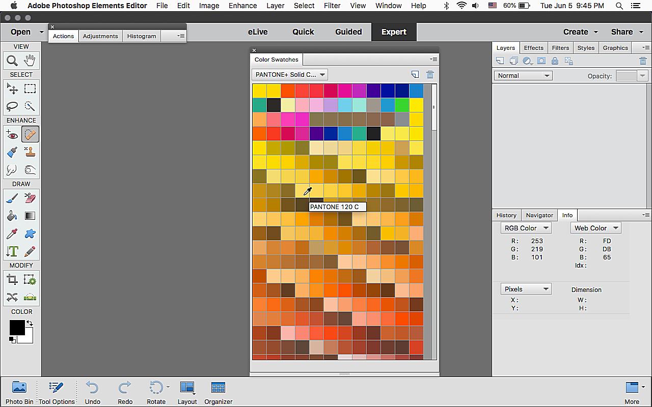
While Pantone Connect is the preferred method for many, you might still encounter situations where you need to load Pantone swatch files (.ACO). These files contain specific Pantone libraries and can be loaded into Photoshop’s Swatches panel.
Where do you find these files? Sometimes, clients might provide them, or you might find them online (though be cautious about the source and ensure they are up-to-date and accurate). Once you have the .ACO file, it’s a simple process to load it into Photoshop. Go to the Swatches panel (Window > Swatches), click on the menu icon (four horizontal lines), and select “Import Swatches.” Navigate to your .ACO file and click “Open.” The Pantone library will now be available in your Swatches panel.
Identifying Pantone Colors in Images
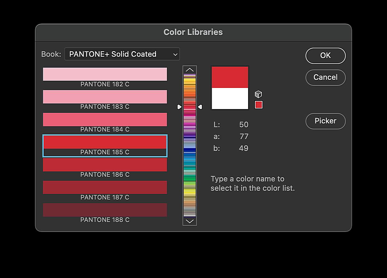
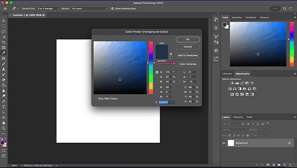
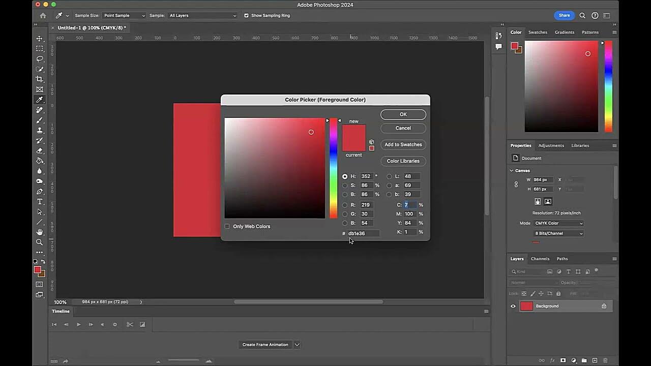
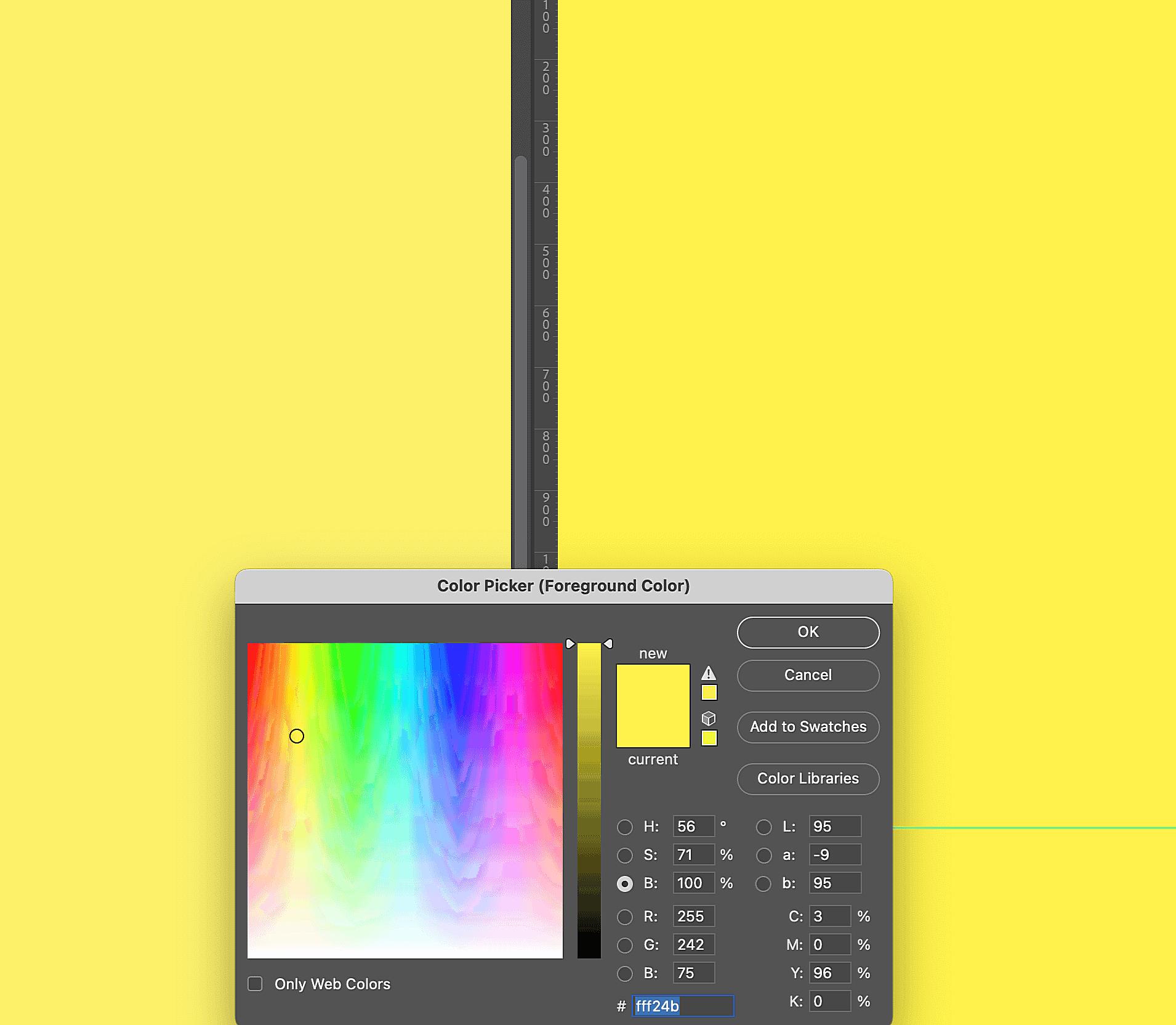
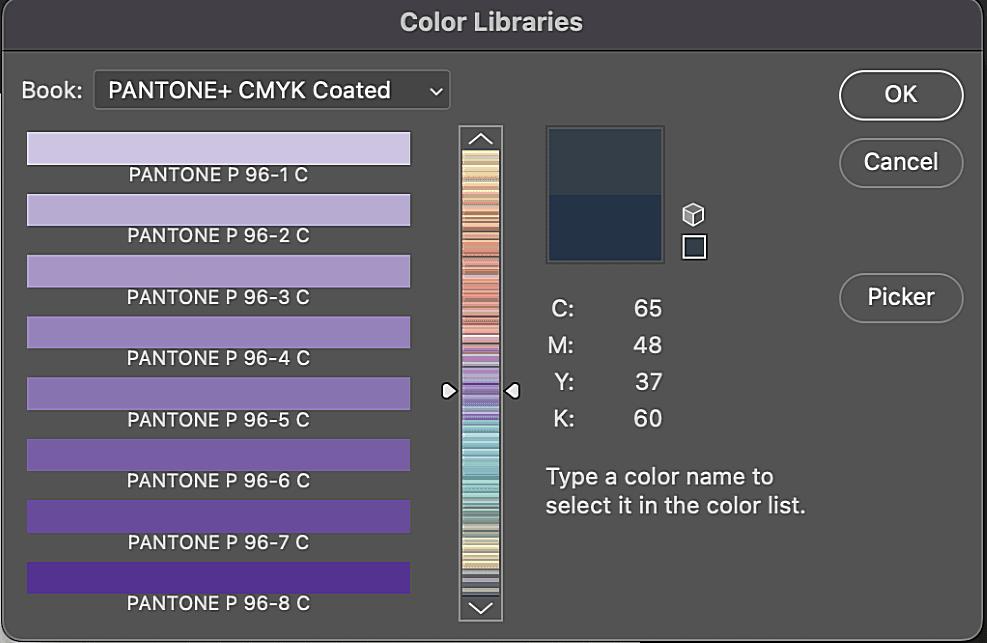
Let’s say you have an image with a color you want to match to a Pantone shade. Photoshop’s Color Picker can give you an approximate Pantone match. However, it’s crucial to understand that this method isn’t always 100% accurate. The Color Picker analyzes the RGB or CMYK values of the color in your image and tries to find the closest Pantone equivalent. Because of the differences between color spaces, this conversion can be tricky.
When might this approach be useful? If you’re working on a preliminary design and need a ballpark Pantone match, it can be a quick solution. However, for final production, it’s always best to use Pantone Connect or a physical Pantone Guide to ensure accuracy. Don’t rely solely on the Color Picker for critical color matching. It’s a starting point, not the definitive answer.

Applying Pantone Colors in Photoshop
Now that you’ve accessed your Pantone colors, let’s explore how to actually use them in your designs. This is where the rubber meets the road, or perhaps, where the ink meets the paper (or screen, as it were).
Selecting Pantone Colors for Design Elements
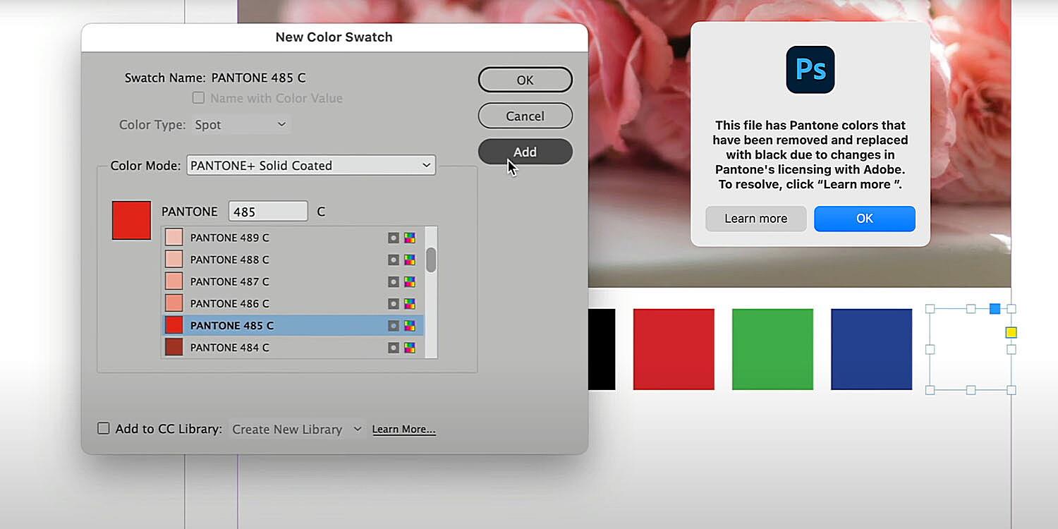
Whether you’re working with shapes, text, or any other design element in Photoshop, applying Pantone colors is straightforward once you have the swatches loaded. If you’re using Pantone Connect, simply select the desired color from the Pantone Connect panel. If you’ve loaded a swatch file, open the Swatches panel and choose the Pantone library you need. Then, select the element you want to color and click on the desired Pantone swatch. Voila! Your design element now sports that precise, consistent hue.
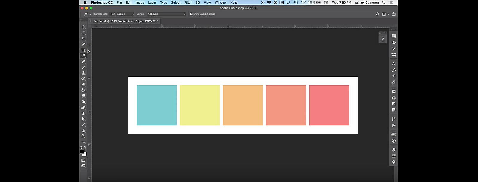
Creating custom Pantone palettes within Photoshop can also be a time-saver. If you’re working on a project that uses a specific set of Pantone colors, create a custom palette to keep them readily accessible. This avoids having to scroll through entire libraries every time you need a specific shade.
Converting Existing Colors to Pantone
Sometimes, you might have a design that uses RGB or CMYK colors, and you need to convert them to Pantone. Why would you do this? Perhaps your client requires all colors to be specified in Pantone, or you’re preparing a design for print and need to ensure accurate color reproduction.
There are a couple of ways to convert colors. You can use the Color Picker to find the closest Pantone match (again, remember the limitations of this method). Or, if you have Pantone Connect, it often offers a more accurate conversion process. However, it’s essential to understand that converting colors isn’t always a perfect science. There might be slight color shifts during the conversion process, especially when going from RGB to Pantone. It’s always a good idea to proof your designs after conversion to ensure the colors are still what you intended.
Working with Spot Channels for Pantone Colors
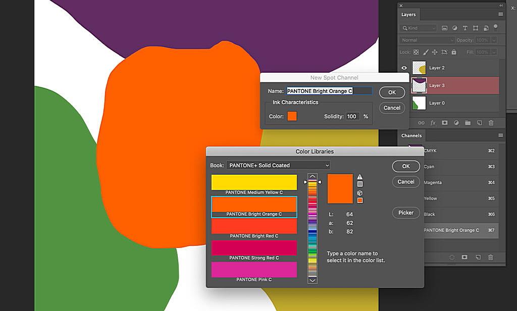
For professional printing, especially when using Pantone colors, spot channels are your best friend. What are they? Spot channels are special ink channels that are used to print specific colors, like Pantone colors. Instead of mixing CMYK inks to create a color, spot channels use a pre-mixed ink, ensuring the most accurate and vibrant color reproduction.
How do you create spot channels in Photoshop? You’ll typically need to work with your design in CMYK mode. Create a new spot channel (in the Channels panel) and select the desired Pantone color. Then, apply that spot color to the elements you want printed in that specific Pantone ink. Why are spot channels so important? They guarantee that your Pantone colors will be printed accurately and consistently, without any color shifts or variations. They’re a must-have for any project that requires precise color matching. Think of them as the VIP treatment for your Pantone colors.
Ensuring Accurate Pantone Color Reproduction
So, you’ve chosen your Pantone colors, applied them in Photoshop, and now you’re ready to send your design off to print. But hold on! Before you hit that “print” button, there are a few crucial steps you can take to ensure that the final printed product matches your digital vision. Color management is key to preventing any unwanted surprises.
Calibrating Your Monitor
Think of your monitor as the window through which you view your digital creations. If that window is dirty or distorted, the colors you see won’t be accurate. That’s why monitor calibration is so important. It’s the process of adjusting your monitor’s settings to display colors as accurately as possible.
How do you calibrate your monitor? You can use hardware calibrators (small devices that attach to your monitor) or software calibration tools. Hardware calibrators are generally more accurate, but software solutions are a more affordable option. Regular calibration (every few weeks or months) is essential for maintaining accurate color representation. After all, you wouldn’t want your carefully chosen Pantone colors to look completely different in print just because your monitor was a little off, would you?
Working with Color Profiles
Color profiles are like little translators that help different devices (monitors, printers, etc.) communicate color information consistently. They define the range of colors that a particular device can reproduce. Understanding color profiles is crucial for accurate color reproduction.
When working with Pantone colors in Photoshop, you’ll likely be dealing with CMYK color profiles, especially if your final output is print. Make sure you’re using the correct CMYK profile for your printing process (ask your printer for their recommended profile). Using the wrong color profile can lead to color shifts and unexpected results.
Proofing Your Designs
Proofing is like a dress rehearsal for your print job. It’s a way to preview how your design will look when printed, allowing you to catch any potential color issues before they become costly mistakes.
There are different proofing methods available. You can create digital proofs (PDFs) or physical proofs (printed samples). Physical proofs are the most accurate way to check color reproduction, but they can be more expensive and time-consuming. Digital proofs are a good starting point, but they shouldn’t be relied upon for critical color matching.
Communicating with Your Printer
Clear communication with your printer is paramount for achieving accurate Pantone color reproduction. Provide your printer with the correct Pantone color codes (not just the names). Discuss any potential color matching challenges or special printing requirements. Ask about their preferred file formats and color profiles.
A good printer will work with you to ensure that your Pantone colors are printed accurately and consistently. They might even provide you with a printed proof for your approval before running the full print job. Don’t be afraid to ask questions and communicate your expectations. After all, you’ve put a lot of effort into choosing the perfect Pantone colors, so you want to make sure they look their best in the final product.
Tips and Tricks for Working with Pantone Colors in Photoshop
Now that we’ve covered the essentials, let’s explore some tips and tricks to make your Pantone workflow in Photoshop even smoother and more efficient. These little nuggets of wisdom can save you time, reduce frustration, and help you become a true Pantone master.
-
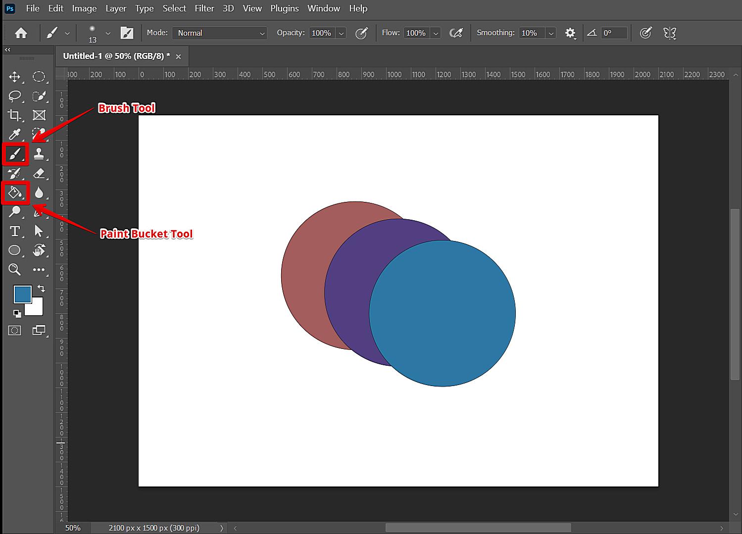
Keyboard Shortcuts: Mastering a few key keyboard shortcuts can significantly speed up your workflow. For example, using the “I” key for the Eyedropper tool can quickly sample colors, and using the “B” key for the Paint Bucket tool can fill areas with your chosen Pantone shade. Explore Photoshop’s keyboard shortcut settings to customize them to your liking.
-
Organizing Swatches: If you frequently work with specific Pantone libraries or custom palettes, organize your swatches for easy access. You can create folders within the Swatches panel to group related colors. This prevents you from having to scroll through hundreds of swatches every time you need a specific shade. Think of it as creating your own personal Pantone color library, tailored to your projects.
-
Adjustment Layers: While you generally want to avoid directly altering Pantone colors (to maintain their consistency), adjustment layers can be your friend when you need to fine-tune the overall look of your design. For example, you can use a Hue/Saturation adjustment layer to subtly adjust the overall color balance without affecting the underlying Pantone values.
-
Staying Up-to-Date: Pantone releases new colors and updates its libraries periodically. Staying up-to-date with these changes is essential for ensuring you’re working with the latest and most accurate color information. Subscribe to Pantone’s newsletter or follow them on social media to stay informed.
-
Pro Tip: When working with spot channels, always double-check that you’ve selected the correct Pantone color and that the spot channel is set to “Spot Color” mode. A simple mistake here can lead to costly reprints.
Troubleshooting Common Pantone Issues in Photoshop
Even the most experienced designers can occasionally run into hiccups when working with Pantone colors in Photoshop. Here are some common issues and how to troubleshoot them:
-
Pantone Colors Not Showing Up: If your Pantone colors aren’t appearing in the Swatches panel, make sure you’ve loaded the correct swatch file (.ACO) or that your Pantone Connect extension is properly installed and synced. Restarting Photoshop can sometimes resolve minor glitches.
-
Color Mismatch: A common complaint is a color mismatch between what you see on your screen and what prints out. This is often due to uncalibrated monitors, incorrect color profiles, or issues with the printing process itself. Calibrating your monitor, using the correct color profiles, and communicating effectively with your printer are crucial for resolving this issue.
-
Pantone Connect Problems: If you’re experiencing problems with Pantone Connect, check your internet connection and make sure the extension is up-to-date. Contact Pantone support if the issue persists.
-
Accurate Conversion Challenges: As mentioned earlier, converting colors to Pantone isn’t always perfect. If you’re having trouble achieving an accurate conversion, try using Pantone Connect’s conversion tools or consulting with a color management specialist.
Mastering Pantone Colors in Photoshop
Congratulations! You’ve reached the end of this comprehensive guide to using Pantone colors in Photoshop. We’ve covered everything from accessing Pantone libraries to ensuring accurate color reproduction in print. Remember, mastering Pantone colors is a valuable skill for any designer, allowing you to create consistent, professional, and visually stunning designs.
The key takeaway is that Pantone colors are the industry standard for a reason. They provide a universal language for color, ensuring that your designs look exactly as you intended, regardless of the medium. By understanding how to use Pantone colors effectively in Photoshop, you can elevate your design work and create truly impactful visuals.
Now, go forth and experiment! Play with different Pantone shades, create custom palettes, and explore the possibilities. Don’t be afraid to ask questions and seek out further resources. The world of color is vast and exciting, and with the knowledge you’ve gained, you’re well on your way to becoming a true Pantone aficionado. So, what are you waiting for? Start creating! And if you found this guide helpful, please share it with your fellow designers. Let’s spread the word about the magic of Pantone!


