Why Did Adobe Remove Pantone
Related Posts
Ever found yourself staring at a screen, agonizing over the perfect shade of blue, only to have it emerge from the printer looking…well, not quite right? Or maybe you’re a designer trying to nail down that exact brand color, the one that screams “trustworthy” or “energetic,” and CMYK just isn’t cutting it? You’ve probably stumbled into the fascinating, sometimes frustrating, world of color conversion, specifically the journey from CMYK to Pantone Solid Coated.
The World of CMYK: Process Color
CMYK stands for Cyan, Magenta, Yellow, and Key (Black). This is the color model used in four-color process printing, the workhorse of the printing industry. Imagine tiny dots of these four inks being printed in various combinations to create a vast spectrum of colors. It’s like a painter mixing primary colors to achieve different hues. CMYK is great for reproducing photographs and complex images, where a wide range of colors is needed. However, CMYK has a limited color gamut, meaning it can’t reproduce all colors, especially certain vibrant or highly saturated shades. Think of trying to paint a neon sign with watercolors – it just won’t quite pop the same way.
The Precision of Pantone: Spot Colors
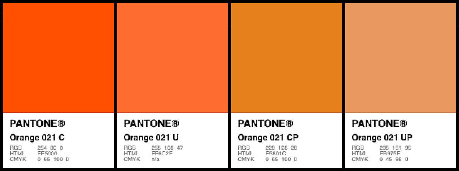
Pantone, on the other hand, is all about spot colors. Instead of mixing inks during the printing process, Pantone colors are pre-mixed by the manufacturer to ensure consistent color reproduction. Each Pantone color has a unique number and name, like a specific recipe for a particular shade. This is where Pantone Solid Coated comes in. “Solid” refers to the ink being a single, solid color (not made up of dots), and “Coated” indicates that it’s printed on a coated paper stock, which affects how the color looks. Pantone Solid Coated colors are essential for branding, where precise color matching is paramount. Think of a company’s logo – it needs to look the same, whether it’s printed on a business card or a billboard. Pantone also offers special effect inks, like metallics and fluorescents, which CMYK simply can’t replicate.
Feature CMYK Pantone Solid Coated Color Creation Mixing inks during printing Pre-mixed inks Printing Method Four-color process printing Spot color printing Color Gamut Limited Wider, includes special effects Use Cases Photographs, complex images Branding, precise color matching, special effects Consistency Can vary slightly Highly consistent Why Convert CMYK to Pantone Solid Coated?
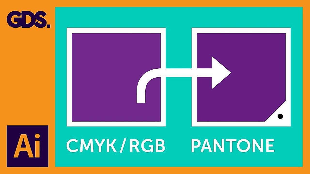
So, why would you need to convert from CMYK to Pantone Solid Coated in the first place? The most common reason is brand consistency. Imagine a world where your favorite soda can is a slightly different shade of red every time you buy it. Chaos! Brands rely on specific Pantone colors to maintain their visual identity across all their materials, from logos and packaging to websites and merchandise. If a logo is designed using CMYK, it needs to be converted to its corresponding Pantone Solid Coated equivalent for accurate printing.
Another reason is to achieve colors that CMYK simply can’t reproduce. As mentioned earlier, CMYK has a limited color gamut. If your design requires a vibrant, saturated color or a special effect like metallic gold, you’ll need to use a Pantone color. Think of it like trying to paint a car with only four colors – you might get close, but it won’t have that same showroom shine.
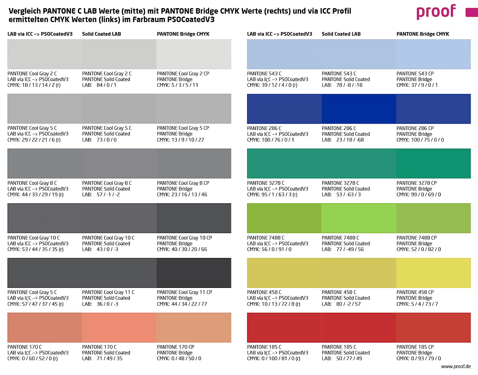
It’s important to note, however, that not all CMYK colors can be perfectly converted to Pantone Solid Coated. Due to the differences in the color systems, some colors will be closer matches than others. This is where the expertise of a professional printer comes in, as they can help you navigate these challenges and achieve the best possible results.
How to Convert CMYK to Pantone Solid Coated
Now for the million-dollar question: how do you actually do this conversion? There are a few methods, each with its own pros and cons.
Tools of the Trade: Software and Online Converters
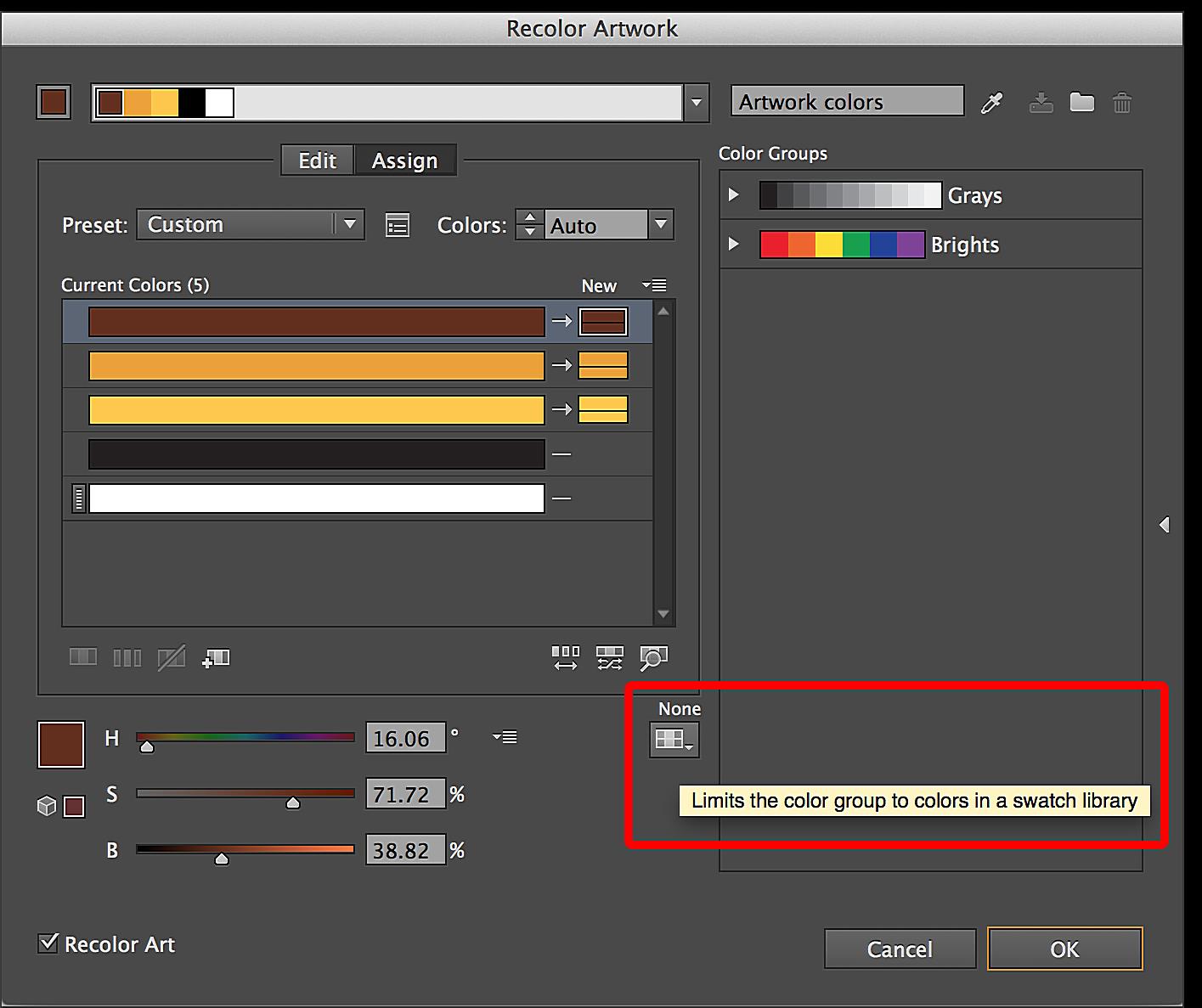
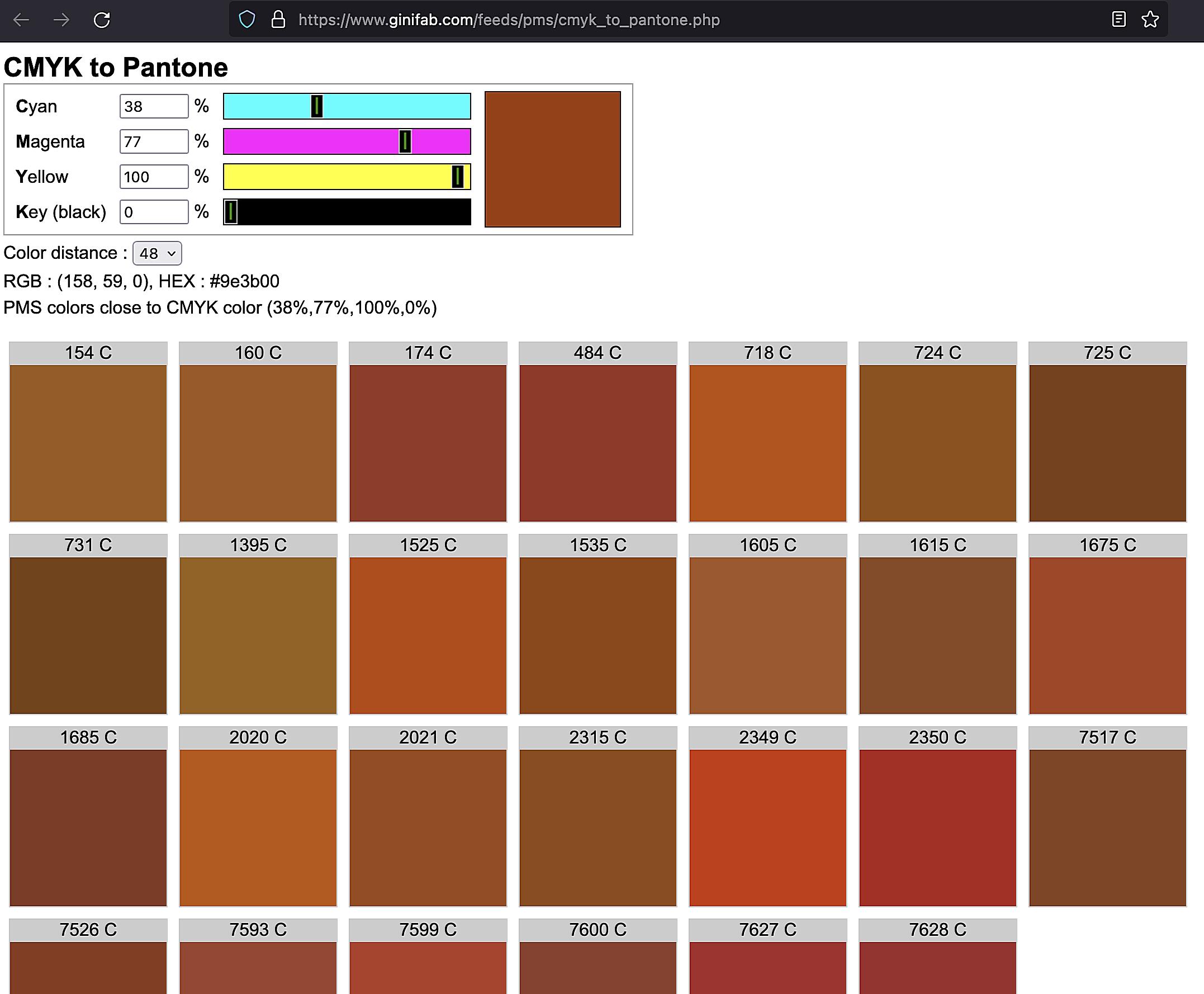
The digital age offers us a plethora of tools to aid in CMYK to Pantone Solid Coated conversion. Software like Adobe Illustrator, Photoshop, and InDesign all have built-in features for converting colors. You can typically select a CMYK color and then find its closest Pantone equivalent within the software’s color libraries. There are also numerous online CMYK to Pantone Solid Coated conversion tools available. Just a quick search will bring up a host of options.
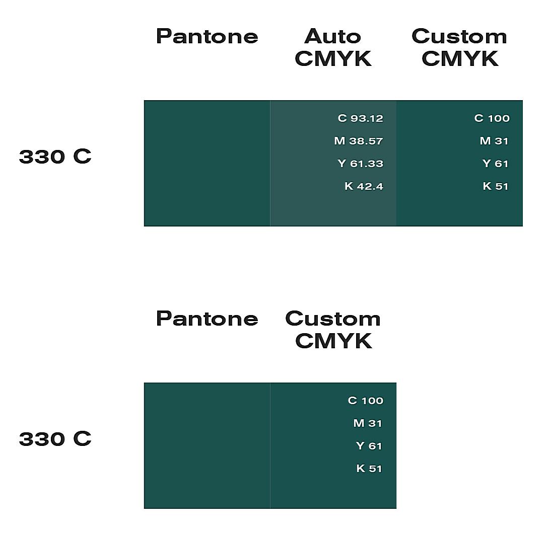
However, a word of caution: automated conversion is not always accurate. These tools rely on algorithms to approximate the closest Pantone match, and the results can sometimes be off, especially with subtle color nuances. Think of it like using a translation app for a complex sentence – it might get the gist, but the finer points can get lost in translation.
The Art of Matching: Manual Color Lookups
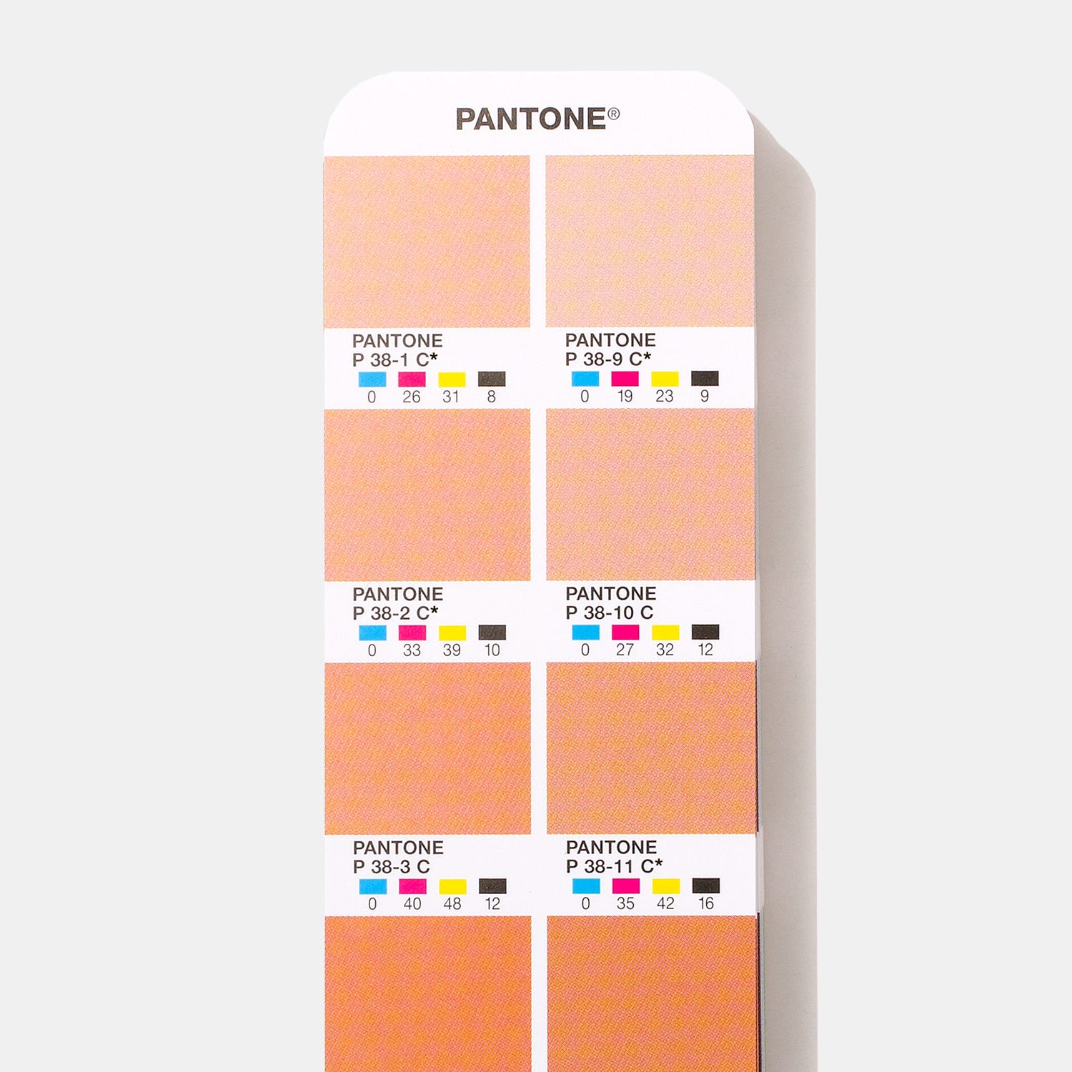
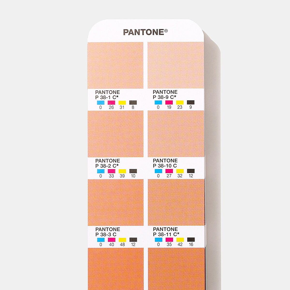
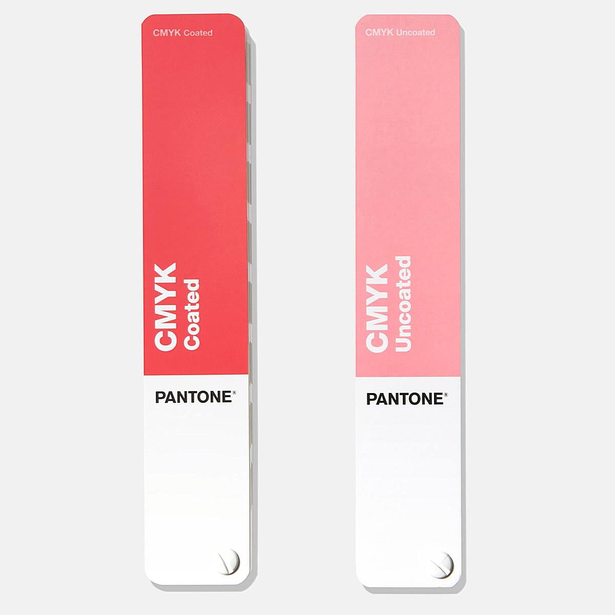
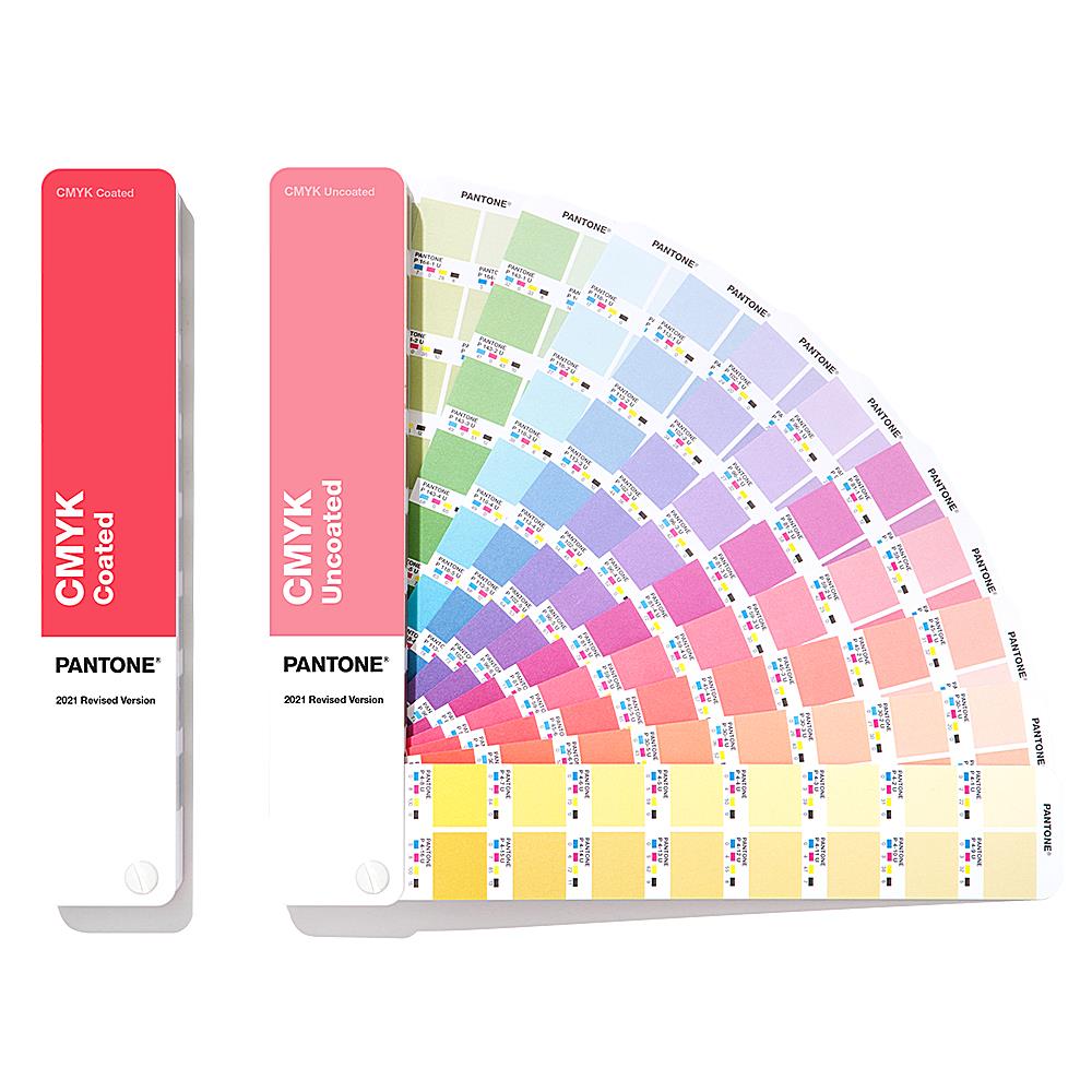
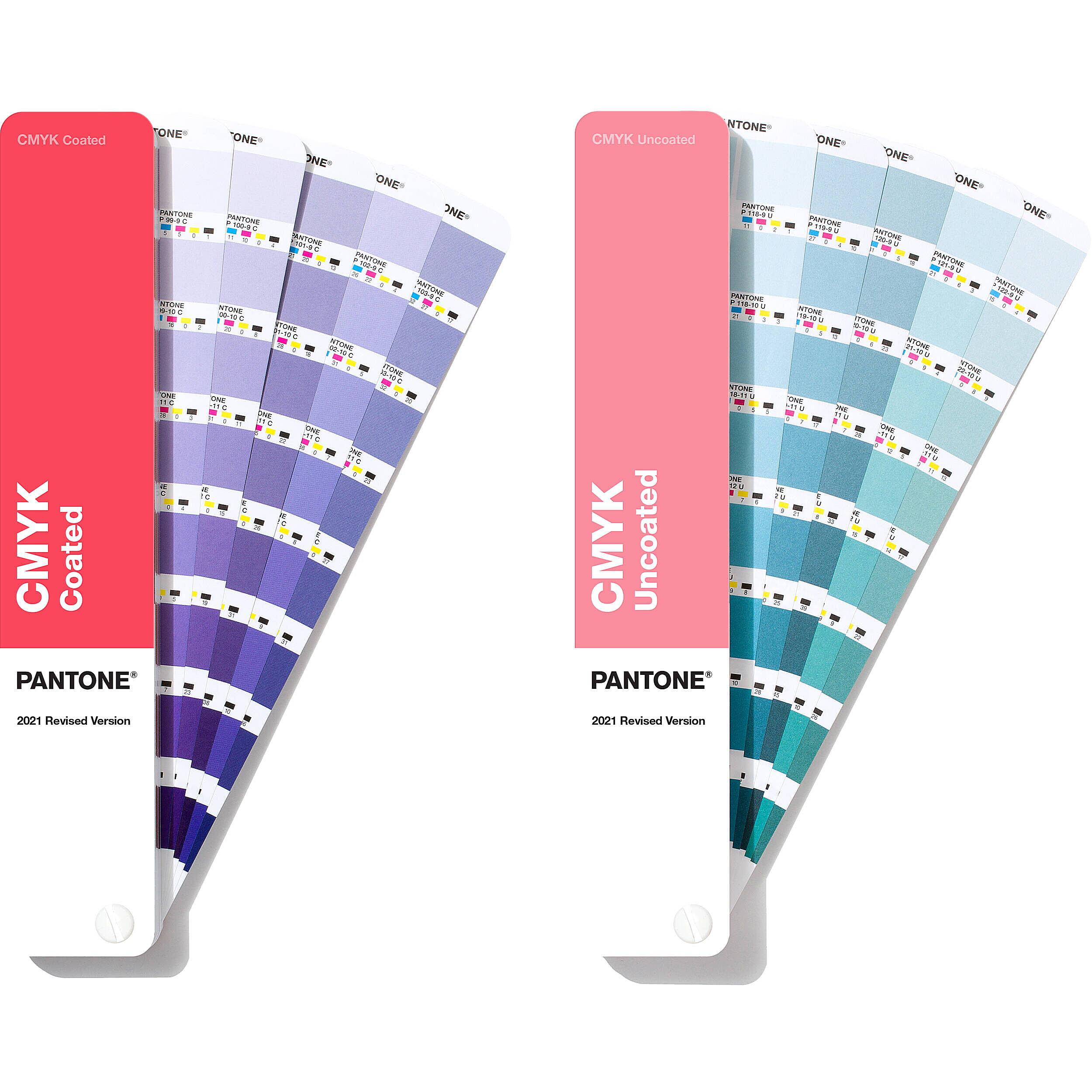
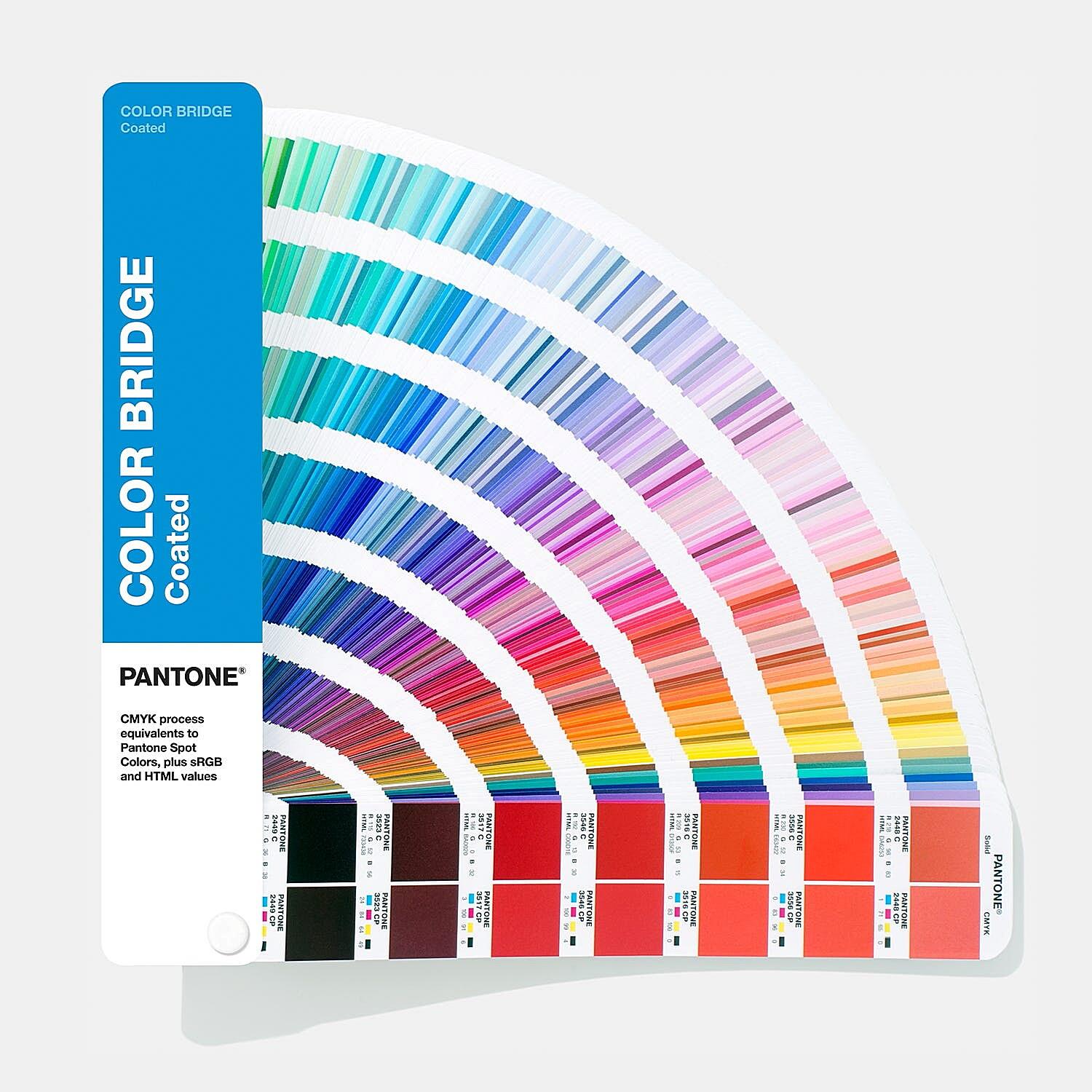
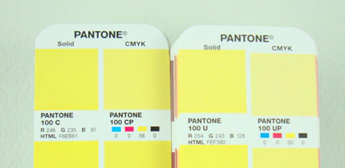
For critical color matching, especially when dealing with brand colors, nothing beats the good old-fashioned Pantone color book, also known as a Formula Guide. These books contain physical samples of all the Pantone Solid Coated colors, printed on coated paper stock. You can visually compare your CMYK print to the Pantone swatches under controlled lighting conditions to find the closest match. This is the most accurate way to convert CMYK to Pantone Solid Coated, but it requires a physical color book and a keen eye for color. It’s like comparing paint chips at the hardware store – you need to see the real thing to make the best decision.
Partnering with Professionals: Printer Expertise
Ultimately, the best approach is to work closely with your printer. They have the experience and expertise to handle color conversions and ensure accurate reproduction. They can also provide valuable advice on color choices and printing techniques. Your printer will likely use a combination of software tools, manual matching, and their own color management systems to achieve the desired results. They’ll also produce color proofs, which are sample prints that allow you to review and approve the colors before the final print run. Think of it as a dress rehearsal before the main performance. Don’t skip this step!
The Reality of Conversion: Challenges and Limitations
Let’s be realistic: converting CMYK to Pantone Solid Coated is not always a straightforward process. There are inherent challenges and limitations due to the fundamental differences between the two color systems. As mentioned before, not all CMYK colors have a direct Pantone equivalent. This is because CMYK and Pantone have different color gamuts. Some colors that are achievable in CMYK might fall outside the range of Pantone Solid Coated, and vice versa.
Another factor that can affect color matching is the paper stock. Coated and uncoated paper will absorb ink differently, which can alter the appearance of the color. That’s why Pantone offers both coated and uncoated versions of their color books. Think of it like trying to paint the same picture on different canvases – the texture and color of the canvas will affect how the paint looks.
Furthermore, monitor calibration plays a crucial role. If your monitor isn’t properly calibrated, the colors you see on screen might not accurately represent the printed output. This can lead to frustration and wasted time. It’s like trying to navigate a city with a faulty GPS – you might end up going in circles.
In short, achieving perfect CMYK to Pantone Solid Coated conversion can be tricky. It requires a thorough understanding of color systems, the right tools, and the expertise of a professional printer.
Mastering the Process: Best Practices for CMYK to Pantone Solid Coated Conversion
Navigating the world of CMYK to Pantone Solid Coated conversion can feel like traversing a labyrinth. But fear not, intrepid color explorer! Here are some best practices to guide you on your quest for perfect color matching:
Pantone First: Whenever possible, start with Pantone colors for critical color matching, especially for logos and branding. This eliminates the need for conversion and ensures greater accuracy from the get-go. Think of it like building a house with a solid foundation – it makes everything else easier.
Calibrate, Calibrate, Calibrate: Ensure your monitors and printing equipment are calibrated regularly. This will minimize discrepancies between what you see on screen and what comes out of the printer. It’s like tuning a musical instrument – it ensures everything sounds harmonious.
Printer Partnership: Consult with your printer early in the design process. They can provide valuable insights into color choices, conversion challenges, and printing techniques. They’re your trusted guides in the color wilderness.
Physical References: Always use physical Pantone color books (Formula Guides) for accurate visual reference. Don’t rely solely on digital representations. Seeing is believing, especially when it comes to color.
CMYK Limitations: Understand the limitations of CMYK printing. Not all colors can be perfectly reproduced, especially highly saturated or metallic shades. Knowing the boundaries will help you make informed decisions.
Proof It: Always proof your colors before the final print run. This allows you to catch any discrepancies and make adjustments before it’s too late. It’s like proofreading a document before sending it out – it can save you from embarrassment.
Quick Reference: CMYK to Pantone Solid Coated Chart – Optional
While a comprehensive CMYK to Pantone Solid Coated chart might seem like a magic bullet, it’s important to understand its limitations. Due to the complexities of color conversion and the vast number of possible combinations, a single chart can’t capture every nuance. Directly including a large chart here would also be impractical and potentially inaccurate as color libraries are updated.
Instead of a static chart, I recommend exploring resources that offer up-to-date color conversion tools and libraries. Software like Adobe Illustrator and online conversion tools can provide starting points for your conversion. However, remember that these are just approximations. Always verify the results with a physical Pantone book and your printer. Think of these tools as a helpful map, but you still need to check the road signs along the way.
Your Questions Answered: CMYK to Pantone Solid Coated FAQ
Let’s tackle some frequently asked questions that often pop up in the world of color conversion:
Q: What’s the difference between Pantone Solid Coated and Uncoated? A: Coated paper has a smooth, glossy finish, while uncoated paper has a more textured, matte finish. The paper type affects how the ink is absorbed and, therefore, how the color looks. Think of it like painting on different surfaces – the same paint will look different on wood versus canvas.
Q: Why do colors look different on screen vs. in print? A: This is due to the different ways that screens and printers create color. Screens use light, while printers use ink. Also, monitor calibration and printing processes can introduce variations. It’s like comparing a photograph to a painting – they both depict the same scene, but they look different.
Q: How can I ensure accurate color matching for my project? A: The key is to start with Pantone colors whenever possible, use calibrated equipment, consult with your printer, and always proof your colors. It’s a team effort!
Q: What are the costs associated with using Pantone colors? A: Pantone colors typically involve an additional cost for ink mixing and spot color printing. However, the added cost is often worth it for brand consistency and achieving specific colors. Think of it as an investment in your brand’s visual identity.
Q: Where can I buy Pantone color books? A: Pantone color books are available from various online retailers and graphic arts suppliers.
Q: What if I can’t find a direct Pantone match for my CMYK color? A: Work with your printer to find the closest possible match. They can also explore options like custom ink mixing to achieve the desired color.
CMYK to Pantone Solid Coated
CMYK to Pantone Solid Coated conversion is a complex process with its own set of challenges and limitations. While digital tools can be helpful, the expertise of a professional printer and the use of physical Pantone color books are essential for achieving accurate and consistent color matching. By understanding the intricacies of color systems and following best practices, you can navigate the world of color conversion with confidence and ensure that your designs look exactly as you envisioned them.
