How Are Pantone Colors Identified
Related Posts
Ever stared at a printed piece and wondered, “Is that really the right shade of blue?” You’re not alone. In the world of color, consistency is king, and that’s where Pantone comes in. Pantone colors are the gold standard, a universal language of hues used by designers, printers, and manufacturers worldwide. But how do you actually detect a Pantone color? It’s not always as simple as pointing and saying, “Yep, that’s it!”
Imagine a world where every “red” was slightly different. Chaos, right? That’s precisely what Pantone prevents. They’ve meticulously cataloged thousands of unique colors, each with its own specific code, ensuring that the “Coca-Cola red” you see on a billboard in New York is the same “Coca-Cola red” you see on a can in Tokyo. This standardization is vital for brand identity, product development, and clear communication throughout the design and production process.
However, accurately detecting a Pantone color can be tricky. Our eyes can be deceived by lighting, printing variations, and even the screens we use. Think about how different your favorite sweater looks under warm indoor lights versus bright sunlight. These subtle shifts can make visual identification alone unreliable. This guide is your toolbox for navigating the world of Pantone color detection, equipping you with the knowledge and techniques to get it right every time.
Understanding Pantone Color Systems: Decoding the Pantone Universe
Before we dive into how to detect Pantone color, it’s essential to understand what we’re trying to detect. Pantone isn’t just one big color family; it’s a sprawling universe of color systems, each designed for specific applications. Think of it like different dialects of the same language – they share a common root but have their own nuances.
The most common system you’ll encounter is the Pantone Matching System (PMS), often referred to as the Formula Guide. This is the go-to for printed materials, like brochures, packaging, and stationery. Within PMS, you’ll find coated (C) and uncoated (U) versions of each color. Coated paper gives colors a smoother, more vibrant look, while uncoated paper absorbs more ink, resulting in a softer, more matte finish. It’s crucial to specify the correct C or U designation, as the same Pantone number will look drastically different on these two paper types.
Beyond print, Pantone also offers systems like Fashion, Home + Interiors (FHI) for textiles and home goods, and Pantone Plastics (PP) for, well, plastics! Each system has its own numbering convention and color library tailored to the specific materials and industries they serve. So, when you’re trying to detect a Pantone color, the first step is to determine which system it belongs to. Are you dealing with a printed brochure (PMS)? A fabric swatch (FHI)? Knowing the context is key to accurate identification.
Fact: Did you know that the Pantone Color Institute selects a “Color of the Year” annually? This influential choice often sets trends in fashion, design, and even product development.
Example: Let’s say you’re trying to match the blue in your company logo. You’d first need to know if it’s a PMS color (likely) and whether it’s coated or uncoated. Then, you’d use the corresponding Pantone swatch book (Formula Guide Coated or Uncoated) to find the closest match. Just grabbing any old blue swatch won’t cut it!
Visual Methods for Pantone Color Detection: Is It Accurate Enough?
Let’s be honest, sometimes a quick visual check is all you need. But when accuracy is paramount (think brand colors, critical print jobs, or matching product samples), relying solely on your eyes can be a risky game. Visual methods can be a good starting point, but they have limitations.
A. Comparing to Pantone Swatches: The Classic Approach
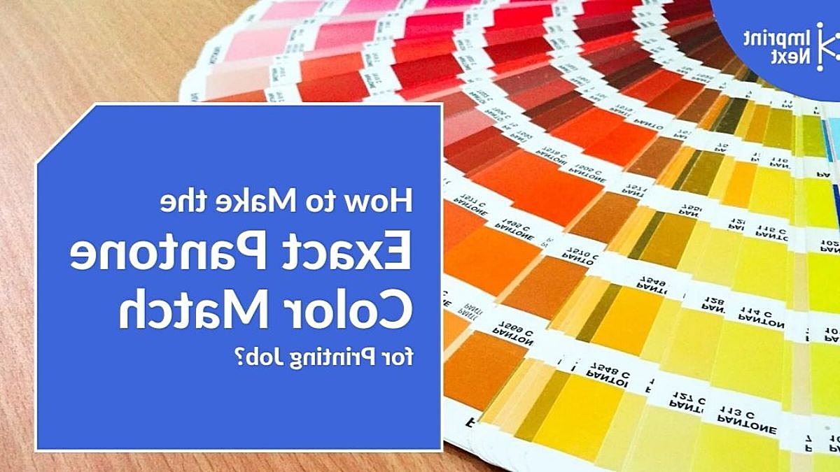
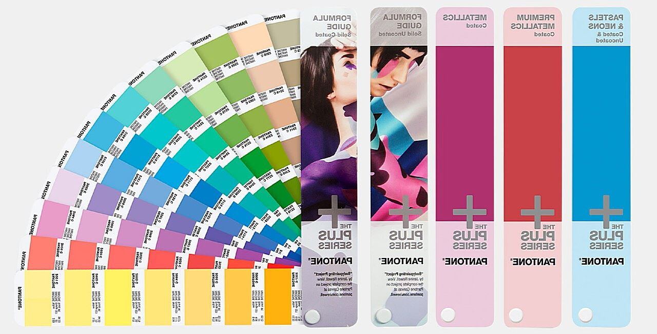
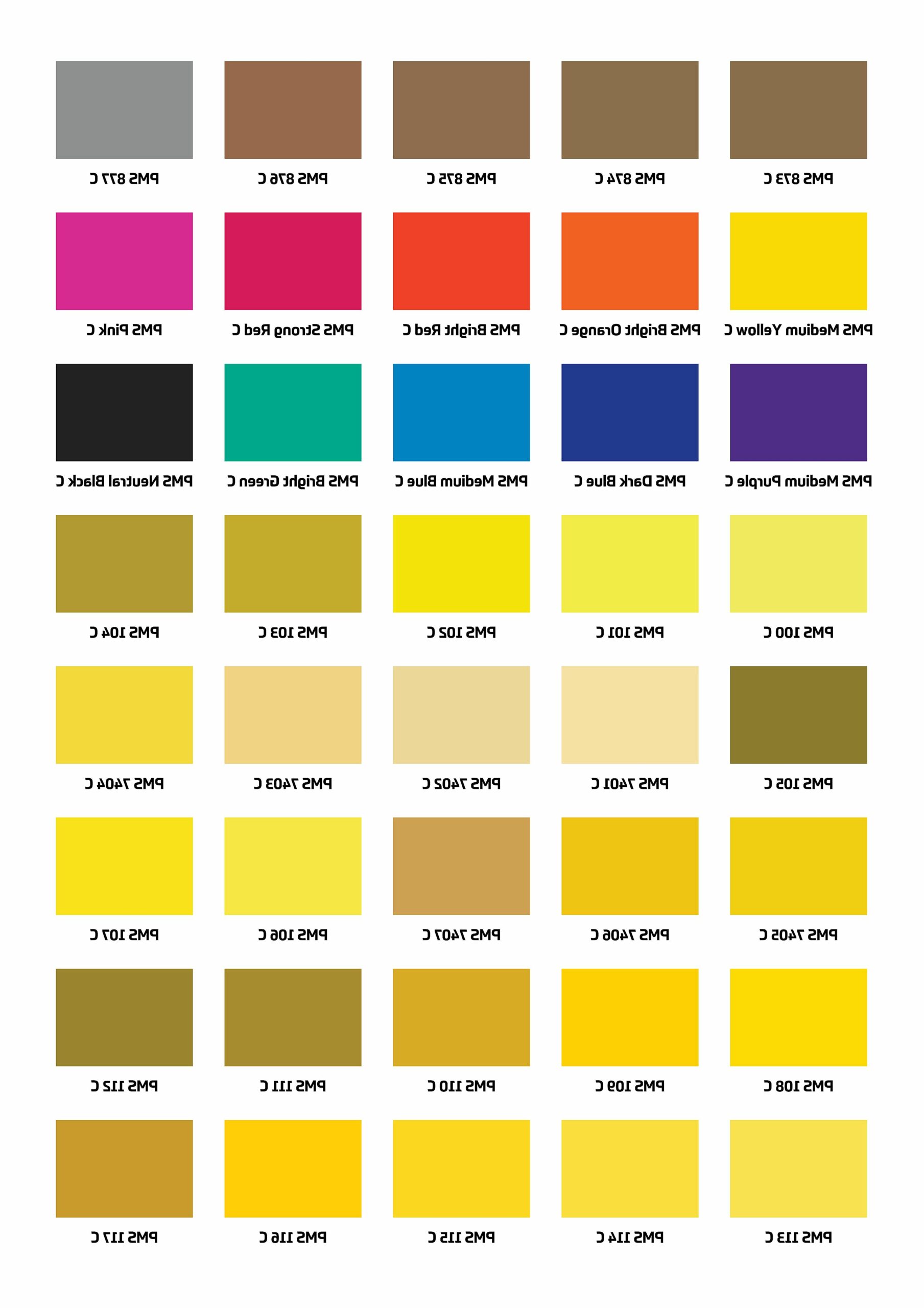
The most traditional way to detect a Pantone color is by comparing it to physical Pantone swatches, often found in fan decks or color books. These books contain printed chips of each Pantone color, meticulously formulated to represent the truest possible hue. To use them effectively, find the color you suspect is a match in your swatch book and hold it next to the sample you’re trying to identify. Rotate the swatch book under different lighting conditions to see how the color changes.
Limitations:
- Lighting: Different light sources can drastically alter how colors appear. A color might look perfect under fluorescent office lights but appear completely different under warm incandescent light. Ideally, you should compare colors under a standardized light source, like a light booth designed for color evaluation.
- Swatch Fading: Over time, Pantone swatches can fade or become discolored, especially if exposed to sunlight or humidity. Using outdated swatches can lead to inaccurate color matching. It’s recommended to replace your swatch books periodically to ensure accuracy.
- Subjectivity: Color perception varies from person to person. What looks like a perfect match to one person might seem slightly off to another. This subjectivity makes visual comparison alone unreliable for critical color decisions.
B. Using a Color Matching App: Mobile Pantone Detection
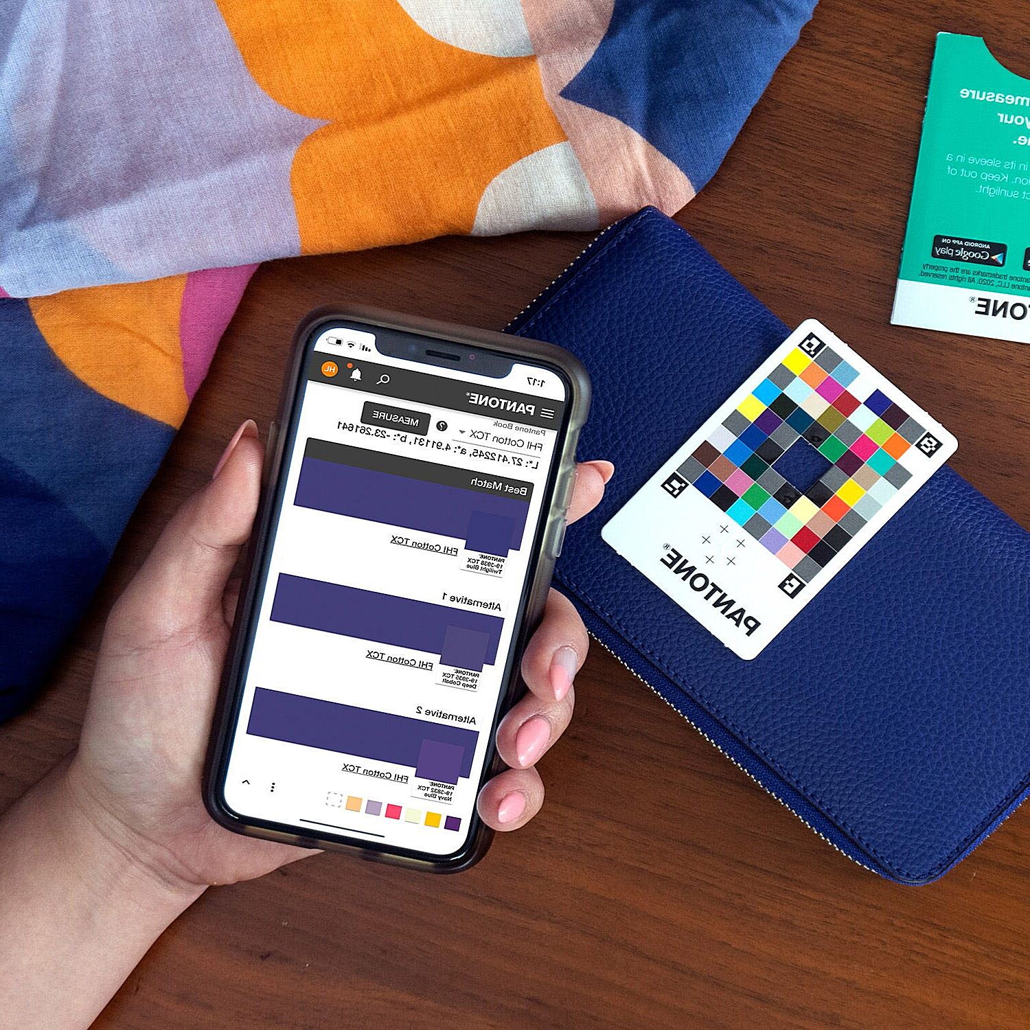
In today’s tech-savvy world, there’s an app for almost everything, including color matching. These apps use your smartphone’s camera to analyze a color and attempt to identify the closest Pantone equivalent. While convenient, these apps should be used with caution.
Limitations:
- Camera Accuracy: Smartphone cameras aren’t designed for precise color measurement. Factors like lighting, camera settings, and even the phone’s age can affect the accuracy of the color reading.
- App Algorithms: The algorithms used by these apps to match colors aren’t always perfect. They might suggest a close match, but it might not be the exact Pantone color you’re looking for.
C. The Human Eye and Color Perception: The Human Factor
Ultimately, all visual methods rely on the human eye, and our eyes can be easily tricked. Color perception is a complex process influenced by various factors, including:
- Lighting: As mentioned earlier, lighting plays a huge role in how we perceive colors.
- Individual Differences: Everyone’s eyes are slightly different, and some people have color blindness or other vision impairments that affect their ability to distinguish between certain colors.
- Surrounding Colors: The colors surrounding a particular color can influence how we perceive it. A color might look different against a white background than it does against a black background.
While visual methods can be helpful for quick checks or rough estimations, they shouldn’t be your primary method for critical Pantone color detection. For accurate and reliable results, you’ll need to explore digital tools.
Digital Tools for Pantone Color Detection: Accuracy at Your Fingertips
When visual methods fall short, digital tools step in to provide the precision needed for accurate Pantone color detection. These tools range from software solutions to specialized hardware, offering a more objective and reliable way to identify and verify Pantone colors.
A. Pantone Connect: The Digital Hub for Pantone Colors
Pantone Connect is a cloud-based platform that gives you access to the entire Pantone library, right at your fingertips. It’s more than just a digital version of the swatch books; it’s a powerful tool for managing and sharing Pantone colors.
Key Features:
- Digital Color Libraries: Access all Pantone color systems, including PMS, FHI, and more.
- Color Palette Creation: Create and save custom color palettes for your projects.
- Color Sharing: Easily share Pantone color information with colleagues and clients.
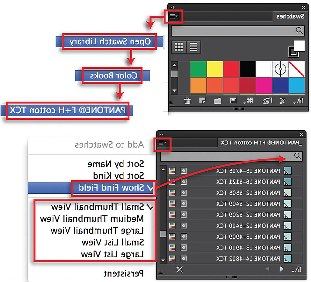
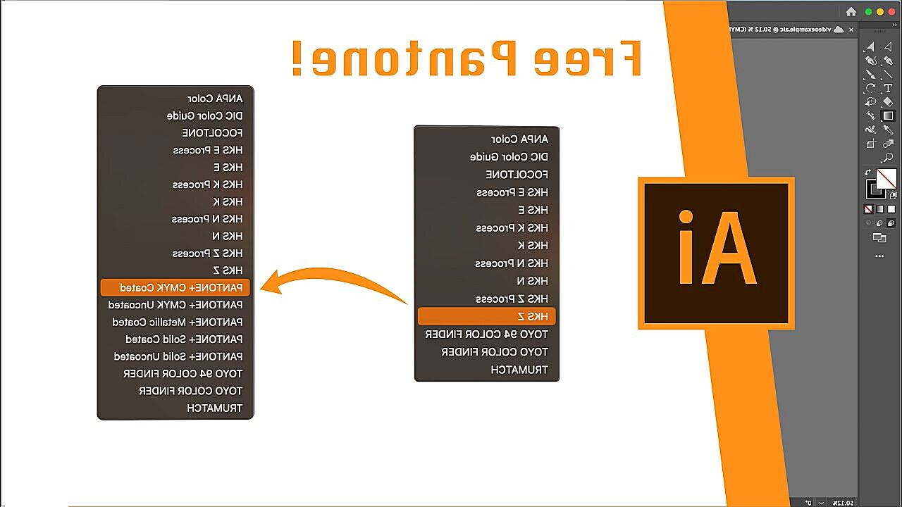
- Integration with Design Software: Pantone Connect integrates with popular design software like Adobe Photoshop and Illustrator, streamlining your workflow.
Pantone Connect is a subscription-based service, but it offers a free trial, allowing you to explore its features before committing. It’s a valuable tool for any designer or brand manager who works regularly with Pantone colors.
B. Spectrophotometers: The Gold Standard for Pantone Color Measurement
For the ultimate in Pantone color accuracy, you need a spectrophotometer. These sophisticated devices measure the spectral reflectance of a color, providing a precise digital representation of its hue. Think of it as a highly sensitive color “scanner.”
How it Works: Spectrophotometers shine a light onto the surface of a color sample and measure the amount of light reflected back. This data is then used to calculate the color’s unique spectral fingerprint, which can be compared to Pantone color data to identify the closest match.
Types of Spectrophotometers:
- Handheld: Portable and convenient for measuring colors on various surfaces.
- Benchtop: More accurate and feature-rich, typically used in labs or production environments.
Spectrophotometers are an investment, but they are essential for businesses that require precise color matching, such as printing companies, manufacturers, and brand owners.
C. Software Integration: Integrating Pantone into Your Workflow
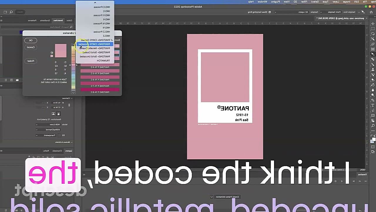
Many design software programs, like Adobe Photoshop and Illustrator, offer built-in Pantone libraries or plugins that facilitate Pantone color management. These tools allow you to:
- Select Pantone Colors Directly: Choose Pantone colors from a dropdown menu within your design software.
- Convert Colors to Pantone: Convert existing colors in your designs to their closest Pantone equivalents.
- Ensure Color Consistency: Maintain color consistency throughout your design and production process.
Using these software integrations streamlines your workflow and reduces the risk of color errors. They ensure that the Pantone color you select in your design is the same color that gets printed or manufactured.
Pantone Color Verification: Ensuring Accuracy
You’ve identified your Pantone color, but how can you be absolutely sure it’s correct? Pantone color verification is the process of confirming that the color you’re using matches the official Pantone standard. This is a crucial step, especially in printing and manufacturing, where color errors can be costly.
A. Why Verify Pantone Colors? The Importance of Precision
Imagine you’re a clothing manufacturer producing a line of t-shirts. You’ve specified a particular Pantone shade of blue for your logo. If the printed logo is even slightly off, it can damage your brand image and lead to customer dissatisfaction. This is just one example of why Pantone color verification is essential.
Consequences of Color Errors:
- Brand Inconsistency: Incorrect colors can dilute your brand identity and confuse customers.
- Production Reworks: If color errors are discovered late in the production process, it can lead to costly rework and delays.
- Customer Dissatisfaction: Incorrect colors can disappoint customers and lead to returns or negative reviews.
B. Best Practices for Pantone Color Verification: Getting it Right
Here are some best practices for ensuring accurate Pantone color reproduction:
- Use Up-to-Date Pantone Swatches: As mentioned earlier, Pantone swatches can fade over time. Make sure you’re using current editions of the Pantone Formula Guide or other relevant swatch books.
- Control Lighting Conditions: Evaluate colors under standardized lighting conditions, ideally using a light booth designed for color assessment.
- Proofing: Always request color proofs from your printer or manufacturer before proceeding with a full production run. These proofs allow you to visually check the color accuracy and make any necessary adjustments.
- Color Calibration: Ensure that your monitors and printers are properly calibrated to accurately display and reproduce colors.
- Certified Pantone Printers: Consider working with printers who are certified by Pantone. These printers have demonstrated their ability to consistently reproduce Pantone colors accurately.
- Spectrophotometer Verification: For critical color applications, use a spectrophotometer to measure the color of your printed or manufactured products and compare it to the official Pantone data.
VI. Troubleshooting Pantone Color Issues: When Things Go Wrong
Even with the best planning, Pantone color issues can still arise. Here are some common problems and how to troubleshoot them:
A. Pantone Colors Not Matching: Why the Discrepancy?
- Incorrect Printing Process: Different printing processes (offset, digital, flexo) can produce slightly different color results.
- Wrong Substrate: The material you’re printing on (paper, fabric, plastic) can significantly affect the appearance of the color.
- Ink Variations: Inks can vary slightly from batch to batch, affecting the final color.
- Fading or Discoloration: Over time, printed colors can fade or become discolored due to exposure to light, heat, or other environmental factors.
Troubleshooting Steps:
- Check the Pantone Color System: Ensure you’re using the correct Pantone system (PMS, FHI, etc.) and the correct coated or uncoated designation.
- Verify the Printing Process: Confirm that the printing process being used is appropriate for the desired color result.
- Examine the Substrate: Make sure the substrate is compatible with the ink and printing process.
- Compare to Pantone Swatches: Compare the printed color to your Pantone swatches under standardized lighting conditions.
- Consult with Your Printer: If you’re still having trouble, consult with your printer to identify the cause of the color mismatch and find a solution.
B. Finding a Specific Pantone Color: The Hunt for the Right Hue
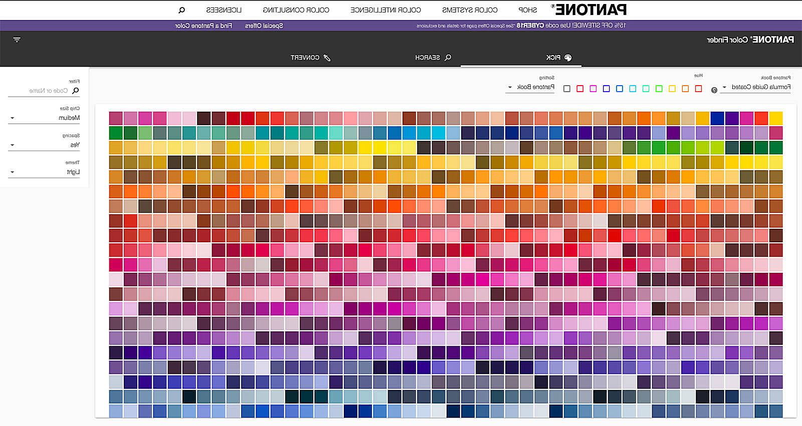
- Pantone Connect: The easiest way to find a specific Pantone color is to use Pantone Connect. You can search by color name, number, or even by visual browsing.
- Pantone Swatch Books: If you have physical Pantone swatch books, you can browse through them to find the color you’re looking for.
- Online Resources: Several websites and online databases provide information about Pantone colors.
Custom Pantone Colors: If you can’t find the exact Pantone color you need, you can even create a custom Pantone color. This usually involves working with a Pantone representative to develop a unique color formula.
