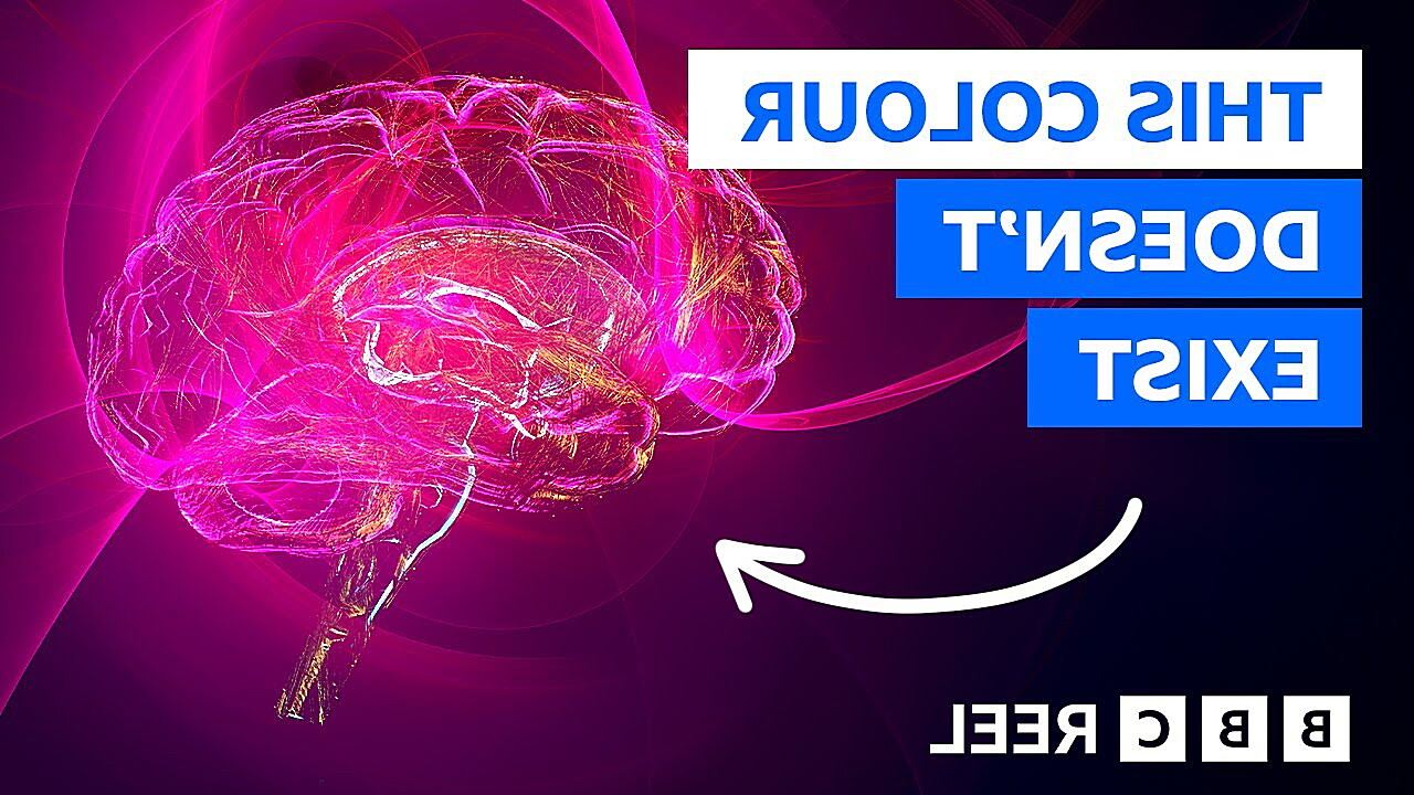
Why Can’t Humans See Magenta
Related Posts
Ever looked at a vibrant sunset and wondered about that striking pinkish-purple hue? You might be surprised to learn that magenta, that color, doesn’t actually exist in the rainbow. It’s a bit of a head-scratcher, isn’t it? We see it, we name it, we use it in everything from fashion to printing, yet it’s not a pure wavelength of light like the colors of the rainbow. This raises the fascinating question: Is magenta a false color?
Understanding True Colors and the Visible Spectrum
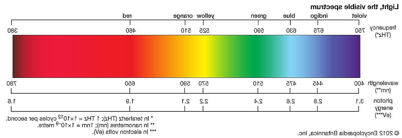
To understand why magenta’s status as a “true” color is debated, we first need to grasp the basics of light and color. Light is a form of electromagnetic radiation, and the visible spectrum is the portion of this radiation that our eyes can detect. Think of it like a tiny sliver of a much larger pie. This visible spectrum is what we see as the colors of the rainbow: Red, Orange, Yellow, Green, Blue, Indigo, and Violet (ROYGBIV). Each of these colors corresponds to a specific wavelength of light. Red has the longest wavelength, while violet has the shortest.
Our eyes contain specialized cells called cones, which are responsible for color vision. We have three types of cones, each sensitive to different wavelengths of light: red, green, and blue. When light enters our eyes, these cones are stimulated to varying degrees depending on the wavelengths present. This information is then sent to the brain, which interprets the signals and creates our perception of color. “Pure” colors, like those in the rainbow, correspond to a single wavelength of light. These are the spectral colors, the fundamental building blocks of the color world.
What is Magenta, Anyway?
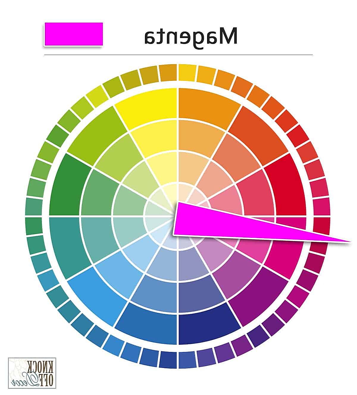
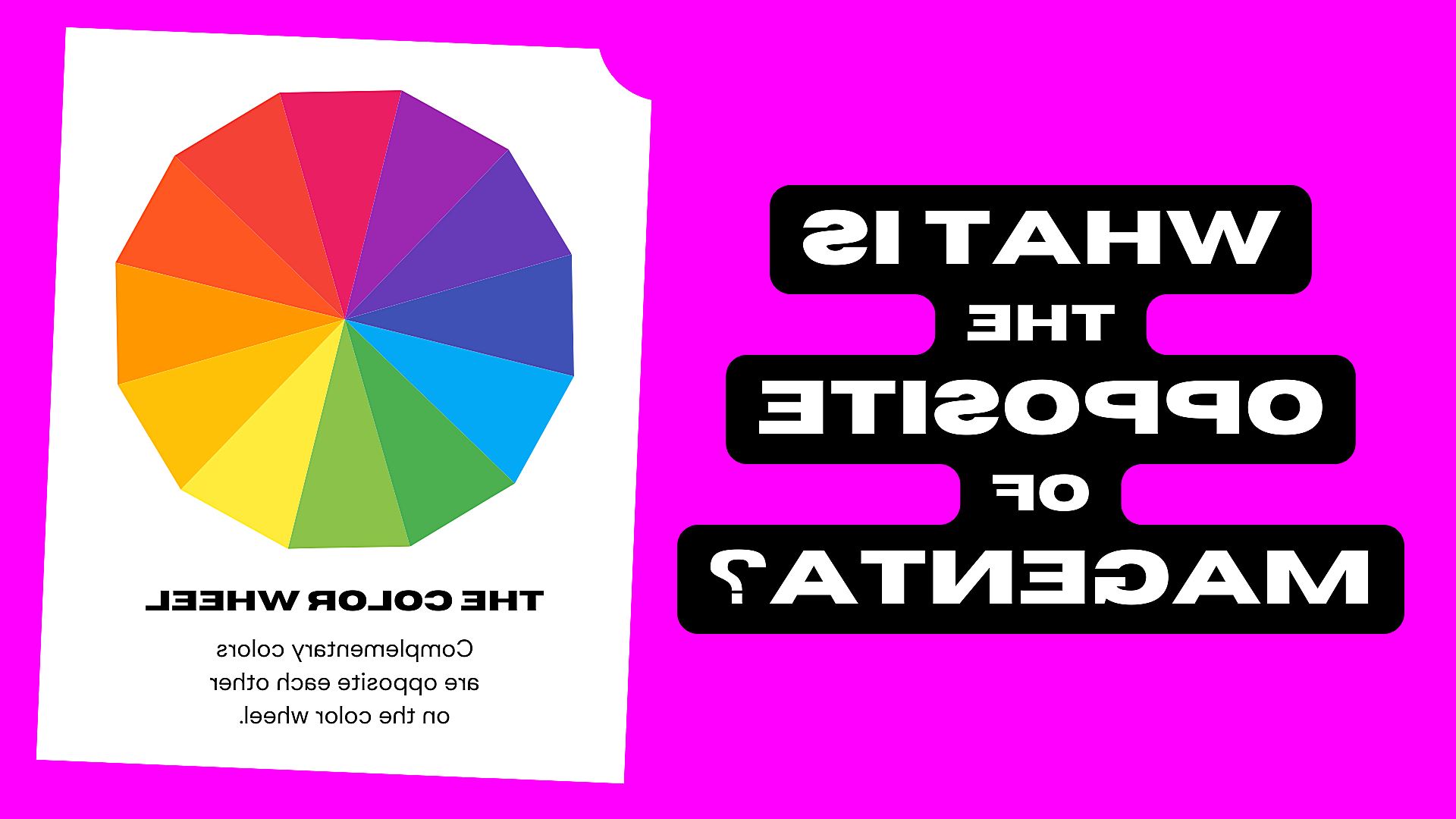
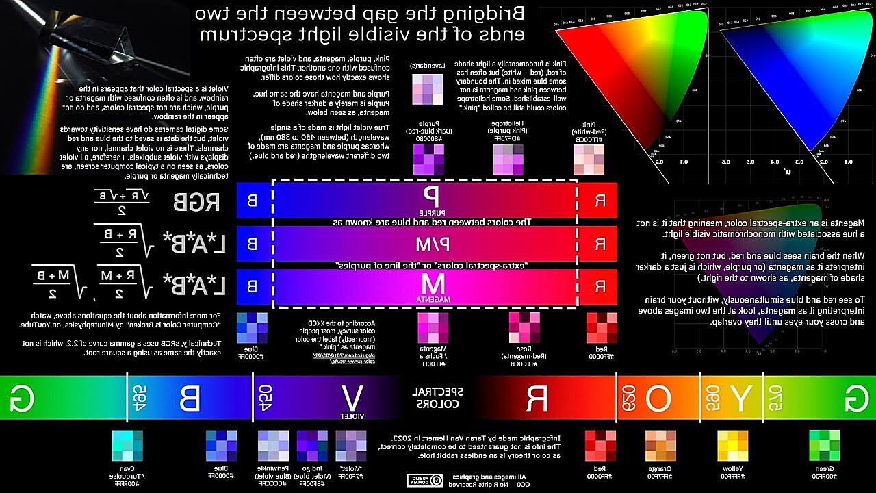
So, where does magenta fit into all this? Magenta is a color that sits between red and blue on the color wheel. It’s often described as a purplish-pink or a reddish-purple. You see it in everything from vibrant sunsets to trendy clothing. But here’s the crucial point: magenta isn’t a spectral color. It doesn’t correspond to a single wavelength of light. Instead, it’s created by a combination of red and blue light. Imagine mixing red and blue paint – you get purple, which is closely related to magenta. The same principle applies to light.
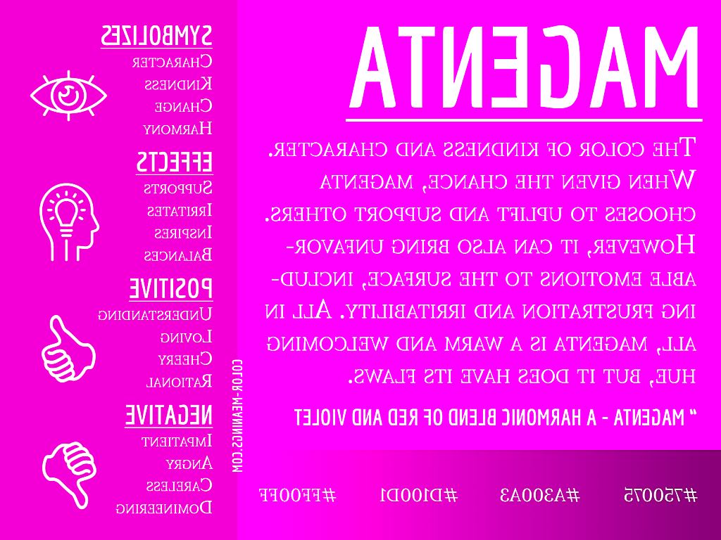
There are many different shades and variations of magenta, just like any other color. You might encounter terms like “bright magenta,” “deep magenta,” or “hot pink.” These variations are due to slight differences in the proportions of red and blue light that make up the color. Visually, magenta can be incredibly striking and versatile. It can evoke feelings of passion, creativity, or even mystery, depending on its context.
The Curious Case of Magenta: Why It’s Not in the Rainbow
Now, the million-dollar question: if we see magenta, and it’s such a prominent color, why isn’t it in the rainbow? The answer lies in the physics of light and how our brains interpret it. The rainbow is a beautiful display of the visible spectrum, showcasing the pure colors associated with individual wavelengths of light. As we discussed earlier, magenta doesn’t fit this definition. There’s simply no single wavelength between red and blue that our eyes perceive as magenta. It’s a “missing wavelength,” so to speak.
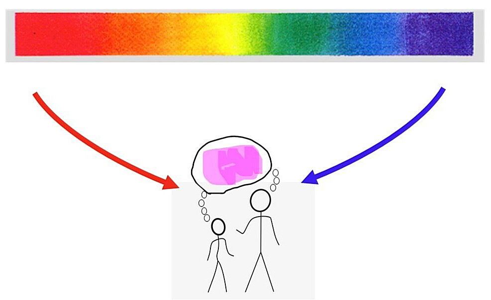
Think of the rainbow as a linear progression of colors, each blending smoothly into the next. You can move from red to orange, yellow, green, and so on, all the way to violet. But there’s no direct path from red to blue within the rainbow’s spectrum. To get to magenta, you have to jump outside that linear sequence. Our brains take the signals from our red and blue cones being stimulated simultaneously and, rather than perceiving a gap or nothing at all, they create the sensation of magenta. It’s a clever bit of visual processing!
This is where the misconception of magenta being a “made-up” color sometimes arises. In a way, it is. It’s a construct of our brains, a perceptual experience that doesn’t directly correspond to a single wavelength of light. However, this doesn’t mean it’s fake or unreal. Magenta is a genuine visual experience, just one that’s created differently than the spectral colors of the rainbow.
How Do We See Magenta? The Role of Our Brains
To understand how our brains conjure up the perception of magenta, we need to delve a little deeper into the trichromatic theory of color vision. This theory states that our color vision is based on the activity of three types of cone cells in our eyes: red, green, and blue cones. Each type of cone is most sensitive to a particular range of wavelengths. When light enters the eye, these cones are stimulated to varying degrees depending on the mix of wavelengths present.
When we see magenta, both our red and blue cones are strongly stimulated. Our green cones, however, are only minimally activated. This specific combination of cone stimulation sends a unique signal to the brain. The brain then interprets this signal, not as a combination of red and blue (which would appear more purplish), but as a distinct color: magenta. It’s a bit like mixing paint, but instead of pigments, it’s light and neural signals that are being combined.
The brain plays a crucial role in this process. It’s not just passively receiving signals from the cones; it’s actively processing and interpreting them. This is why color perception is somewhat subjective. While most people with normal color vision will perceive magenta similarly, subtle individual differences in cone sensitivity and brain processing can lead to slight variations in how we see it. The concept of “metamers” is also relevant here. Metamers are different combinations of wavelengths that can produce the same perceived color. So, while magenta is typically created by a mix of red and blue light, other combinations of wavelengths could also potentially trigger the same perceptual experience.
Is Magenta a False Color? The Final Verdict
So, after all this exploration, where does magenta stand? Is it a false color? The answer, like many things in science, is nuanced. The term “false color” often refers to colors that are not present in the visible spectrum. Since magenta isn’t a single wavelength of light and doesn’t appear in the rainbow, it technically fits this definition. It’s created by our brains as an interpretation of combined red and blue light, not by a single wavelength stimulating our cones.
However, it’s crucial to understand that “false color” doesn’t equate to “fake” or “unreal.” Magenta is a perfectly valid and real perceptual experience. We see it, we use it, and it plays a significant role in our visual world. The fact that its creation is different from spectral colors doesn’t diminish its reality. It’s more accurate to describe magenta as a non-spectral color, emphasizing its unique origin outside the traditional rainbow spectrum.
Ultimately, whether you consider magenta a “false color” depends on your definition. If you strictly adhere to the idea that only colors corresponding to single wavelengths are “true,” then yes, magenta is a false color. But if you take a broader view that includes how our brains interpret light and create color experiences, then magenta is undeniably a real and vibrant color. It’s a testament to the amazing complexity of our visual system and how our brains construct our perception of the world around us. The subjective nature of color perception also plays a role. While the physics of light is objective, how we experience color is filtered through our individual biology and neurology.
Magenta in Art, Design, and Technology
Regardless of its classification, magenta holds a prominent place in art, design, and technology. In art, magenta has been used for centuries to convey a range of emotions, from passion and energy to mystery and sophistication. It’s often associated with creativity and non-conformity. In graphic design, magenta is a versatile color that can be used to create eye-catching visuals and evoke specific moods. It’s a popular choice for branding and marketing, particularly in industries related to fashion, beauty, and technology.
In the world of color reproduction, magenta is one of the primary colors in the CMYK (Cyan, Magenta, Yellow, Key/Black) color model, which is used for printing. Along with cyan, yellow, and black, magenta ink is used to create a vast array of colors on printed materials. Similarly, in digital displays, magenta is created by combining red and blue light in the RGB (Red, Green, Blue) color model. It’s an essential component of creating vibrant and colorful images on screens. From fashion to scientific imaging, magenta’s influence is undeniable. It’s a color that captures our attention and adds a touch of vibrancy to our world.
Beyond Magenta: Exploring Other “Non-Spectral” Colors
Magenta isn’t the only color that defies easy categorization within the rainbow spectrum. Several other colors we encounter in our daily lives are also considered “non-spectral” for similar reasons. Purple, for instance, is another prominent example. Like magenta, purple is a combination of red and blue light, and it doesn’t have a corresponding single wavelength. It sits on the color wheel between blue and red, bridging the gap that the rainbow’s linear progression can’t directly traverse. Our brains, however, seamlessly create the perception of purple when both red and blue cones are stimulated.
Another interesting case is brown. While we often think of brown as a distinct color, it’s actually a complex mix of many different wavelengths. It’s not a pure hue like the colors of the rainbow. Instead, it’s typically a combination of red, yellow, and black light, or a combination of many wavelengths that, when mixed, result in a lower overall light intensity and a brownish appearance. The perception of brown is also heavily influenced by context. A color that appears brown under one lighting condition might look entirely different under another.
These examples highlight the fascinating fact that our perception of color goes beyond the simple wavelengths of light. Our brains are actively involved in interpreting and constructing our color experience, often creating perceptions of colors that aren’t directly represented in the rainbow’s spectrum.
Frequently Asked Questions about Magenta
Let’s tackle some common questions about magenta to solidify our understanding:
Is magenta a primary color? No, magenta is not a primary color in the traditional sense. In some color models, like the RYB (Red, Yellow, Blue) model, it might be considered a secondary color, created by mixing red and blue. However, in the more widely used CMYK model for printing, magenta is considered a primary color, as it’s one of the key inks used to create a wide range of colors.
What colors make magenta? The most common way to create magenta is by combining red and blue light. The specific shade of magenta will depend on the exact proportions of red and blue.
Is magenta a warm or cool color? Generally, magenta is considered a cool color. While it contains red, which is typically associated with warmth, the presence of blue gives it a cooler, more purplish undertone.
What is the difference between magenta and purple? While magenta and purple are closely related, there’s a subtle but noticeable difference. Magenta is typically more reddish, while purple leans more towards the blue side. Think of magenta as a reddish-purple and purple as a bluish-purple. Visually, magenta often appears brighter and more vibrant, while purple can be deeper and more subdued.
