Is Pms Cmyk Or Rgb
Related Posts
Ever had that sinking feeling when the logo you meticulously designed in vibrant blue comes back from the printer looking suspiciously… purple? We’ve all been there. Color miscommunication is a designer’s nightmare, but thankfully, there’s a superhero in the world of color consistency: Pantone. And if you’ve ever wondered, “Is Pantone PMS color the same thing?” you’re in the right place. The short answer is yes! PMS stands for Pantone Matching System, so PMS colors are Pantone colors. Think of it like this: Pantone is the brand, and PMS is their flagship product.
Imagine a world where every shade of red, blue, or green has a unique identifier, a secret code that ensures it looks exactly the same whether it’s printed on a business card in Boise or a billboard in Bangkok. That’s the magic of the Pantone Matching System (PMS). Developed by the Pantone Color Institute in the 1960s, PMS revolutionized the design and manufacturing industries by providing a standardized language for color. Before Pantone, color communication was a chaotic free-for-all, with printers and designers often having vastly different interpretations of the same color name. Pantone brought order to this chaos.
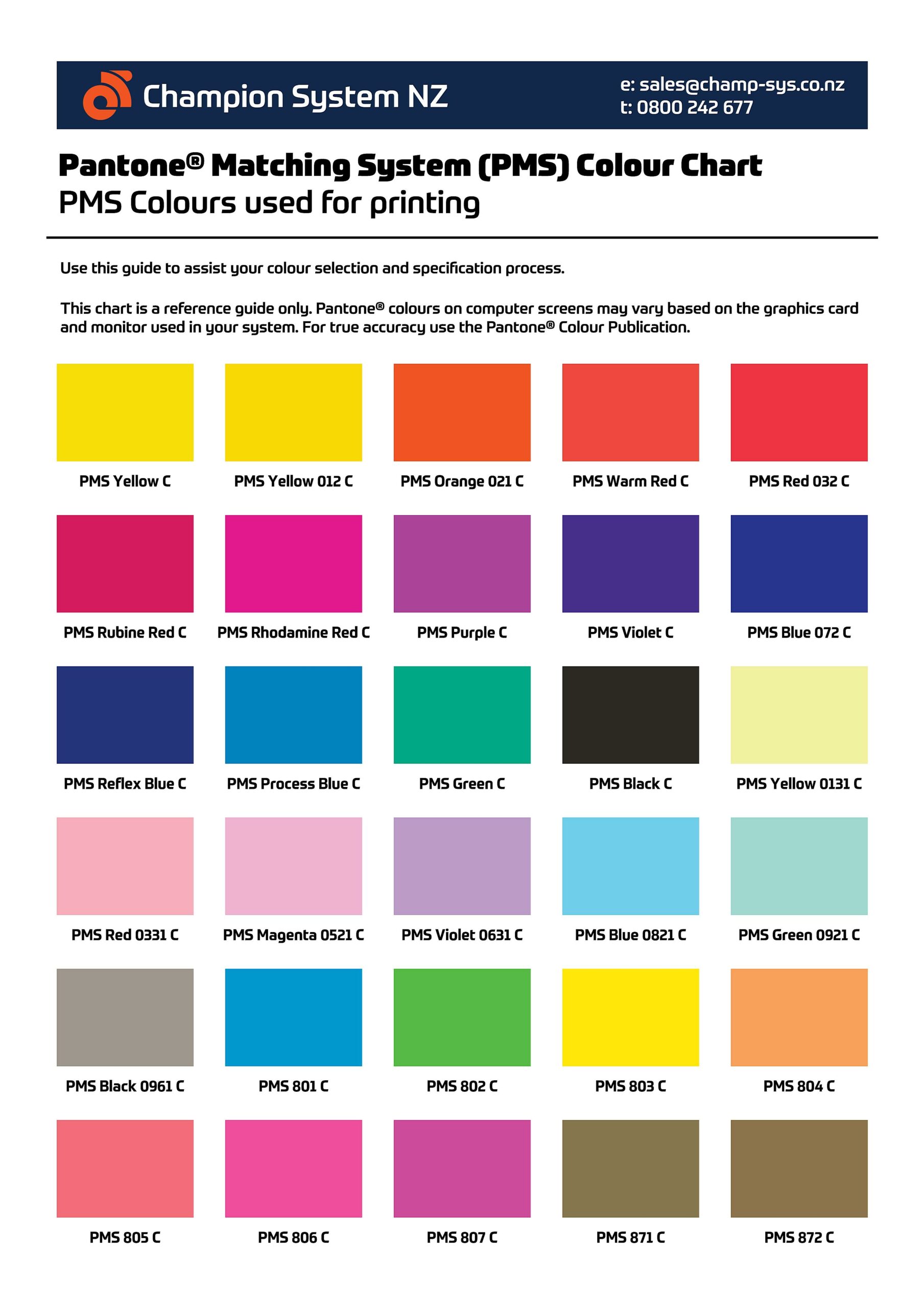
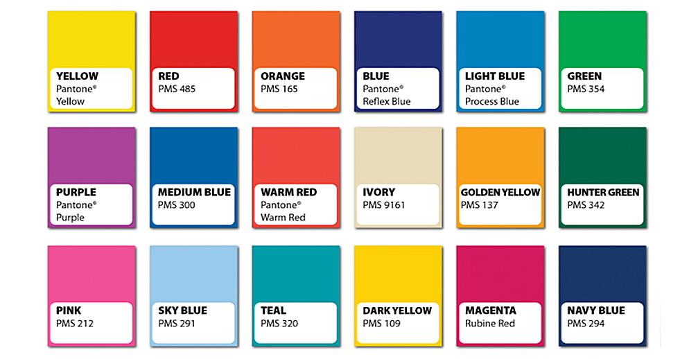
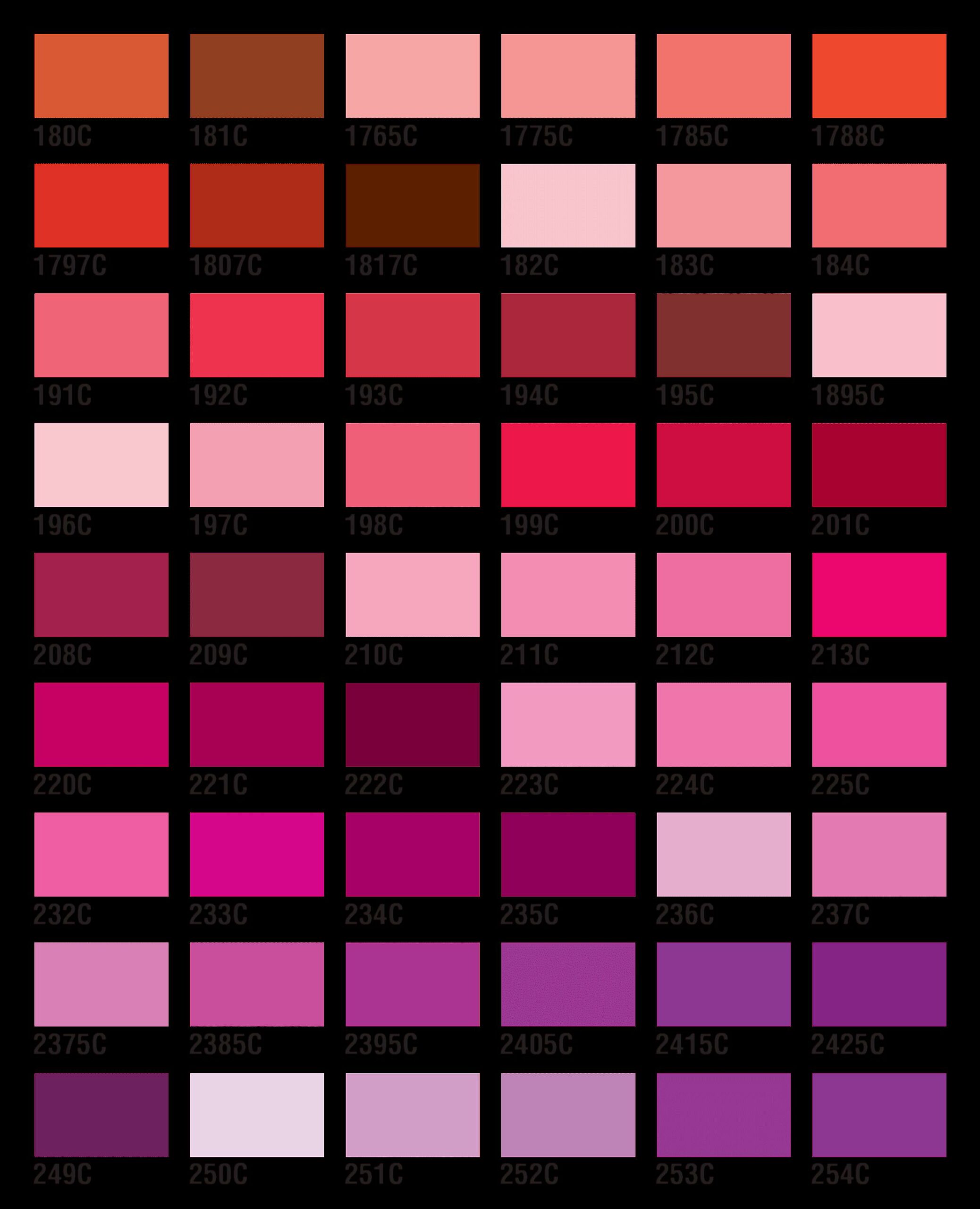
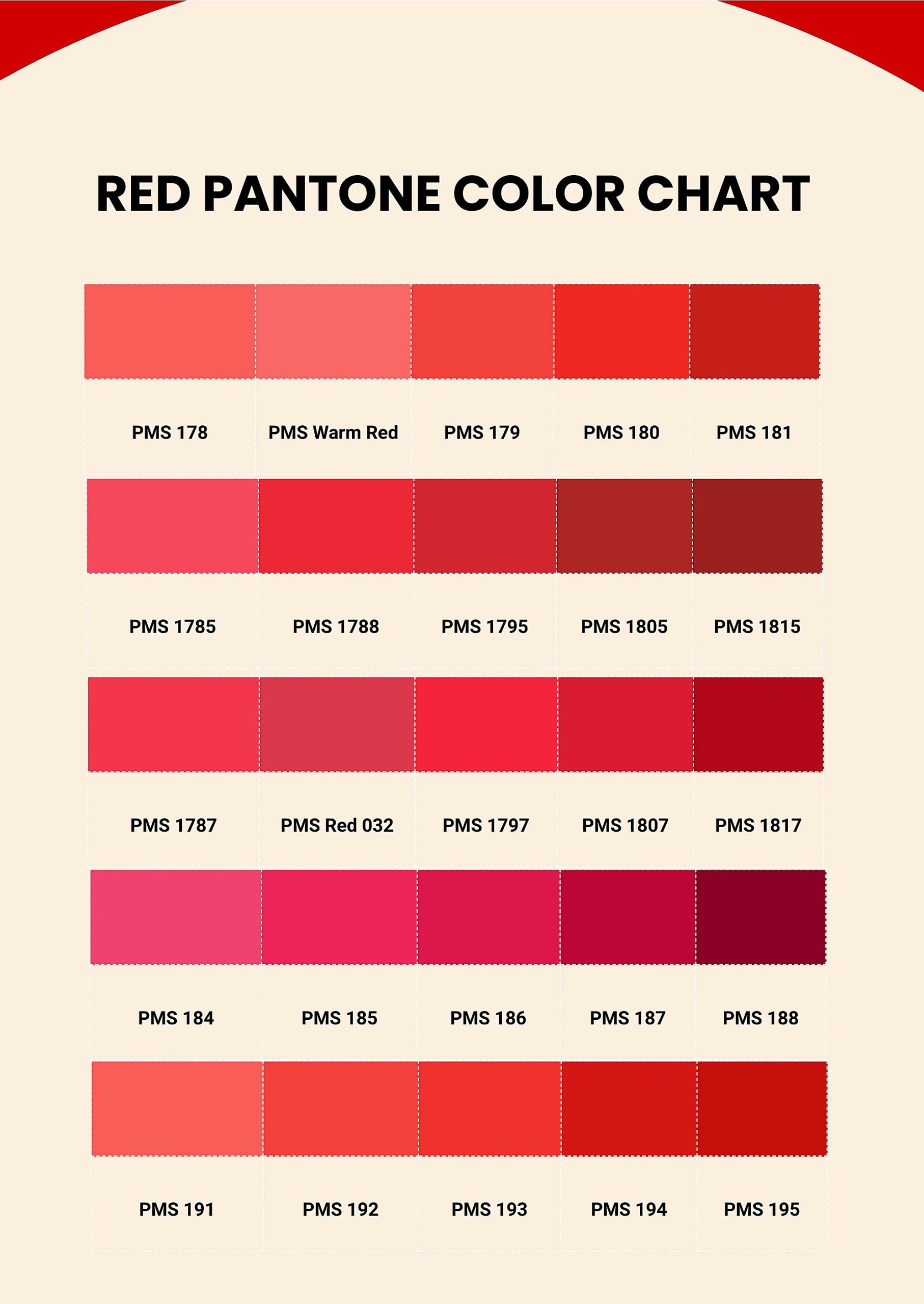
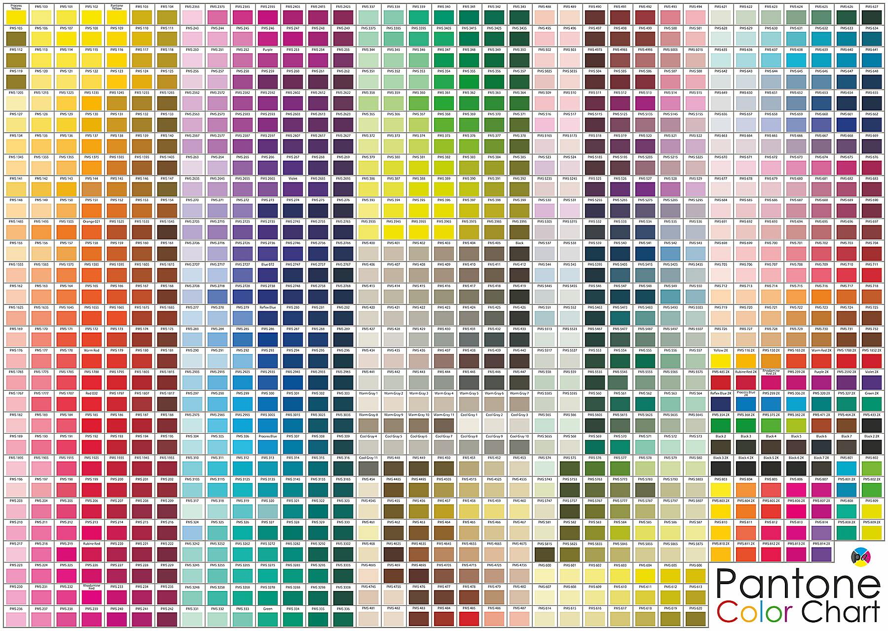
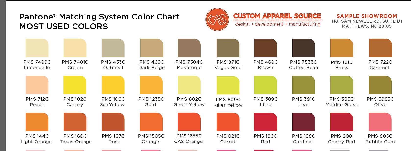
The PMS works by assigning a unique number to each color in its library. These numbers, like “Pantone 185 C” (a vibrant red), act as a precise recipe for ink formulations. Pantone meticulously mixes specific pigments to create each color, ensuring that the “Pantone 185 C” you see in a swatch book will be the same “Pantone 185 C” printed on a t-shirt. This consistency is crucial for branding, where a slight variation in color can dramatically impact a company’s image.
Pantone offers various color libraries tailored to different needs. The most common are:
- Solid Coated: These colors are printed on coated paper, giving them a vibrant, glossy appearance. They are often used for logos, brochures, and other printed materials.
- Solid Uncoated: These colors are printed on uncoated paper, which gives them a more matte, softer look. They are frequently used for stationery, letterheads, and packaging.
- Metallic: These colors contain metallic pigments, creating a shimmering effect.
- Pastel: These are lighter, softer shades.
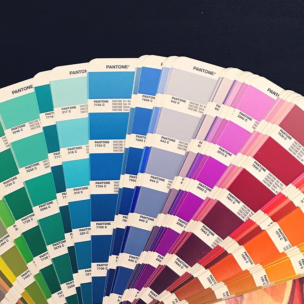
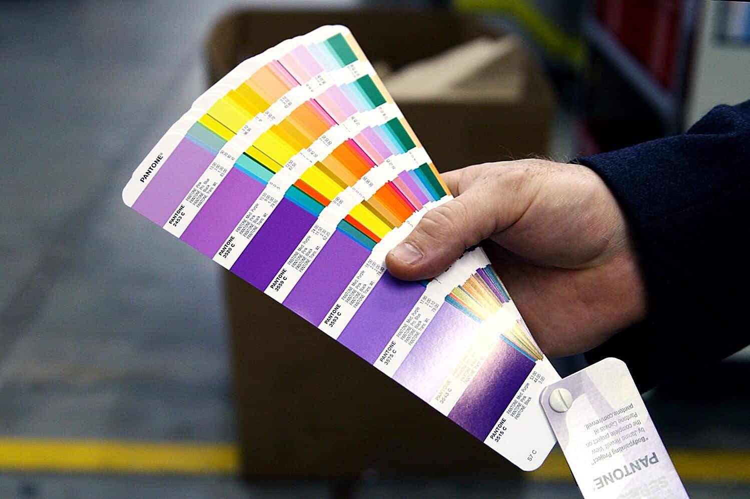
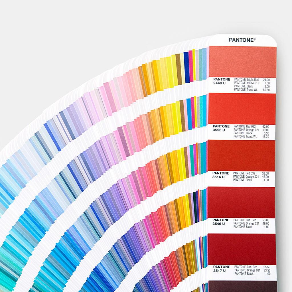
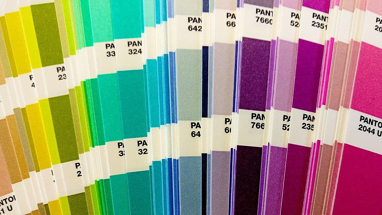
Think of a Pantone color book (or fan deck) as a designer’s bible. It’s a collection of color swatches, each with its unique PMS number, allowing designers to select and specify colors with absolute certainty. These books are an invaluable tool for ensuring color accuracy throughout the design and printing process. They provide a tangible representation of each color, allowing designers to see how it will appear in real life, rather than relying on potentially inaccurate on-screen representations.
How Do Pantone Colors Actually Work?
So, how does Pantone achieve this impressive feat of color consistency? It’s all in the science of ink formulation. Each Pantone color is a specific recipe, a precise blend of different pigments. Pantone doesn’t just assign a number; they define the exact proportions of each pigment needed to create that specific shade. This recipe is what makes “Pantone 185 C” the same vibrant red, no matter where it’s printed.
The process is incredibly meticulous. Pantone maintains a library of base pigments, and their color experts carefully measure and mix these pigments according to the defined formulas. This ensures that the ink used to print a Pantone color matches the standard exactly. Think of it like baking a cake – a slight change in the ingredients can drastically alter the final product. Pantone’s rigorous process ensures that every “batch” of color is consistent.
Pantone also plays a vital role in quality control. They license their color formulas to ink manufacturers worldwide, ensuring that these manufacturers adhere to the precise mixing standards. This licensing model is a key part of how Pantone maintains consistency across different printing methods and substrates. Whether it’s offset lithography, flexography, or digital printing, if a printer uses Pantone-licensed inks, the final result should match the specified Pantone color.
Now, you might be wondering, “How are Pantone colors different from standard colors?” Standard colors, like those you see in a box of crayons, are often based on a more general formulation. While they might be close to a Pantone color, they lack the same level of precision and standardization. Pantone colors are specifically designed to be reproducible, ensuring that the color you choose looks the same every single time. They’re the gold standard for color consistency, especially when brand identity is at stake.
Using Pantone Colors in Your Projects
Using Pantone colors in your projects offers a wealth of benefits, particularly when it comes to branding and design consistency. Imagine a global brand with a logo that appears slightly different in every country. That’s a branding nightmare! Pantone colors eliminate this risk. By specifying a Pantone color for your logo, you ensure it will look the same on your website, your business cards, and even the side of your delivery trucks. This consistent color representation strengthens brand recognition and recall, creating a unified and professional image.
Specifying Pantone colors in design software like Adobe Illustrator, Photoshop, and InDesign is relatively straightforward. Most design programs include Pantone color libraries, allowing you to select the precise PMS number for your chosen color. When you send your design files to a printer, they can then use that PMS number to mix the exact ink formulation, guaranteeing color accuracy.
Here are some practical tips for using Pantone color codes:
- Always use the full PMS number: Don’t just say “red.” Specify “Pantone 185 C” or “Pantone 485 U” (the “C” stands for coated, and “U” for uncoated).
- Check the color on different substrates: The same Pantone color can look slightly different on coated and uncoated paper. Always check your chosen color on the intended printing material.
- Communicate clearly with your printer: Let your printer know that you’re using Pantone colors and provide them with the PMS numbers.
Now, let’s talk about the difference between spot colors (Pantone) and process colors (CMYK). This is a crucial distinction.
Pantone vs. CMYK: What’s the Difference?
Pantone colors are spot colors. They are premixed inks, each with its own unique formula. Think of them like custom paint colors you’d mix at a paint store. CMYK, on the other hand, stands for Cyan, Magenta, Yellow, and Key (Black). These are the four process colors used in standard four-color printing. CMYK colors are created by layering tiny dots of these four inks, creating a wide range of colors through a process called halftone printing.
When Should You Use Pantone Colors?
Pantone colors are ideal for projects that require precise color matching, especially when branding is involved. They’re also a good choice for projects with a limited number of colors, as they can be more cost-effective than CMYK for small print runs. CMYK is better suited for projects with many colors, such as photographs or complex illustrations.
Here’s a handy table summarizing the key differences:
Feature Pantone (Spot Colors) CMYK (Process Colors) Ink Type Premixed Process colors (Cyan, Magenta, Yellow, Black) Color Accuracy Very High Good, but can vary slightly Cost Higher for large print runs, lower for small Lower for large print runs, higher for small Color Range Limited by available PMS colors Wider range of colors Best For Branding, logos, limited color designs Photographs, complex illustrations, projects with many colors In short, if you need a specific, consistent color that absolutely must be reproduced accurately, Pantone is your best bet. If your project involves many colors and some slight variation is acceptable, CMYK might be the more practical choice.
Finding Pantone Colors
Accessing the world of Pantone colors is easier than ever, with a range of resources available to designers and manufacturers. The most traditional and reliable method is through physical Pantone color books, also known as fan decks. These books contain swatches of all the Pantone colors, printed on different paper stocks (coated and uncoated). They’re an invaluable investment for any serious designer, providing a tangible representation of each color and allowing for accurate color selection.
However, in today’s digital age, Pantone also offers a powerful online platform called Pantone Connect.
Pantone Connect: Your Digital Pantone Toolkit
Pantone Connect is a subscription-based digital platform that provides access to the full Pantone color library. It offers a range of features, including:
- Digital color palettes: Create and share color palettes using Pantone colors.
- Color conversion: Convert Pantone colors to other color systems, like CMYK and RGB.
- Color libraries: Access all Pantone color libraries, including the latest additions.
- Collaboration tools: Share color palettes and collaborate with other designers.
Pantone Connect is a fantastic tool for designers who work primarily in digital environments. It streamlines the color selection process and makes it easier to share Pantone colors with clients and printers.
Beyond these primary resources, you can also find online Pantone color finders, which allow you to search for Pantone colors by number or name. However, it’s crucial to remember that on-screen color representations can vary depending on your monitor calibration. Always double-check your chosen color against a physical Pantone color book or through Pantone Connect to ensure accuracy.
The cost of Pantone resources can vary. Physical Pantone color books can be a significant investment, but they’re a one-time purchase that can last for years. Pantone Connect is a subscription-based service, with different pricing tiers depending on your needs. While there might be free online color finders, remember that these should be used for reference only, not for final color decisions.
Regardless of how you access Pantone colors, the most important thing is to ensure accurate color representation. Whether you’re looking at a physical swatch or a digital representation, always strive for consistency and double-check your chosen color before sending your project to print.
Pantone Color Trends
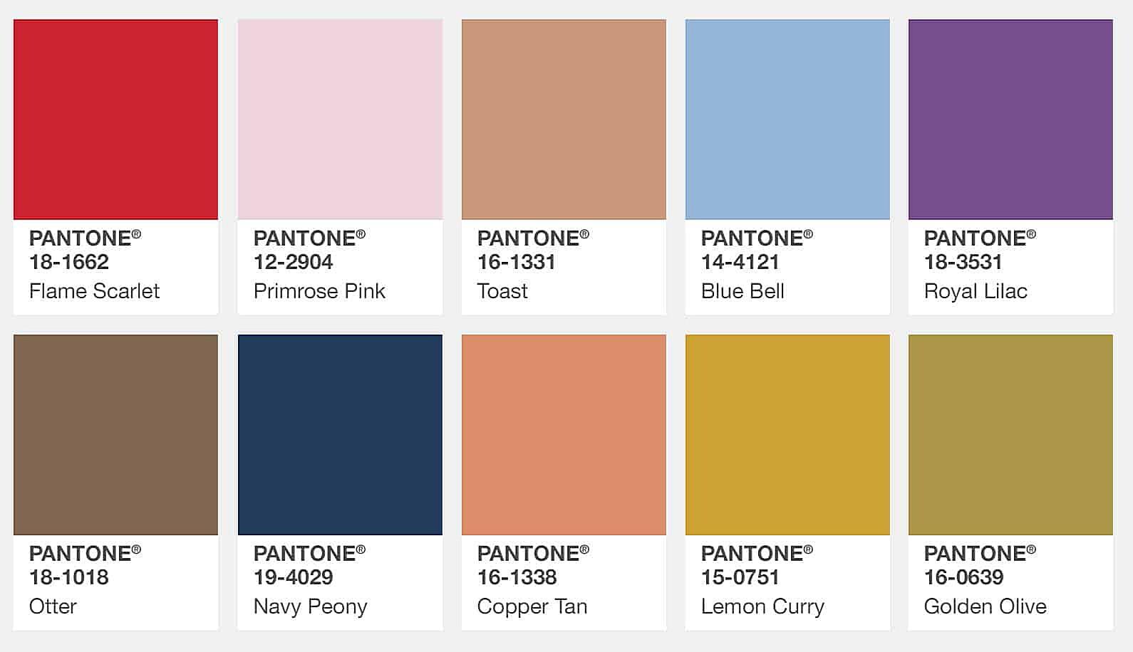
The world of color is constantly evolving, and Pantone is at the forefront of these trends. Each year, the Pantone Color Institute announces its “Color of the Year,” a single shade that they predict will be influential in design, fashion, and culture for the coming year. This announcement is highly anticipated by designers and trendsetters worldwide, as it often sets the tone for color palettes in various industries.
Pantone’s “Color of the Year” selection process is a complex and thoughtful one. A team of color experts travels the globe, observing trends in art, fashion, design, and even social and political events. They look for recurring patterns and emerging color preferences, trying to capture the zeitgeist of the moment. The chosen color is not just a random pick; it’s a reflection of the current cultural climate, a visual representation of the mood and aspirations of society.
Recent Pantone Colors of the Year have included:
- 2023: Viva Magenta: A vibrant, nuanced crimson red that presents a balance between warm and cool, symbolizing dynamism and optimism.
- 2022: Very Peri: A new Pantone color whose blue periwinkle hue with a violet-red undertone blends the faithfulness and constancy of blue with the energy and excitement of red.
- 2021: Illuminating (yellow) and Ultimate Gray: Two colors that conveyed a message of strength and hopefulness, symbolizing the light at the end of the tunnel.
These colors often influence everything from clothing and interior design to graphic design and packaging. Designers often incorporate the “Color of the Year” into their projects, either using it as a primary color or as an accent shade. Staying current with Pantone color trends can help designers create work that feels fresh, relevant, and on-trend.
Even if you don’t slavishly follow the “Color of the Year,” paying attention to Pantone’s trend forecasts can give you valuable insights into the broader color landscape. These trends often reflect deeper cultural shifts and can help you understand what colors are resonating with audiences.
Incorporating Pantone color trends into your projects can be as simple as adding a pop of the “Color of the Year” to a website design or choosing a trending Pantone shade for a new product line. It’s a way to demonstrate that your work is current and in tune with the latest design sensibilities.
Pantone and Brand Identity
Color is a powerful tool in branding. It’s one of the first things people notice about a logo or a product, and it plays a significant role in how they perceive a brand. Consistent color usage is essential for building brand recognition and recall. Think about some of the world’s most iconic brands – Coca-Cola red, Tiffany blue, or UPS brown. These colors are instantly recognizable and have become synonymous with the brands they represent.
Pantone colors play a crucial role in establishing and maintaining brand identity. By specifying a Pantone color for your logo and other brand materials, you ensure that your brand’s visual identity remains consistent across all platforms and mediums. This consistency is vital for creating a strong and cohesive brand image. Imagine if Coca-Cola’s red was slightly different on every can – it would dilute the brand’s visual impact and create confusion among consumers.
Pantone colors provide the precision and standardization needed to avoid these inconsistencies. They offer a guarantee that your brand colors will look the same, whether they’re printed on a business card or displayed on a website. This level of color accuracy is particularly important for global brands that operate in multiple markets. Pantone ensures that their brand colors are instantly recognizable, regardless of where they are seen.
Here are a few examples of brands that utilize Pantone colors effectively:
- Tiffany & Co.: Their signature “Tiffany Blue” is a registered Pantone color (Pantone 1837), instantly associated with luxury and elegance.
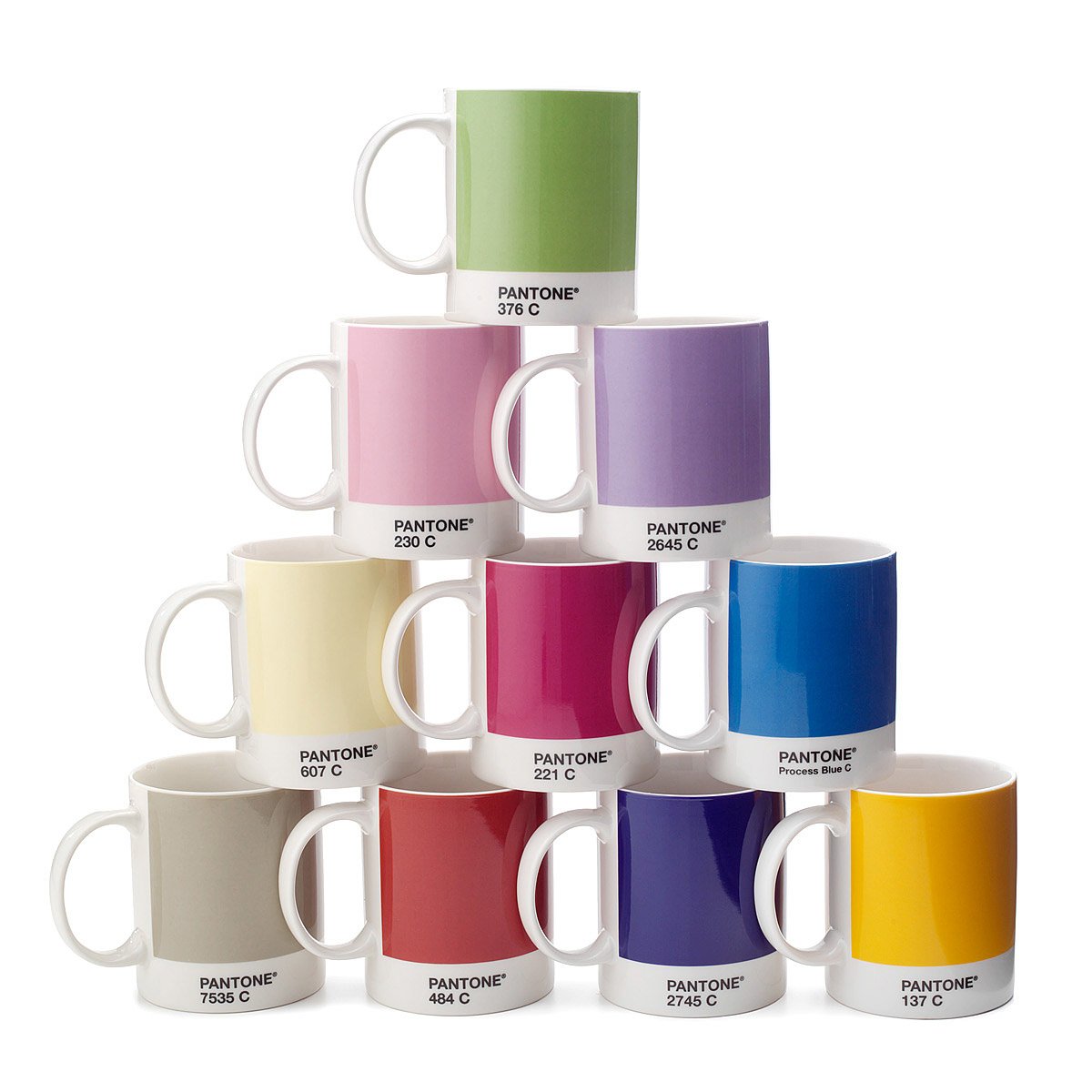
- Coca-Cola: The iconic Coca-Cola red is also a specific Pantone color (Pantone 484 C), contributing significantly to their brand recognition.
- UPS: Their distinctive brown (Pantone 165 C) is a key element of their brand identity, conveying reliability and trustworthiness.
These examples illustrate the power of Pantone colors in building strong brand identities. By choosing and consistently using specific Pantone colors, brands can create a unique and memorable visual presence that sets them apart from the competition. It’s an investment in brand consistency that pays off in increased recognition and customer loyalty.
Frequently Asked Questions about Pantone Colors
We’ve covered a lot of ground, but you probably still have some burning questions about Pantone PMS color. Let’s tackle some of the most frequently asked questions:
Is Pantone PMS Color the same thing?
Yes! This is the core question we started with. PMS stands for Pantone Matching System. So, when you’re talking about PMS colors, you’re talking about Pantone colors. They are one and the same.
How much do Pantone color books cost?
Pantone color books (fan decks) can range in price depending on the specific collection and the number of colors included. They can be a significant investment, often costing several hundred dollars, but they are a valuable resource for any designer or printer working with color-critical projects.
How do I convert Pantone colors to CMYK?
While you can convert Pantone colors to CMYK, it’s important to understand that the conversion isn’t always perfect. Pantone colors are spot colors, mixed from specific pigments, while CMYK colors are created by layering dots of cyan, magenta, yellow, and black. The color gamut of CMYK is smaller than the Pantone color gamut, meaning some Pantone colors cannot be perfectly reproduced in CMYK. Pantone Connect and some design software offer conversion tools, but it’s always best to consult with your printer to ensure the converted colors meet your expectations.
Where can I buy Pantone products?
You can purchase Pantone color books and other products directly from the Pantone website or from authorized resellers. Many art supply stores and online retailers also carry Pantone products.
Why are Pantone colors so important?
Pantone colors are important because they provide a standardized language for color communication. They ensure color consistency across different printing methods, substrates, and locations, which is crucial for branding and design.
How do I ensure accurate color matching with Pantone?
The best way to ensure accurate color matching is to use physical Pantone color books, specify the correct PMS number, and communicate clearly with your printer. Always check your printed proofs against the Pantone color book to verify the color accuracy.
What is the difference between coated and uncoated Pantone swatches?
Coated paper has a smooth, glossy finish, while uncoated paper has a more textured, matte finish. The same Pantone color will appear slightly different on coated and uncoated paper. That’s why Pantone offers separate swatches for coated and uncoated stocks. Always choose the swatch that corresponds to the paper you’ll be using for your project.
How do I stay updated on new Pantone colors?
Pantone periodically releases new colors to its libraries. You can stay updated by visiting the Pantone website, subscribing to their newsletter, or following them on social media. Pantone Connect also provides access to the latest color additions.
