You May Also Like :
Ever had a project where the color just… wasn’t right? Like, the brochure looked slightly off, or the t-shirt print was a shade too blue? Chances are, color consistency was the culprit. In the world of design and printing, achieving precise color reproduction is paramount, and that’s where the magic of Pantone mixing formulas comes into play.
What are Pantone Colors and Why are They Important?
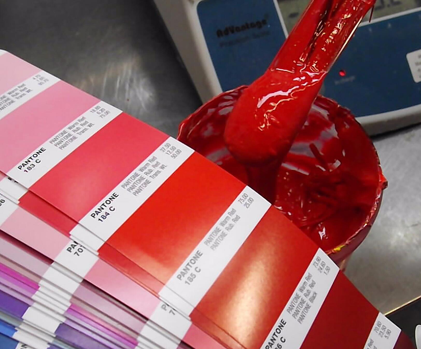
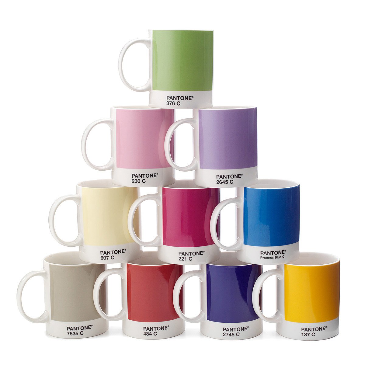
Let’s start with the basics. What exactly is Pantone? Imagine a universal language for color, a way to ensure everyone, from designers to printers, is on the same page (literally!). That’s Pantone. The Pantone Color System is a standardized color matching system, a bit like a color dictionary, that uses numbered codes to identify specific hues. Instead of saying “a kind of reddish-orange,” you can say “Pantone 185 C,” and everyone knows exactly what you mean.
A Brief History of Pantone: Back in the 1960s, a clever chap named Lawrence Herbert recognized the chaos caused by inconsistent color matching in the printing industry. He developed the Pantone system to bring order to this colorful chaos. It was a game-changer.
Why Use Pantone Colors?
- Consistency: This is the big one. Pantone colors ensure that your design looks the same, whether it’s printed on a business card, a billboard, or a coffee mug. No more surprises!
- Standardized Communication: Pantone provides a clear and unambiguous way to communicate color intent. It eliminates the guesswork and subjective interpretations of color names.
- Professionalism: Using Pantone colors signals professionalism and attention to detail. It shows that you take color seriously.
- Brand Recognition: For brands, consistent color is crucial for building recognition and reinforcing their identity. Think of the iconic Coca-Cola red or the instantly recognizable Tiffany blue.
Pantone’s influence spans industries from fashion and graphic design to packaging and manufacturing. They even choose a “Color of the Year” that influences trends across the creative world. Pretty powerful stuff, right?
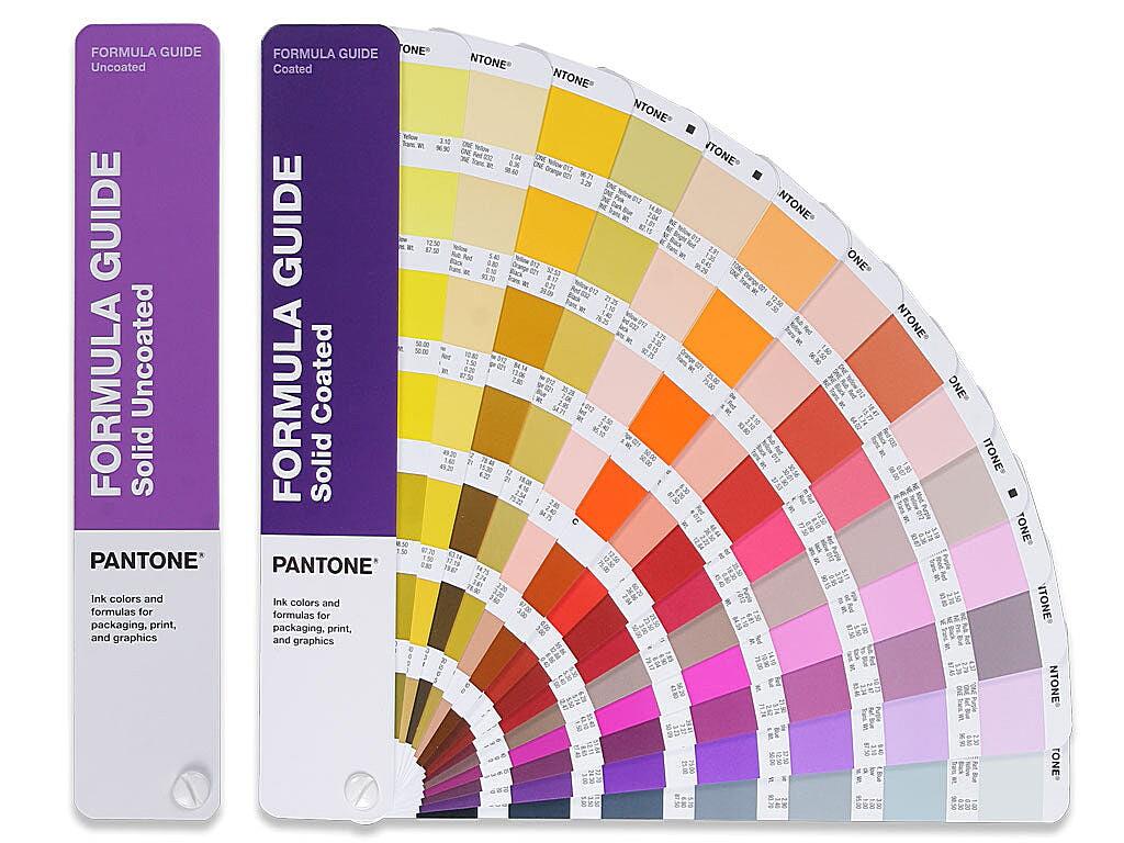
Now that we understand the importance of Pantone colors, let’s dive into the core of our topic: Pantone mixing formulas. These formulas are the secret recipes for creating specific Pantone hues. They’re like a baker’s recipe, outlining the exact proportions of different ingredients (in this case, base inks) needed to achieve the desired color.
What are Pantone Mixing Formulas?
Think of a Pantone mixing formula as a list of ingredients and their measurements. It tells you precisely how much of each base ink to combine to create a particular Pantone color. These formulas are essential for printers and ink manufacturers to ensure accurate color reproduction.
How Do Pantone Mixing Formulas Work?
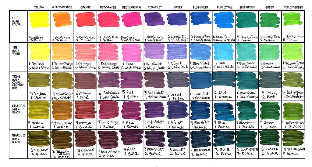
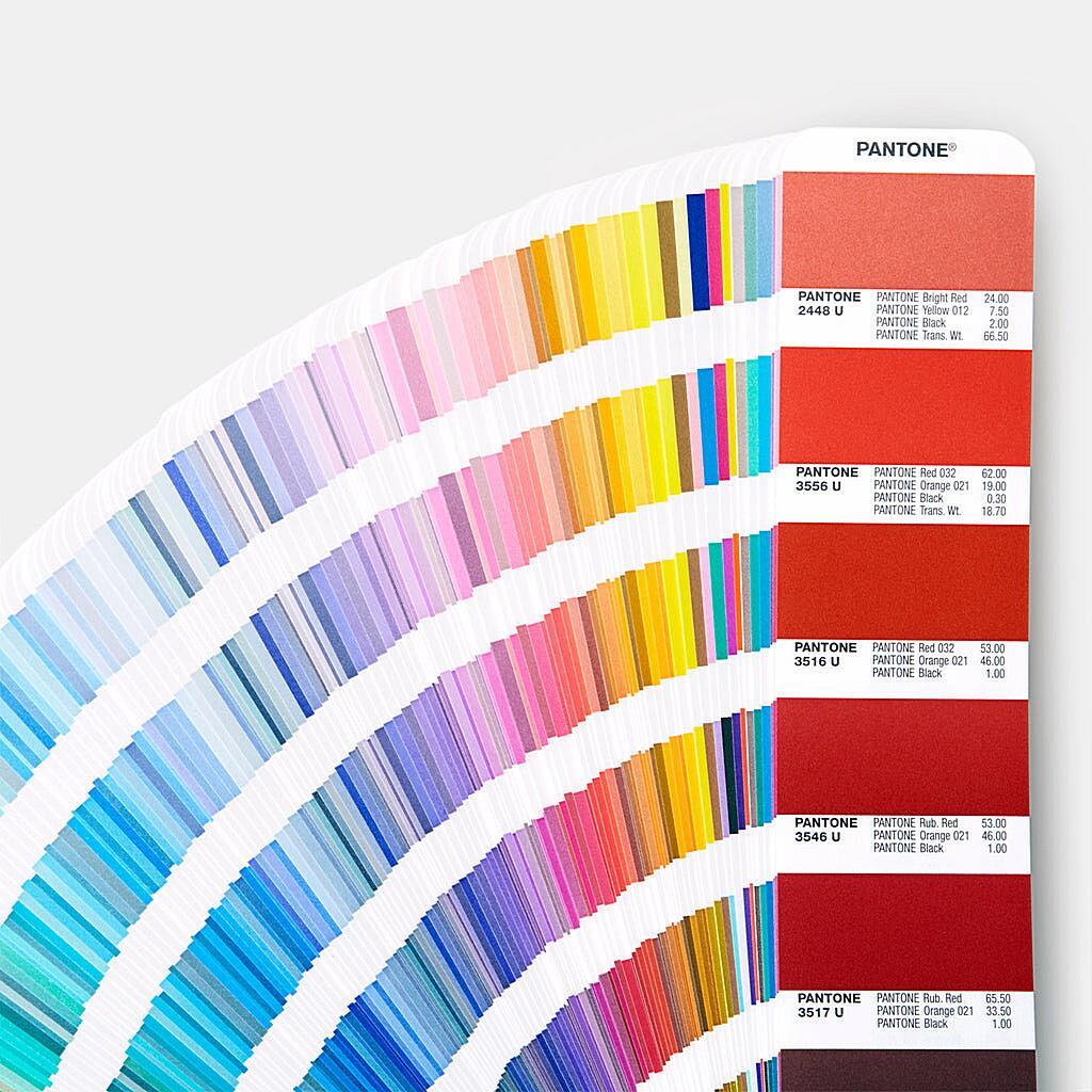
Pantone colors are created by mixing a set of base inks. Each formula specifies the percentage of each base ink required to achieve the target color. For example, a formula might call for 60% cyan, 20% magenta, 10% yellow, and 10% black. By precisely following these instructions, you can recreate the exact Pantone shade.
Where to Find Pantone Mixing Formulas:
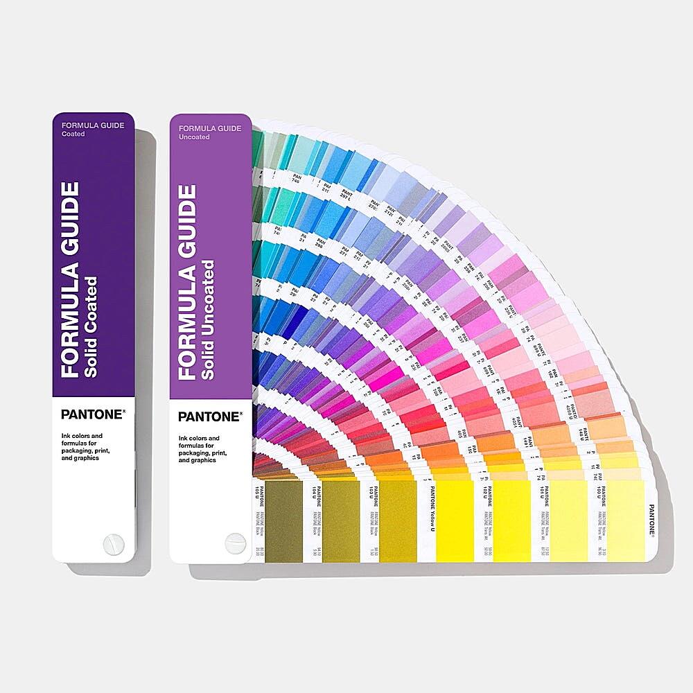
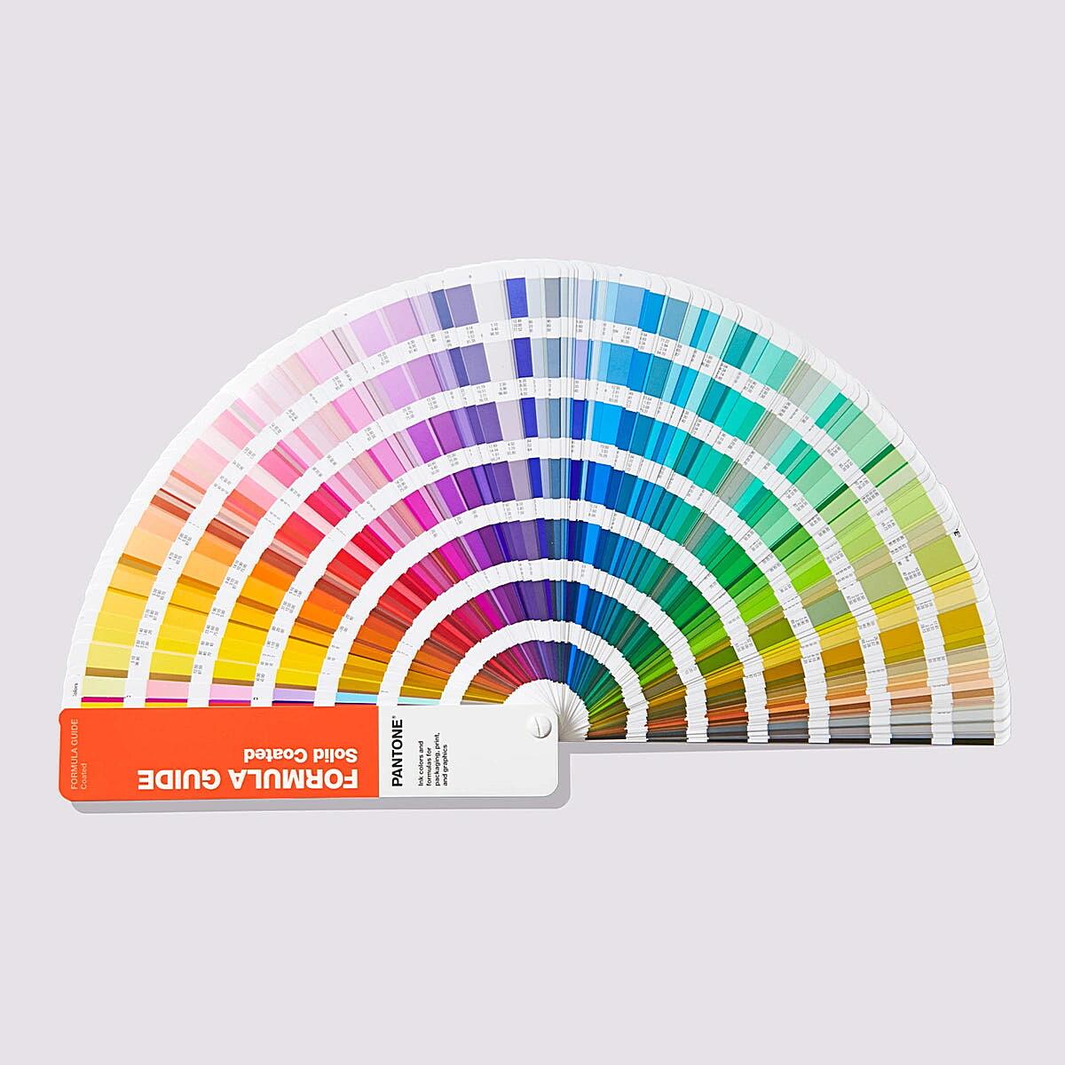
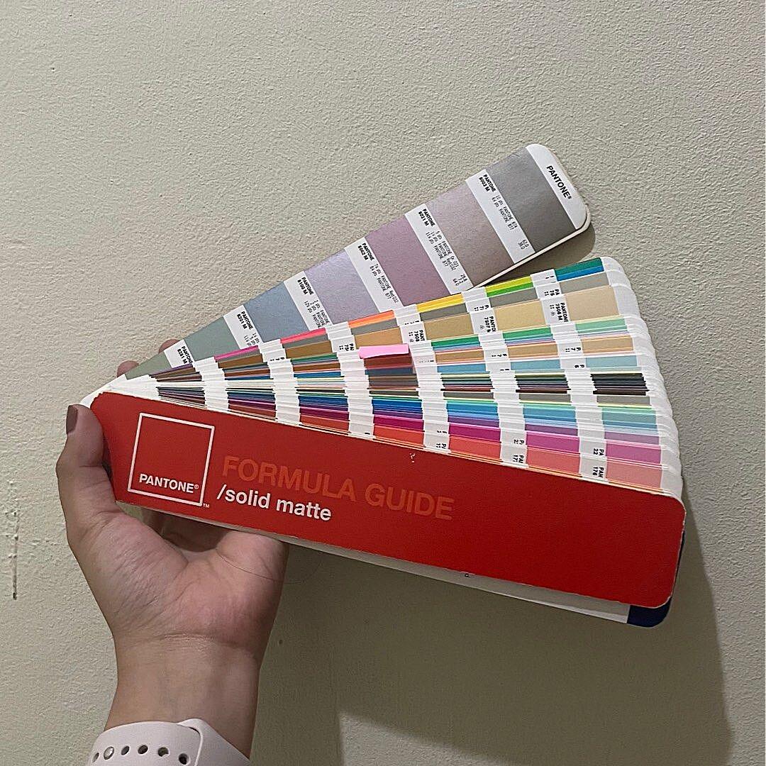
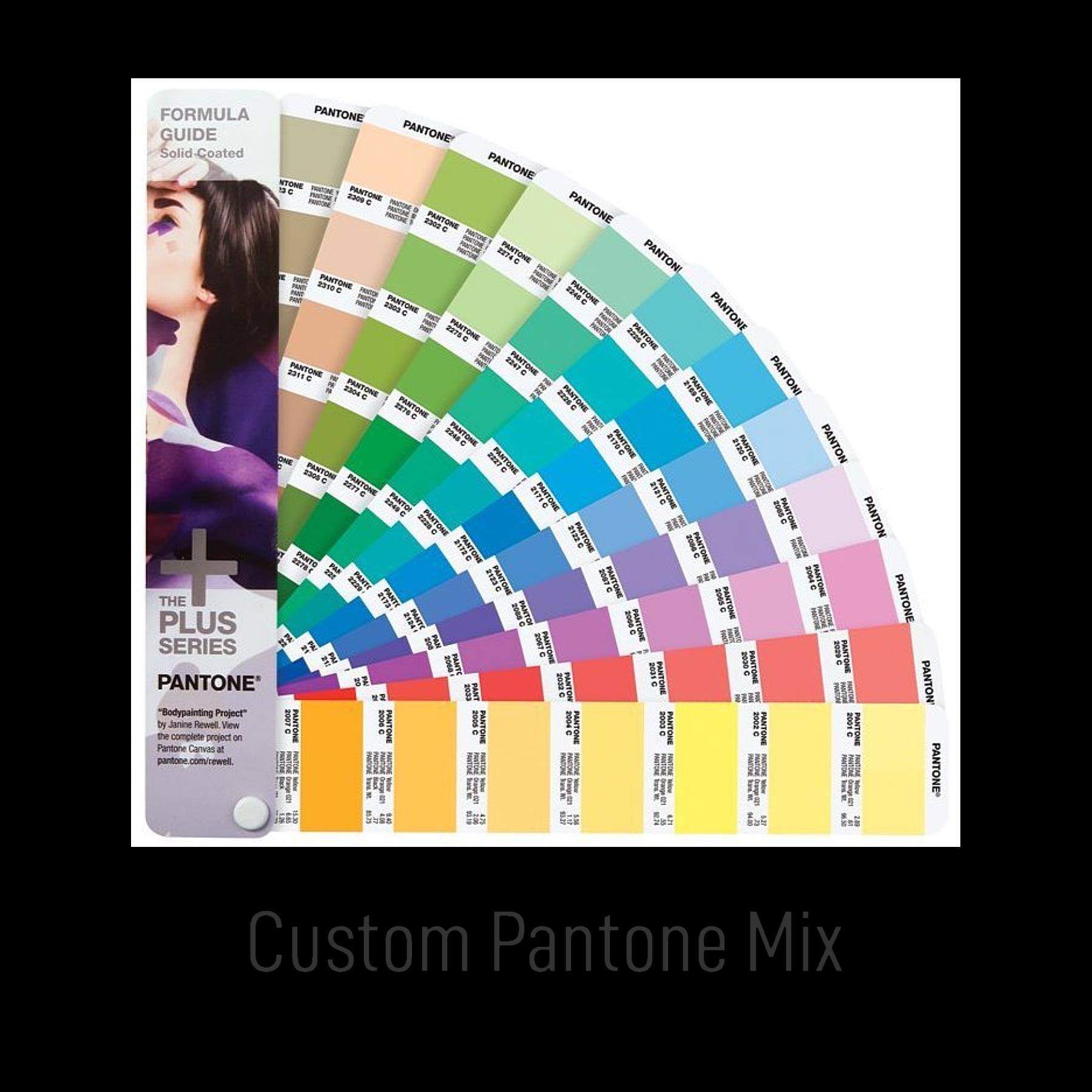
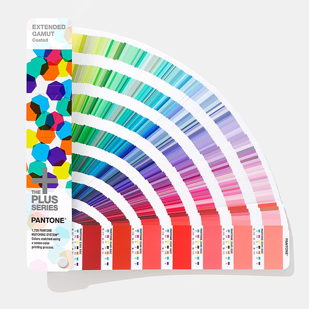
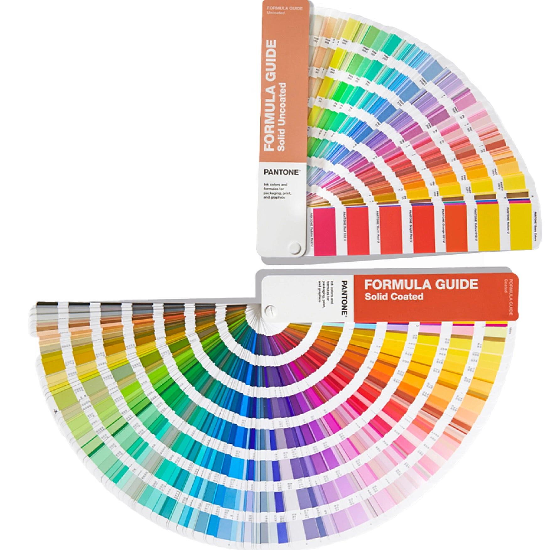
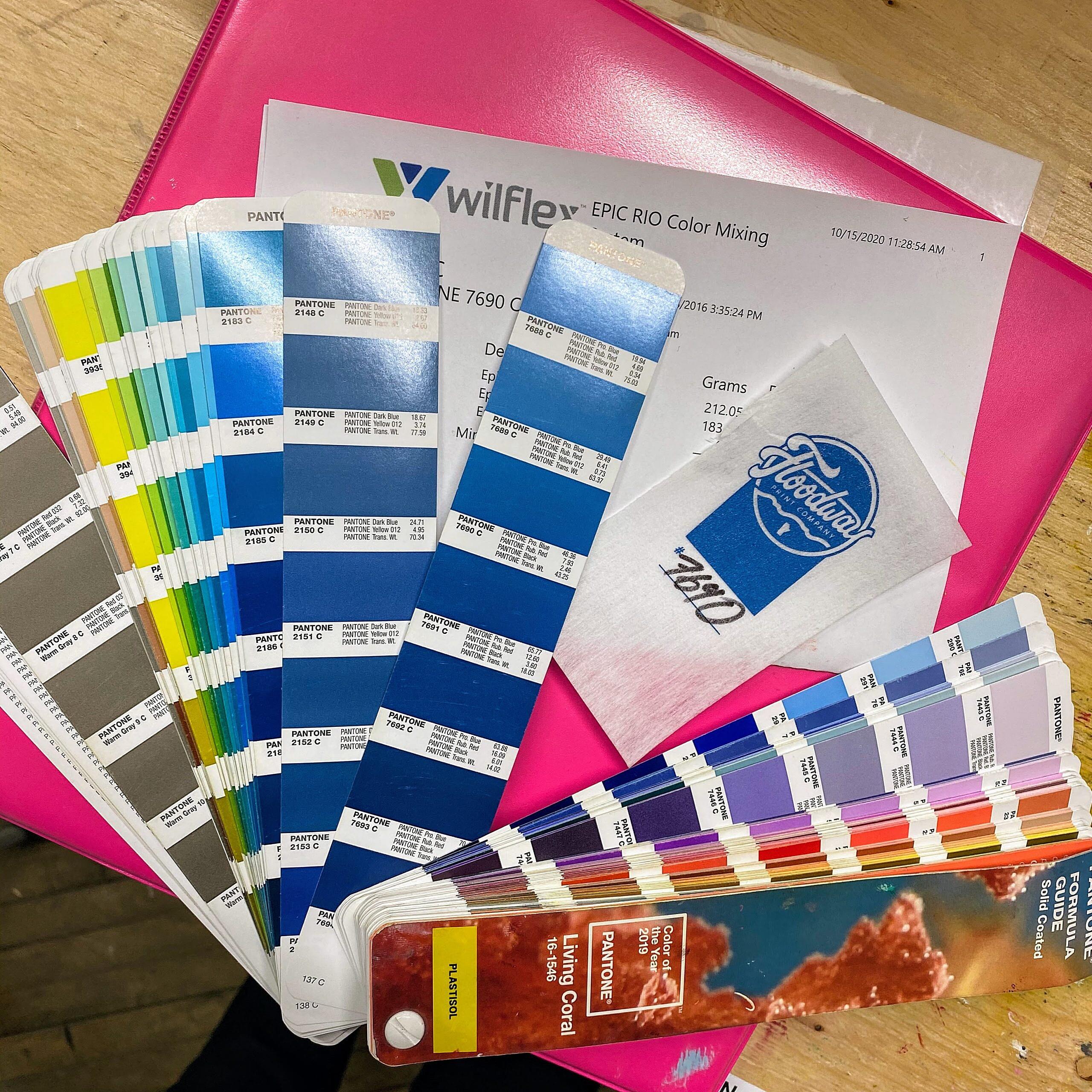
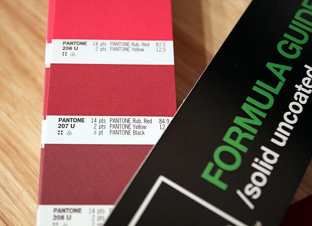
- Pantone Books and Guides: The official Pantone color books and guides are the primary source for mixing formulas. These books contain swatches of Pantone colors along with their corresponding formulas. They are an investment, but invaluable for anyone working with color professionally.
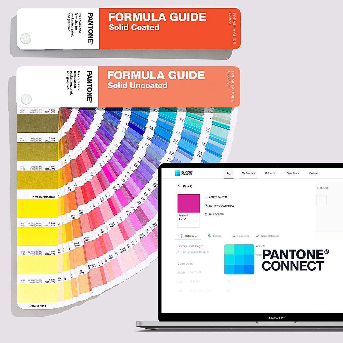
- Pantone Connect (and other Software): Pantone offers digital tools like Pantone Connect, a subscription-based service providing access to their color library, including mixing formulas. Other color management software may also include Pantone formula databases.
- Online Databases (with Caution): Some online resources claim to offer Pantone formulas, but proceed with caution. Always verify these formulas against an official Pantone source to ensure accuracy.
Different Types of Pantone Mixing Formulas:
Pantone offers different formulas for various substrates or printing processes. For instance, you’ll find separate formulas for coated and uncoated paper stocks. Coated stocks tend to produce more vibrant colors, while uncoated stocks have a more matte finish. Using the correct formula for your chosen substrate is crucial for achieving accurate color matching.
The Limitations of Physical Mixing:
While Pantone formulas provide a precise guide, it’s important to remember that physical mixing has limitations. Factors like ink quality, environmental conditions, and even the individual mixing the ink can introduce slight variations. Metamerism, a phenomenon where colors appear different under different lighting conditions, can also pose a challenge. This is why color matching tools, like spectrophotometers, are often used to verify the final mixed color.
Step-by-Step Guide to Mixing Pantone Colors
Alright, let’s get our hands dirty (not literally, unless you’re actually mixing ink!). This section provides a step-by-step guide to mixing Pantone colors, ensuring you achieve the closest match possible.
Materials Needed for Mixing Pantone Colors:
- Accurate Scale: A highly precise scale is essential for measuring ink quantities. We’re talking about small percentages, so accuracy is key. A digital scale that measures in grams or even fractions of grams is recommended.
- Pantone Base Inks: You’ll need the specific Pantone base inks listed in your chosen formula. Make sure you’re using the correct type of ink for your printing process (e.g., offset, flexo).
- Mixing Tools: This includes palette knives, spatulas, or other tools for stirring and combining the inks. Use tools made of non-reactive materials to avoid contaminating the inks.
- Ink Containers: Small, clean containers are needed for holding and mixing the inks.
- Pantone Formula: Have your Pantone formula readily available, either from a book or digital resource. Double-check you are using the correct formula for the substrate (coated/uncoated).
- Substrate Sample: It’s helpful to have a sample of the substrate you’ll be printing on to check the color match under the appropriate lighting conditions.
The Mixing Process:
- Calculate Ink Quantities: Based on the formula and the total amount of ink you want to mix, calculate the exact weight of each base ink required. For example, if the formula calls for 60% cyan and you want to mix 100 grams of ink, you’ll need 60 grams of cyan.
- Measure Inks: Carefully weigh each base ink using your scale and add it to your mixing container. Precision is paramount here. Don’t try to eyeball it!
- Mix Thoroughly: Use your mixing tool to thoroughly combine the inks. Ensure that the mixture is homogenous and that there are no streaks or swirls of individual colors. This step can take some time and effort.
- Verify Color: Once mixed, compare the color to the Pantone swatch in your book or guide. You can also use a color matching tool (spectrophotometer) for a more objective assessment.
- Adjust (If Necessary): If the color isn’t quite right, you may need to make small adjustments by adding tiny amounts of specific base inks. This requires a keen eye and a steady hand. Keep track of any adjustments you make so you can replicate the process in the future.
Tips for Precise Color Matching:
- Cleanliness is Key: Ensure all your tools and containers are clean to avoid contamination.
- Start Small: It’s better to mix a small amount of ink initially and then scale up if needed.
- Record Everything: Keep detailed records of your mixing process, including the ink quantities, adjustments, and any observations. This will be invaluable for future reference.
- Lighting Matters: Check the color match under consistent lighting conditions. Avoid mixing or comparing colors under different light sources, as this can affect your perception of the hue.
Tools and Resources for Pantone Color Mixing
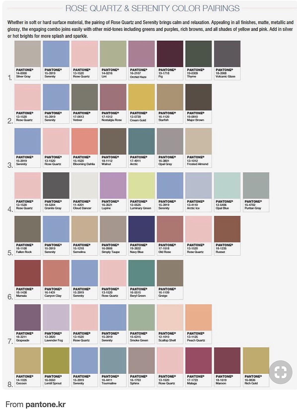
Mixing Pantone colors isn’t just about following a recipe; it’s about having the right tools and resources at your disposal. This section explores the essential tools and resources that will aid you in achieving accurate and consistent color matching.
Pantone Color Books and Guides:
These are the cornerstone of the Pantone system. They provide physical swatches of Pantone colors along with their corresponding mixing formulas. Investing in a good set of Pantone books is a must for any professional working with color. Different books cater to different needs, such as the Formula Guide (for basic color matching) and the Color Bridge (for comparing Pantone colors to CMYK equivalents).
Pantone Connect (and other Color Management Software):
Pantone Connect is a digital platform that provides access to the entire Pantone color library, including mixing formulas, color palettes, and digital color values. It’s a subscription-based service, but it can be a valuable tool for managing Pantone colors in a digital workflow. Other color management software, like those offered by Adobe, may also include Pantone libraries and integration with color mixing tools.
Online Pantone Resources and Databases:
While some online resources offer Pantone information, it’s crucial to exercise caution. Always verify any information found online against an official Pantone source. The official Pantone website is the best place to start for accurate data.
Ink Suppliers and Distributors:
Reliable ink suppliers are essential for obtaining high-quality Pantone base inks. Look for suppliers that specialize in printing inks and have a good reputation for quality and consistency.
Color Matching Tools and Devices:
- Spectrophotometers: These devices measure the color of a sample and provide objective data about its hue, saturation, and lightness. Spectrophotometers are invaluable for verifying the accuracy of mixed Pantone colors and ensuring consistency across print runs. They can also help in adjusting a mix if the color is slightly off.
- Colorimeters: While not as precise as spectrophotometers, colorimeters can still be useful for comparing colors and identifying color differences.
V. Common Mistakes and Troubleshooting
Even with the best tools and intentions, mistakes can happen. This section outlines common errors in Pantone mixing and provides troubleshooting tips to help you get back on track.
Common Errors in Pantone Mixing:
- Incorrect Measurements: The most common mistake is inaccurate measurement of the base inks. Even small errors can lead to significant color discrepancies.
- Wrong Base Inks: Using the wrong base inks will obviously result in an incorrect color. Double-check the formula and ensure you have the correct inks on hand.
- Contamination: Contaminated inks or mixing tools can alter the color. Cleanliness is essential.
- Inadequate Mixing: If the inks are not thoroughly mixed, the color will be uneven and inconsistent.
- Ignoring Substrate: Using the wrong formula for the substrate (coated/uncoated) will affect the final color.
Troubleshooting Color Discrepancies:
- Double-Check Everything: Review your calculations, measurements, and base inks. Make sure you haven’t made any errors.
- Compare to Swatch: Compare the mixed color to the Pantone swatch under consistent lighting.
- Adjust Carefully: If the color is slightly off, make small adjustments by adding tiny amounts of specific base inks. Keep track of your adjustments.
- Use a Spectrophotometer: A spectrophotometer can provide objective data about the color and help you identify the specific adjustments needed.
- Start Over (If Necessary): Sometimes, it’s best to start over from scratch if the color is significantly off.
Dealing with Metamerism:
Metamerism can be tricky. If you suspect metamerism is an issue, try viewing the color under different light sources. If the color changes significantly, you may need to adjust the mix or choose a different Pantone color.
VI. Pantone Mixing Formulas for Different Printing Processes
Pantone mixing formulas are not one-size-fits-all. Different printing processes require specific ink formulations and mixing techniques.
Offset Lithography:
Offset lithography is a widely used printing process that produces high-quality images. Pantone mixing formulas for offset lithography are designed to work with the specific inks and substrates used in this process.
Flexography:
Flexography is a printing process that uses flexible printing plates. Pantone mixing formulas for flexography are formulated to work with the inks and substrates commonly used in flexographic printing, often for packaging and labels.
Digital Printing:
Digital printing processes, like inkjet and toner-based printing, often use CMYK color rather than mixed Pantone inks. However, some high-end digital presses may use spot colors and therefore require specific Pantone mixing formulas.
Other Printing Methods:
Other printing methods, such as screen printing and gravure printing, may also have specific requirements for Pantone color mixing. Consult with your printing professional for guidance on the appropriate formulas and techniques for your chosen printing process.
Pantone Alternatives and Digital Color Matching
While Pantone is the gold standard for color consistency, it’s not always the only option. This section explores alternative color systems and the role of digital color matching tools.
Exploring Alternative Color Systems:
- CMYK: CMYK (Cyan, Magenta, Yellow, and Key/Black) is the standard color model used in most commercial printing. While CMYK can reproduce a wide range of colors, it doesn’t offer the same level of precision and consistency as Pantone. Converting Pantone colors to CMYK can sometimes result in slight color variations.
- RGB: RGB (Red, Green, and Blue) is the color model used for digital displays. RGB colors are brighter and more vibrant than CMYK colors, but they are not suitable for print.
- Other Color Systems: Other color systems, like HSL (Hue, Saturation, Lightness), are used in specific applications, but they are not as widely used as Pantone, CMYK, or RGB.
The Role of Digital Color Matching Tools and Software:
Digital color matching tools and software play an increasingly important role in color management. These tools can help you convert Pantone colors to other color spaces, create color palettes, and ensure color consistency across different media. Pantone Connect, Adobe Creative Suite, and other color management software offer features for working with Pantone colors in a digital environment.
Converting Pantone Colors to Other Color Spaces:
Converting Pantone colors to CMYK or RGB can be necessary for certain applications. However, it’s important to understand that the conversion process can introduce some color variations. Use color management software or online conversion tools with caution, and always verify the results against a physical Pantone swatch if possible.
Limitations of Digital Color Matching:
While digital color matching tools are powerful, they are not a perfect substitute for physical Pantone swatches and mixing formulas. Digital displays can vary in color accuracy, and the conversion process can introduce some level of approximation.
VIII. Maintaining Color Consistency
Achieving accurate color is only half the battle; maintaining color consistency is equally important. This section provides tips for preserving the integrity of your Pantone colors over time.
Importance of Proper Ink Storage:
Proper ink storage is crucial for maintaining color quality. Store inks in a cool, dry place away from direct sunlight and extreme temperatures. Exposure to heat or sunlight can cause the inks to fade or change color.
Regular Calibration of Printing Equipment:
Regular calibration of printing equipment is essential for ensuring consistent color reproduction. Printers should be calibrated according to the manufacturer’s instructions to maintain optimal performance.
Color Quality Control Measures:
Implement color quality control measures throughout your workflow to minimize color variations. This includes checking color proofs, using color matching tools, and regularly inspecting printed materials.
IX. Conclusion: Mastering Pantone Mixing Formulas
We’ve covered a lot of ground in this comprehensive guide to Pantone mixing formulas. From understanding the basics of the Pantone system to troubleshooting common mixing errors, you now have the knowledge and tools to confidently work with Pantone colors.
Remember, accurate Pantone mixing is essential for achieving professional results. By following the tips and techniques outlined in this article, you can ensure that your designs look exactly as intended, every time. So go forth, experiment with color, and create something beautiful!
Frequently Asked Questions about Pantone Mixing Formulas (FAQs)
We’ve reached the final leg of our color journey! This FAQ section addresses some common questions about Pantone mixing formulas, providing quick and concise answers to help solidify your understanding.
Q: How much does it cost to mix Pantone colors?
A: The cost of mixing Pantone colors depends on several factors, including the cost of the base inks, the quantity of ink you need to mix, and whether you’re doing it yourself or hiring a professional ink mixing service. Pantone base inks can be an investment, but they are essential for achieving accurate color matching.
Q: Can I mix Pantone colors myself?
A: Yes, you can mix Pantone colors yourself, provided you have the necessary tools, materials, and knowledge. This guide has provided you with the step-by-step instructions and tips you need to mix Pantone colors accurately.
Q: Where can I buy Pantone inks?
A: You can purchase Pantone base inks from reputable ink suppliers and distributors. Many online retailers also sell Pantone inks. Make sure you choose a supplier that specializes in printing inks and has a good reputation for quality.
Q: What is the difference between coated and uncoated Pantone colors?
A: Coated and uncoated Pantone colors are designed for use on different types of paper stocks. Coated stocks have a smooth, glossy finish, which makes colors appear more vibrant. Uncoated stocks have a more textured, matte finish. Pantone provides separate mixing formulas for coated and uncoated stocks to ensure accurate color reproduction on each type of substrate.
Q: How do I convert a Pantone color to CMYK?
A: You can convert Pantone colors to CMYK using color management software or online conversion tools. However, it’s important to be aware that the conversion process can introduce some color variations. Always verify the results against a physical Pantone swatch if possible. Pantone Connect and other Adobe products have conversion capabilities.
Q: What is the lifespan of mixed Pantone ink?
A: The lifespan of mixed Pantone ink depends on several factors, including the type of ink, storage conditions, and exposure to air and light. Properly stored inks can last for several months, but it’s always best to use freshly mixed ink for critical color matching.
Q: Can I use a regular scale to mix Pantone colors?
A: While you could technically use a regular scale, it’s highly discouraged. Mixing Pantone colors requires precise measurements, often down to fractions of a gram. A regular kitchen scale might not be accurate enough for this level of precision. Invest in a high-quality digital scale that measures in small increments for best results.
Q: What if I can’t find the exact base ink listed in the Pantone formula?
A: If you can’t find the exact base ink, contact a Pantone representative or a reputable ink supplier. They may be able to offer a suitable alternative or provide guidance on how to adjust the formula. Do not attempt to substitute inks without expert advice, as this can lead to unpredictable color results.
Q: My mixed Pantone color looks different under different lights. Why?
A: This is likely due to metamerism, a phenomenon where colors appear different under different lighting conditions. While you can’t completely eliminate metamerism, you can minimize its impact by checking the color match under consistent lighting conditions and using a spectrophotometer to measure the color objectively.
Q: How do I dispose of leftover Pantone ink?
A: Pantone inks are considered hazardous waste and should be disposed of responsibly. Contact your local waste management facility or a hazardous waste disposal company for guidance on proper disposal procedures. Do not pour ink down the drain or throw it in the regular trash.

