How Do I Reset My Screen Calibration
Related Posts
Ever poured your heart into a design, only to have the printed version look like it belongs in a different color family altogether? It’s a designer’s nightmare, and more often than not, the culprit is inaccurate screen calibration. We’ve all been there, staring at a screen that seems to be living in its own little color universe. That’s where Pantone screen calibration comes in, acting as the bridge between your digital vision and the real-world output.
Pantone Screen Calibration: Ensuring Accurate Color Representation
Imagine this: you’ve meticulously crafted a logo, chosen the perfect Pantone shade, and sent it off to print. You eagerly await the final product, only to discover the logo looks like it’s been through a color-fading washing machine. The vibrant blue you envisioned is now a sad, washed-out periwinkle. Frustrating, right? And potentially costly. This scenario highlights the critical importance of accurate Pantone screen calibration. Pantone, the universally recognized language of color, relies on precise representation. Without proper screen calibration, your digital Pantone swatches are essentially just guesses, leading to inconsistencies and potentially disastrous results.
The Foundation of Pantone Screen Calibration
Before we jump into calibration, let’s talk color. What is it, really? At its core, color is light. Our eyes perceive different wavelengths of light as different colors. But it’s more complex than that. Our brains interpret these wavelengths, and that interpretation is subjective, influenced by everything from our biology to our surroundings. This subjectivity is precisely why we need standardized color systems like Pantone.
Pantone, established in 1963, is the gold standard for color communication in the design and printing industries. The Pantone Matching System (PMS) is a vast library of standardized colors, each with a unique number and name. Think of it as a universal language for color, ensuring that a specific shade of red, say Pantone 185 C, looks the same whether it’s printed on a business card in New York or a brochure in London. This consistency is paramount for branding, ensuring that a company’s logo looks the same across all its marketing materials.
But here’s the rub: digital displays and printed materials use different color models. Screens use the additive RGB (Red, Green, Blue) model, where colors are created by mixing light. Print, on the other hand, uses the subtractive CMYK (Cyan, Magenta, Yellow, Key/Black) model, where colors are created by mixing inks. This fundamental difference makes it challenging to perfectly replicate Pantone colors on screen. While your monitor might display a reasonable approximation of Pantone 185 C, the actual printed version could vary significantly if your screen isn’t properly calibrated. This is because your screen is trying to represent a CMYK color (which is what will be printed) using RGB light, and the conversion isn’t always perfect. This is where Pantone screen calibration becomes absolutely essential. It’s the process of aligning your screen’s RGB output as closely as possible to the intended CMYK representation of a Pantone color, minimizing the discrepancy between what you see on screen and what you get in print.
The Importance of Pantone Screen Calibration
Think of screen calibration as fine-tuning your monitor’s color perception. Just like a musician tunes their instrument, you need to calibrate your screen to ensure it’s playing the right color notes. In general, screen calibration ensures that the colors you see on your screen are as accurate as possible, regardless of the specific color system. This is crucial for any visual work, from photo editing to web design. But when it comes to Pantone colors, calibration takes on a whole new level of importance.
Pantone screen calibration is the bridge between your digital design and the physical world of printed Pantone swatches. It’s the key to ensuring that your digital Pantone 185 C actually looks like the real Pantone 185 C when it’s printed. Without it, you’re essentially playing color roulette, hoping that what you see on your screen magically matches the final printed product. The benefits of accurate Pantone screen calibration are numerous:
- Precise Color Matching: Calibration allows you to confidently match your digital designs to physical Pantone swatches, eliminating the guesswork and minimizing the risk of color surprises.
- Seamless Color Communication: When your screen is calibrated, you can communicate color accurately with clients and printers, ensuring everyone is on the same page (literally!). This reduces misunderstandings and costly reprints.
- Reduced Reprints: Color mismatches are one of the most common reasons for reprints, which can be a significant expense. Pantone screen calibration minimizes this risk, saving you time and money.
- Brand Consistency: For businesses, brand consistency is paramount. Accurate Pantone screen calibration ensures that brand colors are consistently represented across all media, from websites to packaging.
The consequences of neglecting Pantone screen calibration can be significant. Imagine presenting a logo design to a client, only for the printed version to be a completely different shade. This not only looks unprofessional but can also damage your credibility. Color drift, where your monitor’s color output gradually changes over time, can also lead to inaccurate proofs and unhappy clients. In short, Pantone screen calibration isn’t just a good idea; it’s a necessity for any professional working with color. It’s an investment in accuracy, efficiency, and client satisfaction.
Methods of Pantone Screen Calibration
Now that we’ve established why Pantone screen calibration is crucial, let’s explore how to actually do it. There are a few different methods, each with its own level of accuracy and complexity.
A. Software Calibration:
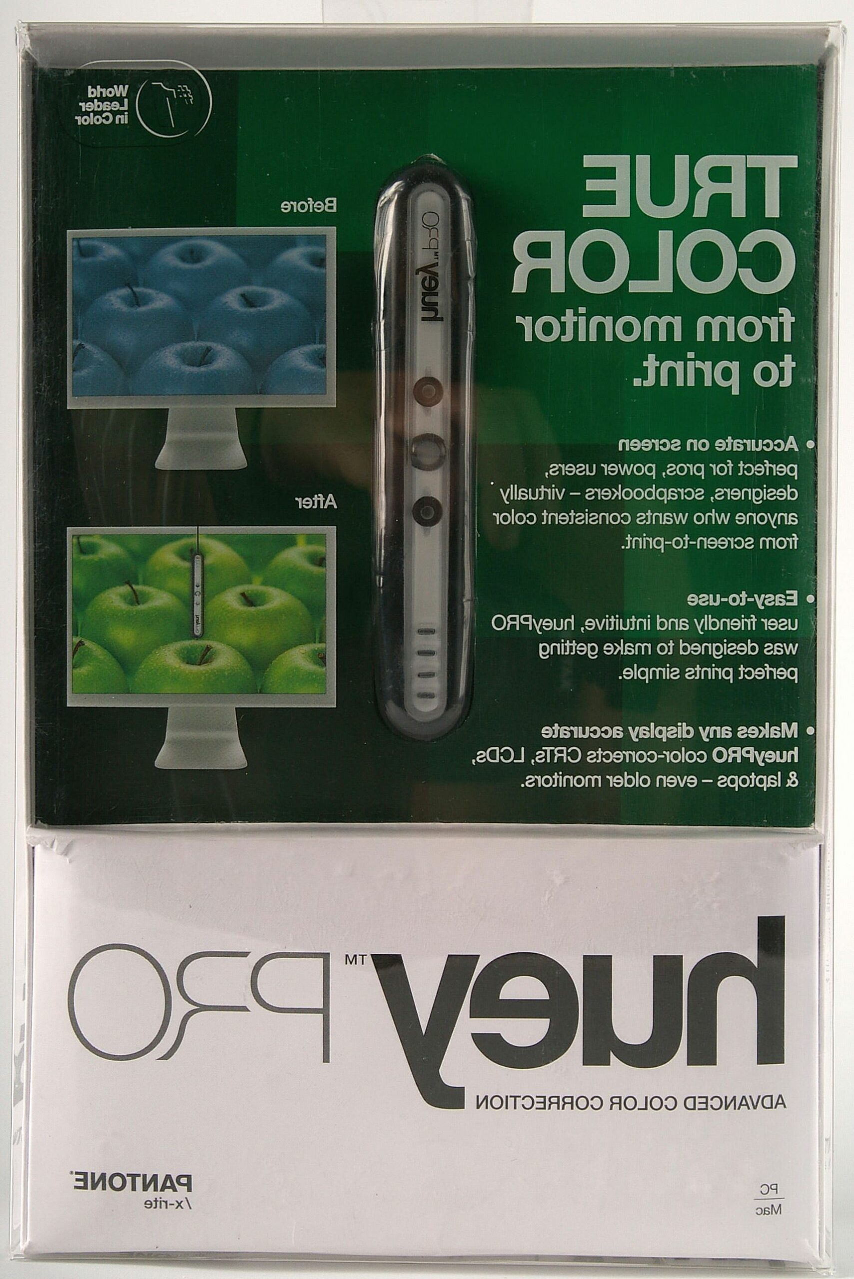
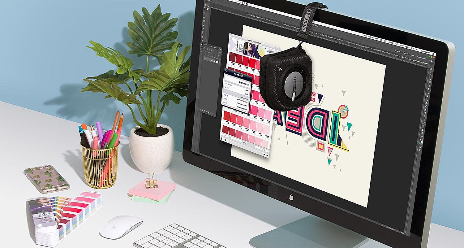
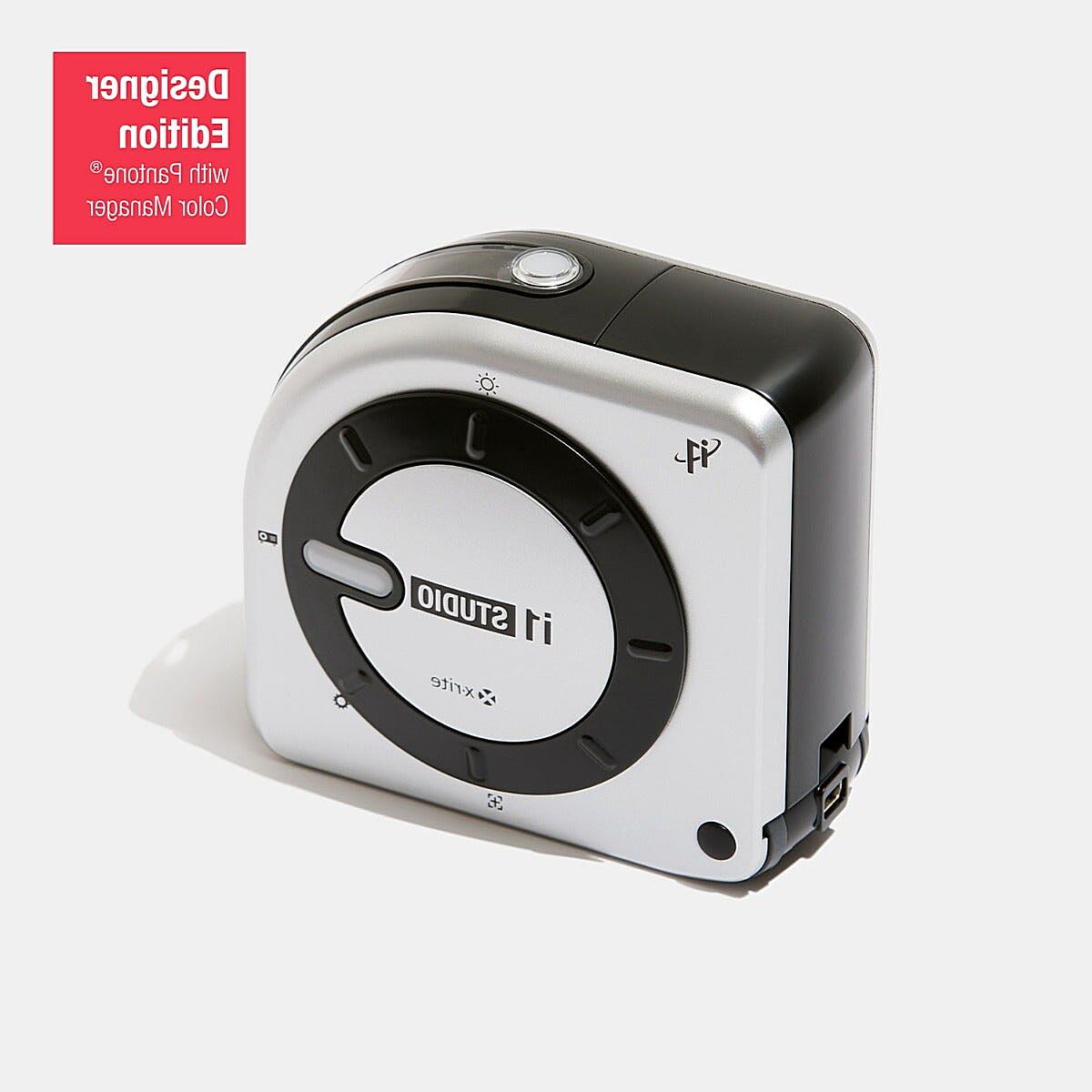
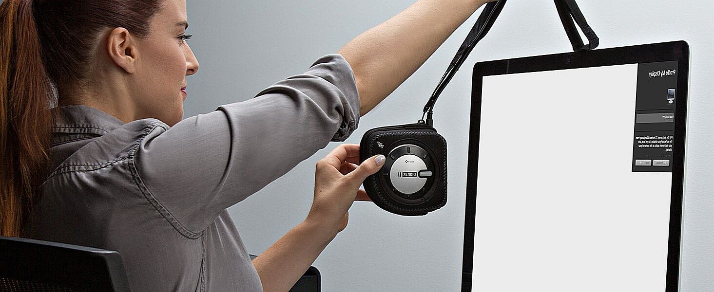
This method involves using software to adjust your monitor’s color output. It’s a good starting point and generally more affordable than hardware calibration. Popular software options include X-Rite i1Profiler and Datacolor Spyder. These programs guide you through the calibration process, often using a small device (a colorimeter) that attaches to your screen to measure color output.
Here’s a simplified breakdown of the software calibration process:
- Install the Software: Install the calibration software on your computer.
- Connect the Device (if applicable): If your software uses a colorimeter, connect it to your computer and attach it to your screen as instructed.
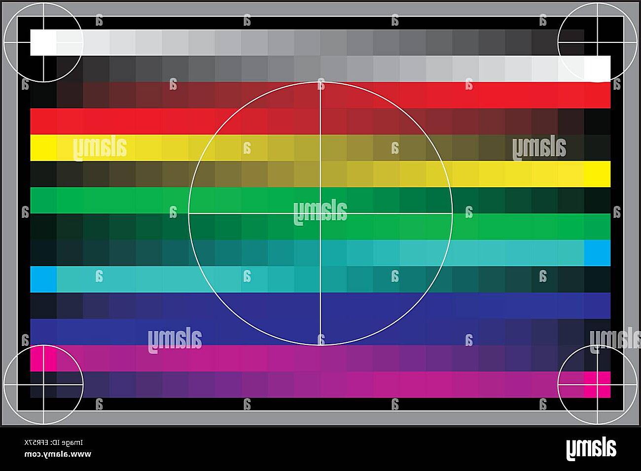
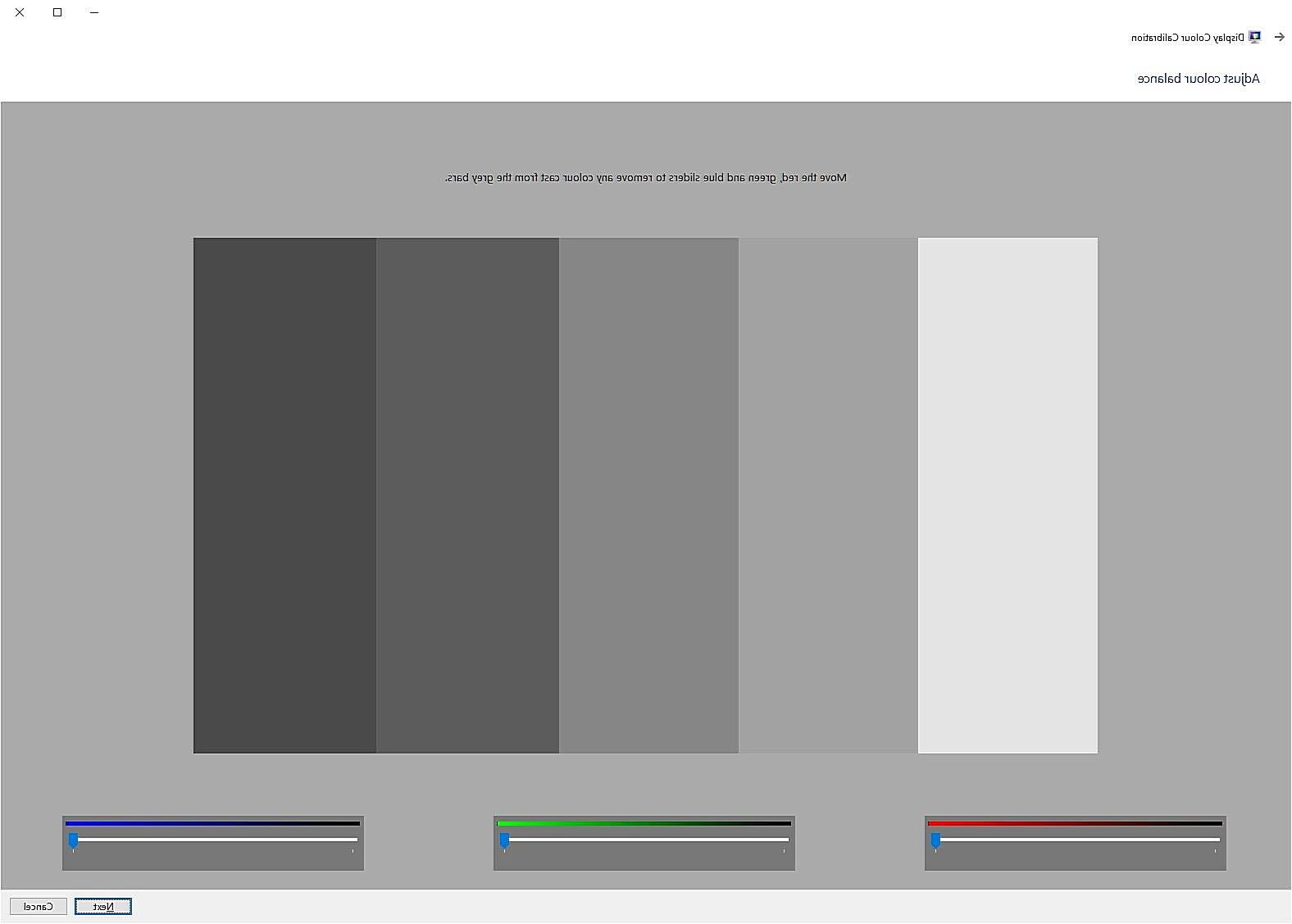
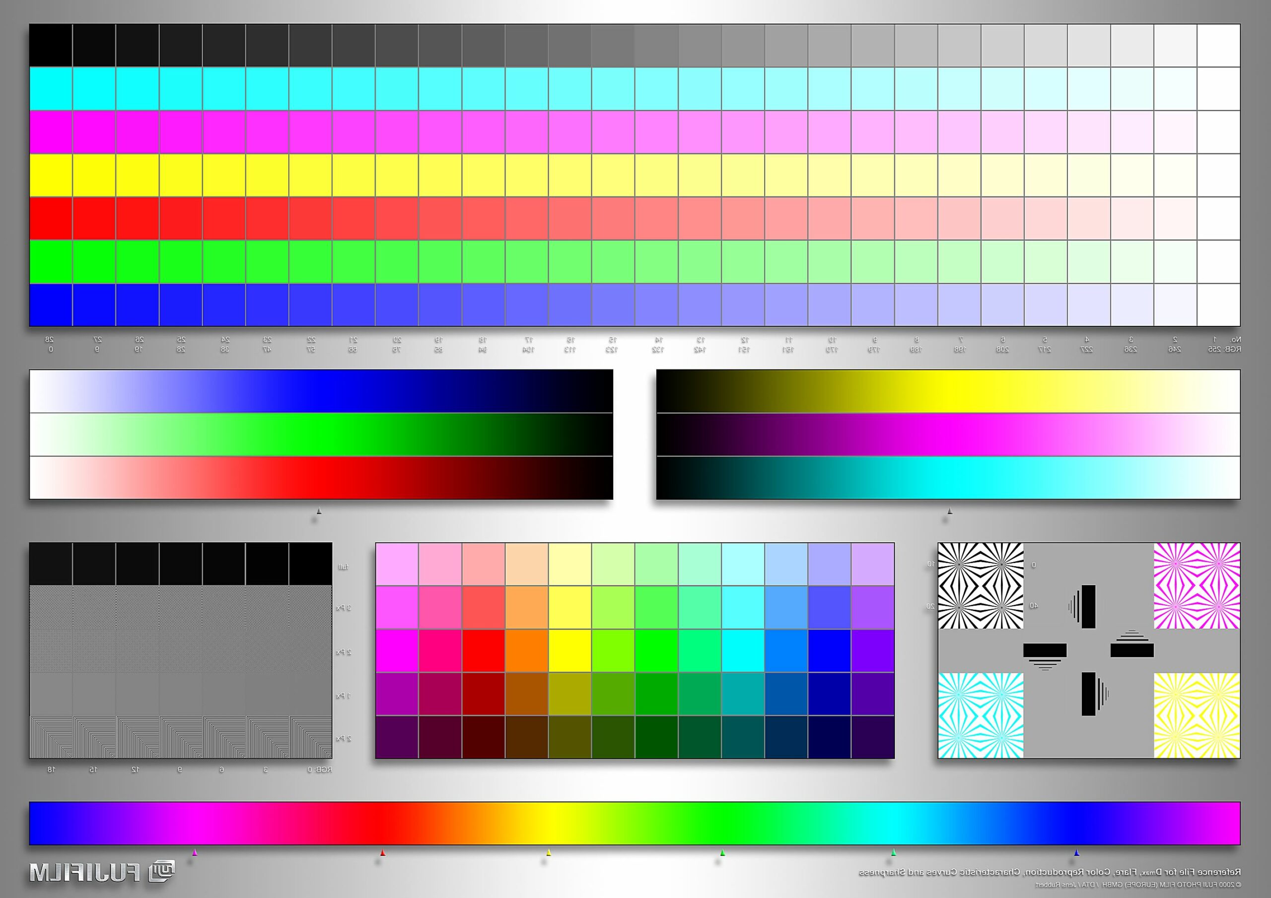
- Follow the On-Screen Instructions: The software will guide you through a series of steps, displaying color patches on your screen and asking you to make adjustments.
- Create a Profile: The software will then create a color profile for your monitor, which you can save and use to ensure accurate color representation.
Software calibration is a decent option, but it has limitations. It relies on your monitor’s internal settings, which can sometimes be inaccurate.
B. Hardware Calibration:
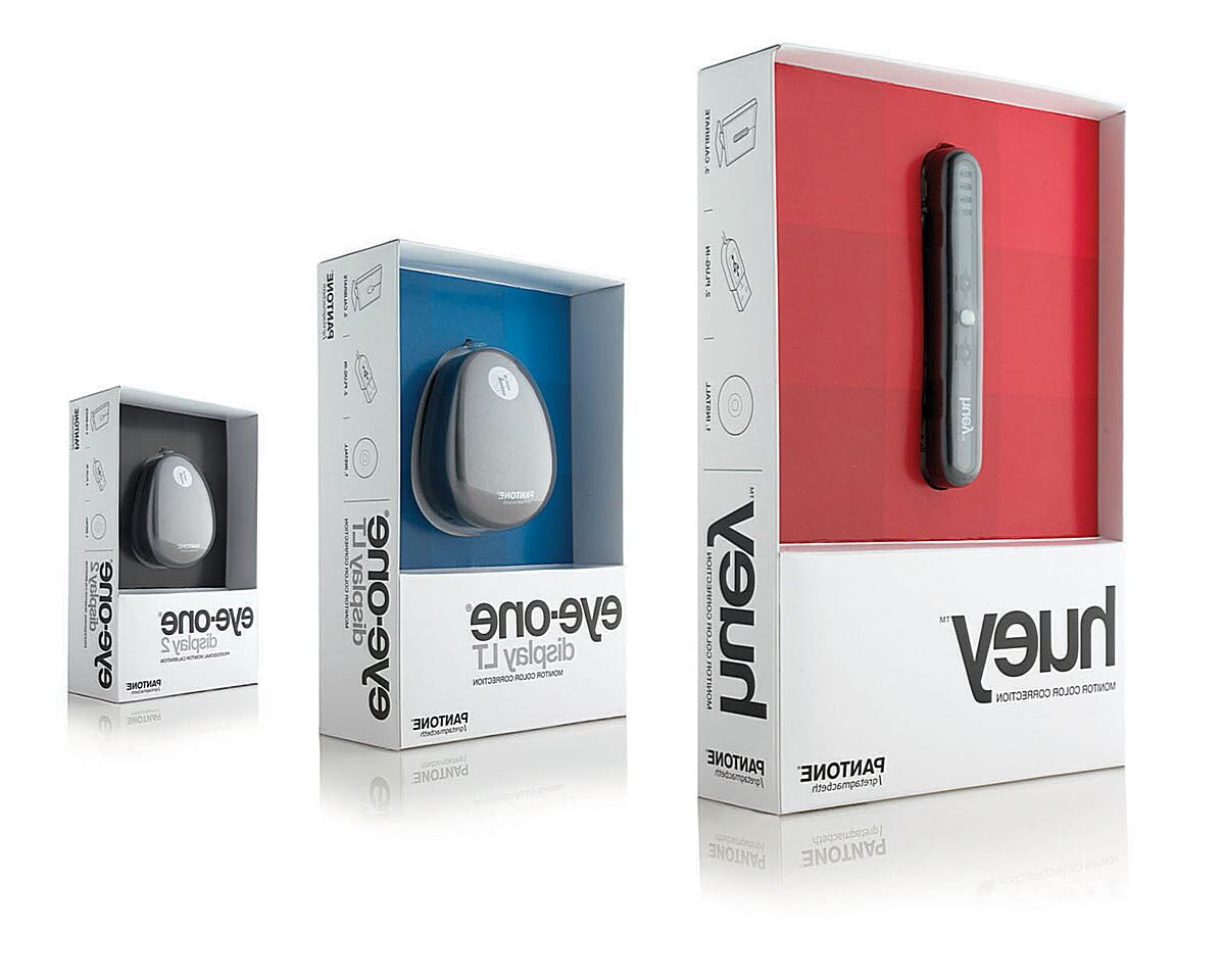
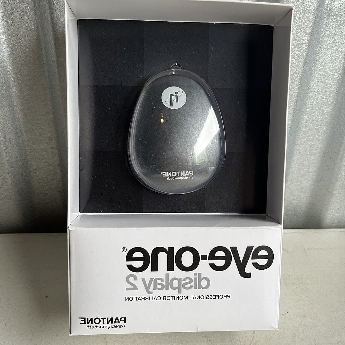
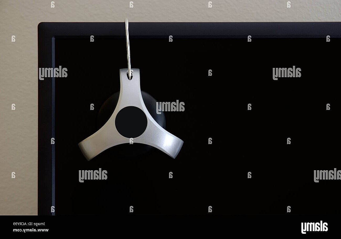
This is the most accurate method of Pantone screen calibration. It involves using a dedicated device, called a colorimeter or spectrophotometer, to measure your screen’s color output. These devices are more precise than the sensors used in software calibration, providing more accurate readings and resulting in better color matching.
Here’s how hardware calibration generally works:
- Connect the Device: Connect your colorimeter or spectrophotometer to your computer.
- Install the Software: Install the software that comes with your hardware calibration device.
- Follow the Instructions: The software will guide you through the calibration process, which usually involves placing the device on your screen to measure color patches.
- Create a Profile: The software will then generate a custom color profile for your monitor.
Hardware calibration offers the highest level of accuracy and is highly recommended for professionals who rely on precise Pantone color matching. While the initial investment is higher, the long-term benefits of reduced reprints and improved color consistency make it a worthwhile investment.
C. Visual Calibration (Least Recommended):
This method relies on your eye to judge color accuracy. It involves comparing colors on your screen to printed swatches or using online tools. While it’s better than nothing, visual calibration is highly subjective and prone to inaccuracies. It should only be used as a last resort if you don’t have access to software or hardware calibration tools. For professional Pantone screen calibration, software or, preferably, hardware calibration is essential.
Pantone Connect and Digital Pantone Libraries
In today’s digital world, Pantone has evolved beyond just physical swatch books. Pantone Connect is a digital platform that provides access to a vast library of Pantone colors, along with tools to help you manage and integrate those colors into your workflow. Think of it as your digital Pantone bible, accessible anytime, anywhere.
Pantone Connect offers several key benefits for Pantone screen calibration:
- Digital Pantone Swatches: Access the most up-to-date Pantone libraries digitally, ensuring you’re always working with the latest colors. No more faded or outdated swatch books!
- Integration with Design Software: Pantone Connect seamlessly integrates with popular design software like Adobe Creative Suite (Photoshop, Illustrator, InDesign). This allows you to easily select and apply Pantone colors to your designs directly within your favorite applications.
- Color Management Tools: Pantone Connect provides tools for creating color palettes, managing color libraries, and even comparing different Pantone colors. This simplifies the process of working with Pantone colors and ensures consistency across your projects.
- Enhanced Calibration: By using digital Pantone swatches in conjunction with your calibrated screen, you can further refine your color workflow. You can compare on-screen colors to digital Pantone swatches to verify accuracy and make any necessary adjustments.
Using Pantone Connect in conjunction with a calibrated screen provides the most accurate and efficient way to work with Pantone colors in a digital environment. It ensures that your digital designs are true to the intended Pantone hues, minimizing the risk of color surprises when your designs go to print. It’s a powerful combination that streamlines your workflow and enhances your color management capabilities. Essentially, Pantone Connect bridges the gap between the physical Pantone world and your digital design space, making Pantone screen calibration even more effective.
Maintaining Your Calibration
Just like a car needs regular maintenance, your screen calibration needs periodic attention to ensure it’s performing optimally. Calibration isn’t a one-and-done process; your monitor’s color output can drift over time due to various factors, such as age, usage, and environmental conditions. Therefore, establishing a regular maintenance schedule is crucial for maintaining accurate Pantone screen calibration.
So, how often should you calibrate your screen? A good rule of thumb is to calibrate your monitor at least monthly, or even more frequently if you’re working on color-critical projects. If you notice any color shifts or inconsistencies, it’s a clear sign that your screen needs recalibration.
Beyond regular calibration, several other factors can influence color perception and affect the accuracy of your Pantone screen calibration:
- Ambient Lighting: The lighting in your workspace can significantly impact how you perceive colors on your screen. Avoid working in brightly lit or dimly lit environments. Ideally, your workspace should have consistent, neutral lighting. Consider using a light booth or color viewing booth for critical color assessments.
- Monitor Warm-Up Time: Monitors need time to warm up before their color output stabilizes. Allow your monitor to warm up for at least 30 minutes before calibrating it. This ensures that the calibration is performed under stable operating conditions.
- Cleaning Your Monitor: A dirty screen can distort colors and affect your perception. Regularly clean your monitor with a soft, lint-free cloth to remove dust, fingerprints, and other debris. Avoid using harsh chemicals or abrasive cleaners, as these can damage the screen.
- Verifying Calibration Accuracy: Even with regular calibration, it’s a good idea to periodically verify the accuracy of your calibration. You can do this by visually comparing on-screen colors to physical Pantone swatches or by using the verification tools provided by your calibration software.
By following these maintenance tips, you can ensure that your Pantone screen calibration remains accurate and consistent, allowing you to work with confidence and produce high-quality color-critical work. Think of it as an ongoing partnership between you and your monitor, where regular maintenance ensures a harmonious and color-accurate relationship.
