You May Also Like :
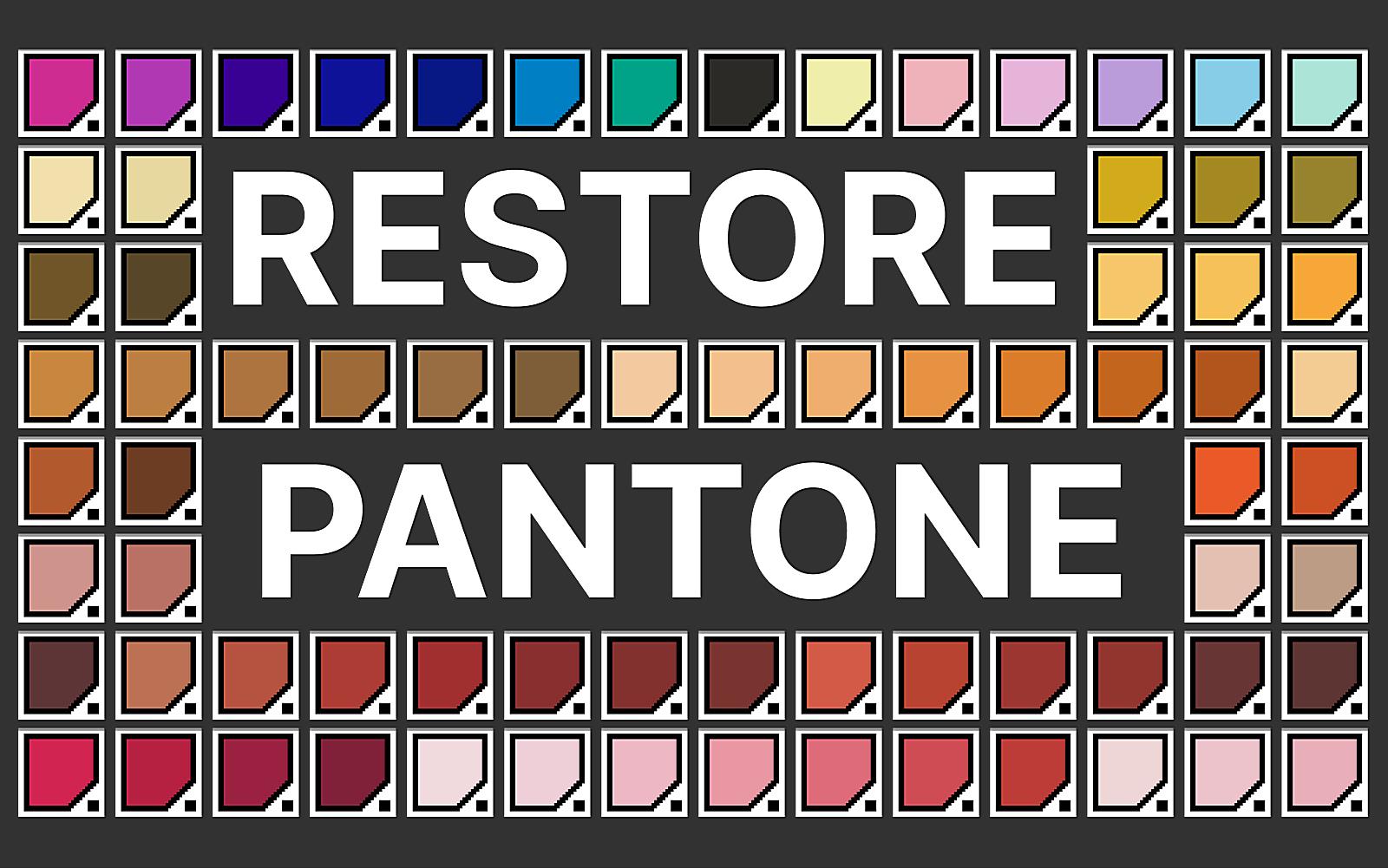
The Art of Color Fidelity: Printing Pantone Charts from Illustrator
Understanding the Importance of Color Accuracy
For those working in design and printing, accurate color is essential. The Pantone Color Matching System (PMS) is a standard, ensuring colors look the same across different materials. Adobe Illustrator, a powerful tool, helps with this. Yet, getting digital colors to print accurately can be tricky. It’s not just pressing “print”; it’s about making sure what you see on screen matches what you get on paper. This needs careful planning, considering printer settings, color profiles, and paper types. It’s like translating a song into notes; precision matters.
The process from a digital Pantone color to a printed sample has several steps. First, make sure your Illustrator file is in CMYK mode, used for printing. Then, check your color settings to match your printer’s abilities. Many overlook the color settings in Illustrator, which can cause color changes. This is a common mistake that can lead to expensive reprints. Imagine ordering marketing materials, only to find the brand’s color is wrong. Not good, right?
Also, the printer needs to be set up to match the digital colors. This often means using color management software and tools to create a printer profile. This profile helps Illustrator and the printer communicate about color. Without this, you’re guessing if the colors will match. It’s like baking without a recipe; you might get something, but not what you wanted.
Lastly, the paper used changes the printed colors. Coated papers, for example, make colors brighter than uncoated papers. This is because coated papers have a smooth surface that keeps the ink on top. Choosing the right paper and knowing its properties is important for accurate Pantone colors. It’s like choosing the right canvas for a painting; the surface matters.
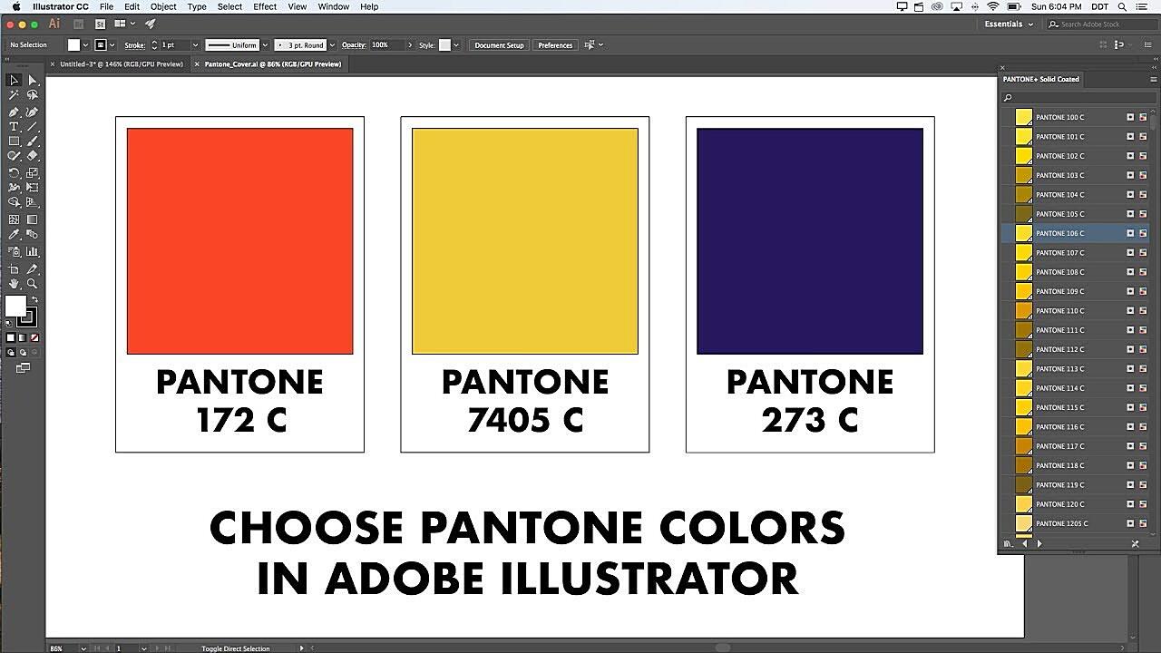
Preparing Your Illustrator Document for Best Print Results
Setting Up Color Modes and Profiles
Before printing, set up your Illustrator file properly. Start by checking that the color mode is CMYK. This mode is for printing and ensures the colors on screen look right on paper. RGB, though bright on screen, can cause problems when printing. It’s like trying to fit a puzzle piece in the wrong spot.
Next, look at the color settings. Go to “Edit” and choose “Color Settings.” Here, you set your working spaces and color rules. It’s often best to use a print profile, such as “U.S. Web Coated (SWOP) v2” for coated papers or “Europe ISO Coated FOGRA39” for European printing. These profiles provide a consistent color space for printing. Not getting this right is like trying to speak a language without knowing the rules; it might work, but it’ll be messy.
Consider the ink limits of your printing process. Too much ink can cause problems like ink bleeding. Illustrator lets you adjust these settings, making sure your designs are ready for print. It’s like checking the oil before a trip; a little care prevents problems.
Remember, the goal is to make the process from digital design to print smooth. This means understanding color management and using it in Illustrator. Try different settings and profiles to see what works best for you. Each printer and paper can give different results, so testing can save trouble later. It’s the difference between a decent print and a great one.
Printing Your Pantone Chart: A Simple Guide
From File to Printed Sample
With your Illustrator file set up, it’s time to print. Go to “File” and choose “Print.” In the print window, you’ll find many options that affect your print. Start by choosing your printer and paper size. It seems basic, but double-checking these settings saves paper and ink. It’s like making sure your GPS is set correctly before you drive.
Next, look at the color settings in the print window. Make sure “Color Handling” is set to “Illustrator Manages Colors” and that the right printer profile is chosen. This makes sure Illustrator’s color settings are used when printing. If you let the printer manage the color, you depend on its default settings, which are often not accurate. It’s like letting someone else pick your clothes; they might mean well, but it might not be what you wanted.
Try a proof print to check the color accuracy before printing a large batch. This lets you make changes and avoid reprints. A proof print is like a practice run before a show. It helps you catch errors. Also, make sure the printer is clean and has enough ink. A dirty printer head can make colors look wrong.
Finally, choose the print quality settings. Higher quality gives more accurate colors, but takes longer and uses more ink. Balance quality with efficiency, based on your needs. It’s like finding the right balance between speed and fuel use in a car; you want to get there, but also save resources.
Solving Common Printing Problems
Dealing with Color Issues and More
Even with good preparation, printing problems can happen. One common issue is color differences, where printed colors don’t match the screen. This can be from wrong color settings, uncalibrated printers, or unsuitable paper. It is similar to trying to cook a recipe with the wrong oven temperature. The outcome will be unexpected.
Another issue is banding, lines in printed gradients. This can be from low printer resolution or wrong dithering settings. Set your printer to the highest resolution and enable dithering if needed. Sometimes, the issue is with the printer’s drivers, not the file. Make sure they are up to date. This is similar to trying to use an old phone with a new application, it may not function correctly.
If you get blurry prints, check the resolution of your Illustrator file. Low-resolution images will look blurry when printed. Make sure all images are at least 300 dpi for good print quality. It’s similar to enlarging a small photo; the details will become indistinct. Also, using the wrong paper for the printer can cause problems.
Lastly, if you get different colors across multiple prints, calibrate your printer regularly. Printers can change over time, affecting color accuracy. Regular calibration ensures consistent results. It’s like tuning a musical instrument; it needs adjustments to stay accurate. Don’t hesitate to check your printer’s manual or contact the manufacturer for help.
FAQ: Printing Pantone Charts from Illustrator
Answers to Your Questions
Q: Why do my printed Pantone colors look different from my screen?
A: This is often from differences in color spaces (RGB vs. CMYK), uncalibrated monitors and printers, or wrong color settings. Make sure your Illustrator file is in CMYK mode, your monitor and printer are calibrated, and your color settings are correct. It’s a common issue, but solvable with care. Like adjusting your TV’s contrast, a small change can make a big difference.
Q: What’s the best paper for printing Pantone color charts?
A: Coated papers usually give brighter colors than uncoated papers. The type of coated paper depends on your printer and desired look. Try semi-gloss or gloss paper for best color results. Choosing the right paper is like picking the right stage for a play; it sets the mood and improves the performance.
Q: How often should I calibrate my printer?
A: How often you calibrate your printer depends on how much you print and how accurate the colors need to be. For critical color work, calibrate at least once a month. For less critical work, every few months is fine. It’s like getting your car serviced; regular maintenance keeps it running well.
