Is It Ok To Print In Rgb
Related Posts
Ever stared at a beautifully designed image on your screen, only to have it emerge from your printer looking… well, a bit off? Like it’s been through a color-fading washing machine? Chances are, you’ve stumbled upon the age-old question: Should I print in CMYK or RGB? This color conundrum has baffled designers and print enthusiasts for ages, but fear not!
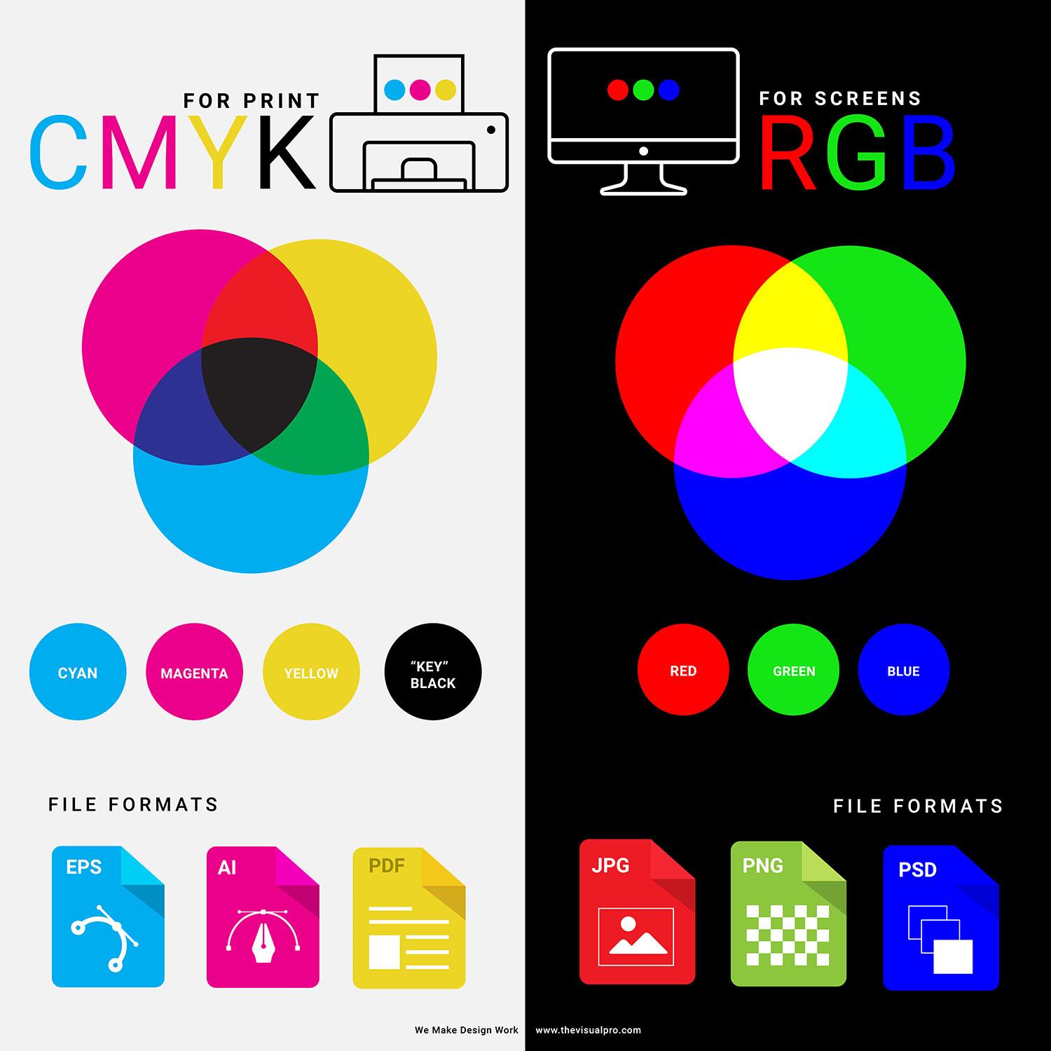
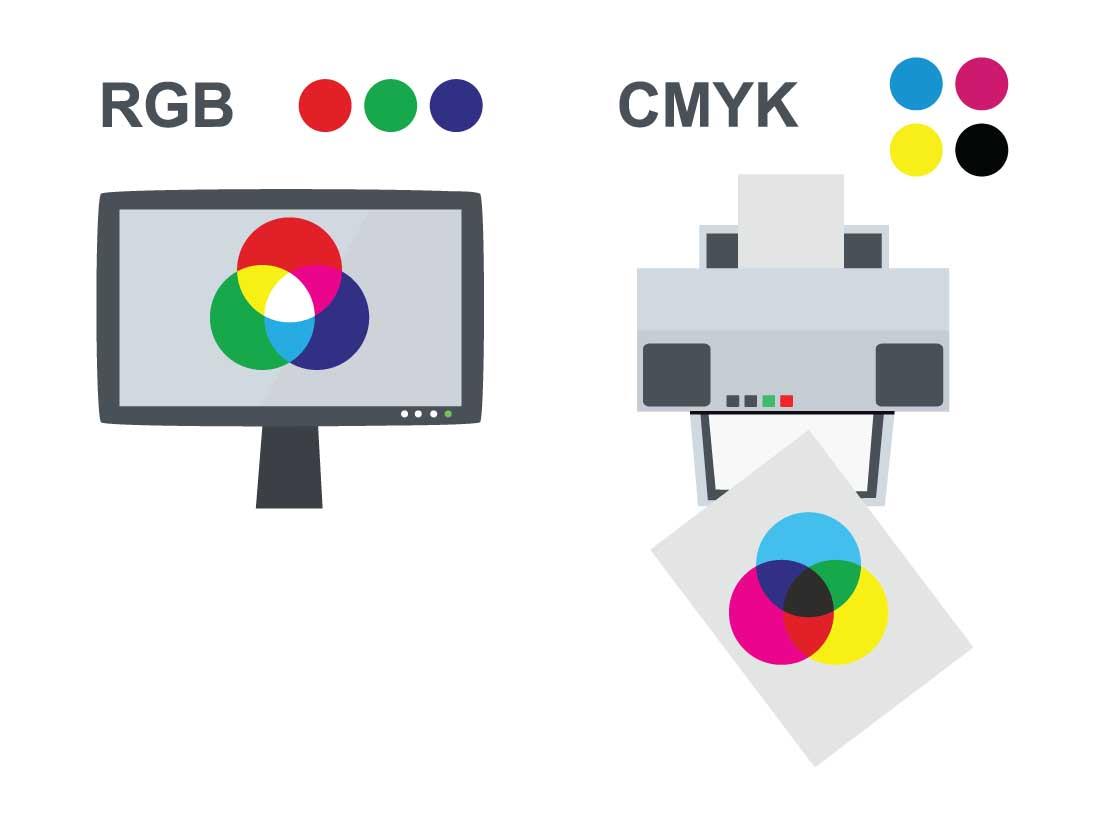
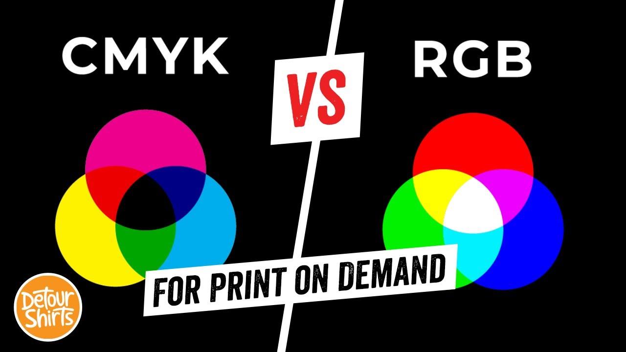
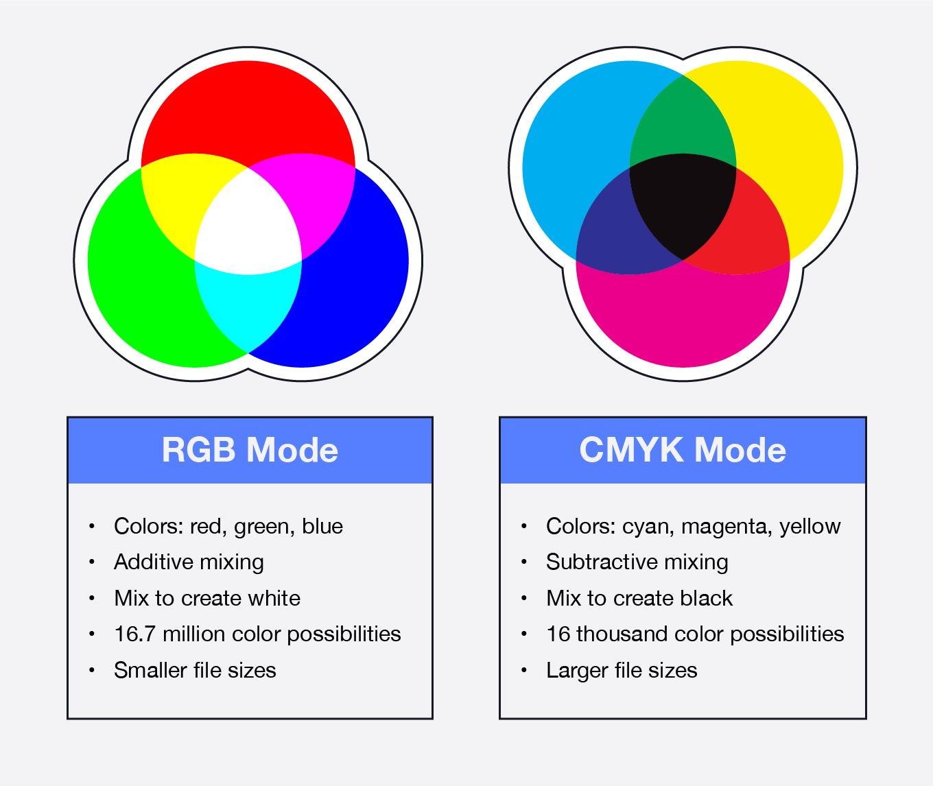
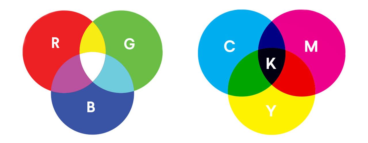
RGB stands for Red, Green, and Blue. It’s an additive color model, meaning it creates colors by adding light together. Imagine shining a red, green, and blue spotlight onto a white wall. Where the lights overlap, you get new colors. Combine all three at full intensity, and you get pure white. Turn them all off, and you get black (the absence of light). It’s like magic, but it’s just science! Think of it like mixing paint, but with light instead of pigment.
RGB’s Domain: Screens and Pixels
RGB is the king of the digital realm. Your computer monitor, TV screen, smartphone, and even your digital camera all use RGB to display images. Each pixel on your screen is made up of tiny red, green, and blue subpixels that emit varying amounts of light to create the colors you see. So, every time you admire a vibrant photo on Instagram or watch a movie, you’re experiencing the magic of RGB. Even scanners use RGB to capture images. It’s the language of the digital world.
Why RGB Falls Short in Print
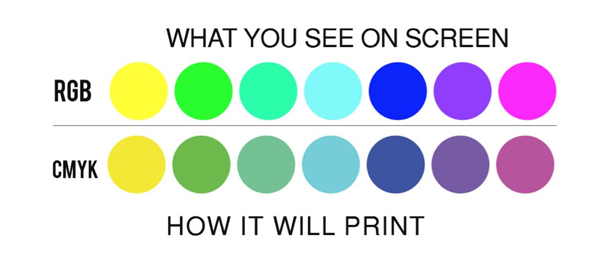
Here’s the crucial bit: printers don’t work with light; they work with ink. They physically mix colored inks on paper to create images. This is where the fundamental difference between RGB and CMYK comes into play. RGB’s bright, vibrant colors are created by light shining through your screen. Printers, on the other hand, lay down ink that absorbs light. This means RGB colors, especially the really bright and saturated ones, often can’t be accurately reproduced using ink. They are simply out of gamut for printing. Think of it like trying to paint a rainbow with only three colors – you’ll get close, but some shades will inevitably be lost. This is why directly printing an RGB file often leads to disappointing results, with colors appearing duller or shifted.
CMYK: Cyan, Magenta, Yellow, and Key (Black)
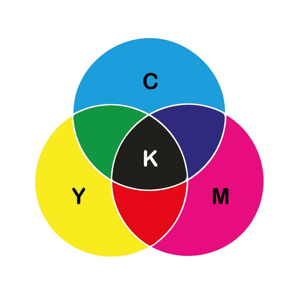
CMYK stands for Cyan, Magenta, Yellow, and Key (Black). It’s a subtractive color model, meaning it creates colors by subtracting light from white. Think of it like mixing paint: the more colors you mix, the darker it gets. CMYK inks are designed to absorb certain wavelengths of light, reflecting the colors you see. When all four CMYK inks are combined, they ideally absorb all light, resulting in black. The “Key” in CMYK refers to black, primarily used to enhance the depth and contrast of printed images. It’s also sometimes called “K” to avoid confusion with “B” for Blue in RGB.
CMYK: The Key to Print Color Accuracy
CMYK is the standard color mode for professional printing. Printers use CMYK inks to reproduce colors on paper, and they’re specifically formulated to interact with each other to create a wide range of hues. While CMYK’s color gamut (the range of colors it can reproduce) is different from RGB’s, it’s the most practical way to achieve accurate color reproduction in print. It’s the language your printer speaks. Trying to print an RGB file directly is like trying to have a conversation with someone who only speaks Spanish – you might get a few words across, but the nuance will be lost.
CMYK vs RGB: Side-by-Side
Feature RGB CMYK Color Model Additive (light) Subtractive (ink) Primary Colors Red, Green, Blue Cyan, Magenta, Yellow, Black Application Digital displays (screens) Printing Color Range Wide and vibrant for screens Optimized for print, different range File Size Generally smaller Generally larger Think of RGB as the vibrant, attention-grabbing billboard of the digital world, while CMYK is the carefully crafted, nuanced print brochure. Both are essential, but they serve different purposes.
Converting from RGB to CMYK: Bridging the Gap
So, we know CMYK is king for print. But what if your beautiful design is in RGB? That’s where the conversion process comes in.
The Necessity of Conversion
As we’ve established, printers use CMYK inks, not RGB light. Therefore, converting your RGB design to CMYK is absolutely essential for accurate color reproduction. Without conversion, your printed piece might look drastically different from what you see on your screen. The colors could be dull, washed out, or even completely shifted. It’s like trying to translate a poem from one language to another – you need to adapt it to the nuances of the new language to preserve its essence.
Conversion Methods: Software and Settings
The conversion from RGB to CMYK is typically handled within your design software, such as Adobe Photoshop, Illustrator, or InDesign. These programs have built-in tools that allow you to switch between color modes. The process usually involves going to “Image” or “File” menu and selecting “Mode,” then choosing “CMYK Color.”
Here’s a simplified example using Photoshop:
- Open your RGB image: Start by opening your RGB design in Photoshop.
- Go to Mode: Navigate to the “Image” menu and select “Mode.”
- Choose CMYK Color: Select “CMYK Color” from the submenu.
You might be prompted to choose a CMYK color profile. This profile defines the specific characteristics of the ink and paper you’ll be using for printing. Selecting the correct profile is crucial for achieving the best possible color match. If you’re unsure, consult with your print service provider for their recommended profile.
Managing Color Shifts
Here’s the tricky part: converting from RGB to CMYK isn’t always seamless. Because the color gamuts of RGB and CMYK are different, some colors that look vibrant on your screen in RGB might not be reproducible in CMYK. These “out-of-gamut” colors will be adjusted by the software, which can sometimes lead to subtle color shifts. Think of it like trying to fit a square peg into a round hole – you can make it work, but you might have to shave off some edges.
The software uses a process called “gamut mapping” to find the closest possible CMYK equivalent for out-of-gamut RGB colors. While the software does its best, some color changes are inevitable. This is why it’s essential to preview your design in CMYK (using the “Soft Proofing” feature in your design software) before sending it to print. This allows you to see how the colors will likely appear in print and make any necessary adjustments. You might need to tweak some colors manually after the conversion to get them as close as possible to your original vision.
CMYK Printing Best Practices: Getting it Right
Converting to CMYK is a big step, but it’s not the only thing to consider for optimal print results. Here are some best practices to ensure your printed materials look their absolute best.
Designing Directly in CMYK
Whenever possible, the best approach is to design in CMYK from the very beginning of your project. This eliminates the need for conversion and minimizes the risk of color shifts. It’s like building a house with the right materials from the start, rather than trying to retrofit things later. While it might seem more restrictive initially, working in CMYK allows you to have more control over the final printed output. You’ll see exactly how your colors will appear in print throughout the design process, making adjustments much easier.
Soft Proofing: Previewing Your Print Colors
Soft proofing is your secret weapon against print surprises. It’s a feature in your design software that simulates how your design will look when printed on a specific printer and paper stock. Think of it as a virtual preview of your printed piece. By using soft proofing, you can catch any potential color issues before they happen, saving you time, money, and frustration. It allows you to see how the CMYK conversion has affected your colors and make any necessary adjustments.
To enable soft proofing in Photoshop, go to “View” -> “Proof Setup” and choose your desired CMYK profile (again, consult your printer if you’re unsure). Then, go to “View” and enable “Proof Colors.”
Calibrating Your Monitor
Your monitor is your window into the digital world, but if it’s not calibrated correctly, it can be giving you a distorted view of your colors. Monitor calibration ensures that the colors you see on your screen are as accurate as possible, which is crucial for making informed design decisions. Think of it like tuning a musical instrument – if it’s out of tune, the music won’t sound right. There are various monitor calibration tools available, both hardware and software, that can help you achieve accurate color representation.
Partnering with Print Professionals
Working with a reputable print service is invaluable. They have the expertise and equipment to ensure your prints meet your expectations. A good print shop will be able to advise you on color profiles, paper choices, and other printing considerations. They can also provide you with press proofs, which are physical samples of your printed piece that you can review before the full print run. It’s like having a skilled craftsman bring your vision to life.
Choosing the Right File Format
The file format you use to send your print files to the printer also matters. PDF (Portable Document Format) is generally the preferred format, as it preserves fonts, images, and layout across different systems. TIFF (Tagged Image File Format) is another good option, particularly for high-resolution images. Avoid sending your print files in formats like JPEG, as they can compress image data and lead to quality loss. It’s like choosing the right packaging for a precious gift – you want to protect it and present it in the best possible way.
Common CMYK and RGB Printing FAQs: Your Questions Answered
Let’s tackle some of the most frequently asked questions about CMYK and RGB printing.
Can I print RGB files directly?
Technically, yes, you can print RGB files directly. However, the results are often unpredictable and usually disappointing. Your printer will attempt to convert the RGB data to CMYK, but the conversion process might not be optimal, leading to color shifts and dullness. It’s like trying to fit a European plug into an American socket – it might work with an adapter, but it’s not ideal, and you might fry something in the process. For the best results, always convert your RGB files to CMYK before printing.
What happens if I print an RGB file without converting it?
As mentioned above, printing an RGB file without converting it can lead to a variety of color issues. The printed colors might look significantly different from what you see on your screen. They could be dull, washed out, or even completely shifted. Some bright, saturated RGB colors might not be reproducible at all in CMYK, resulting in unexpected color substitutions. It’s a bit like ordering a gourmet meal and getting fast food instead – technically food, but a vastly different experience.
How do I know which color profile to use?
Choosing the right color profile is crucial for accurate color reproduction. The best way to determine which profile to use is to consult with your print service provider. They can tell you which profile is best suited for their printing process and the paper stock you’ve chosen. Think of it like choosing the right type of film for your camera – different films have different characteristics, and you need to choose the one that’s appropriate for your shooting conditions.
Why do my printed colors look different from what I see on screen?
This is a common frustration! There are several reasons why printed colors might differ from what you see on screen:
- Different color models: RGB and CMYK are fundamentally different color models, as we’ve discussed.
- Monitor calibration: An uncalibrated monitor can display colors inaccurately.
- Paper stock: Different paper stocks affect how ink is absorbed and reflected, impacting the final color appearance. Glossy paper, for example, will make colors appear more vibrant than matte paper.
- Printing process: Different printing processes (e.g., offset lithography, digital printing) have different color gamuts and characteristics.
It’s important to remember that your screen is a light-emitting device, while print is a light-reflecting one. This fundamental difference will always lead to some degree of variation.
How can I ensure consistent color across different print runs?
Achieving consistent color across multiple print runs can be challenging, but here are some tips:
- Work with a reputable print service: A good print shop will have quality control procedures in place to ensure color consistency.
- Use the same color profiles and paper stock: Consistency in materials and processes is key.
- Request a press proof: Reviewing a press proof before the full print run allows you to catch any color variations early on.
- Communicate with your printer: Open communication with your printer is essential for addressing any color concerns.
It’s like baking a cake – you need to use the same ingredients and follow the same recipe every time to get consistent results.


