What Was The 7th Color
Related Posts
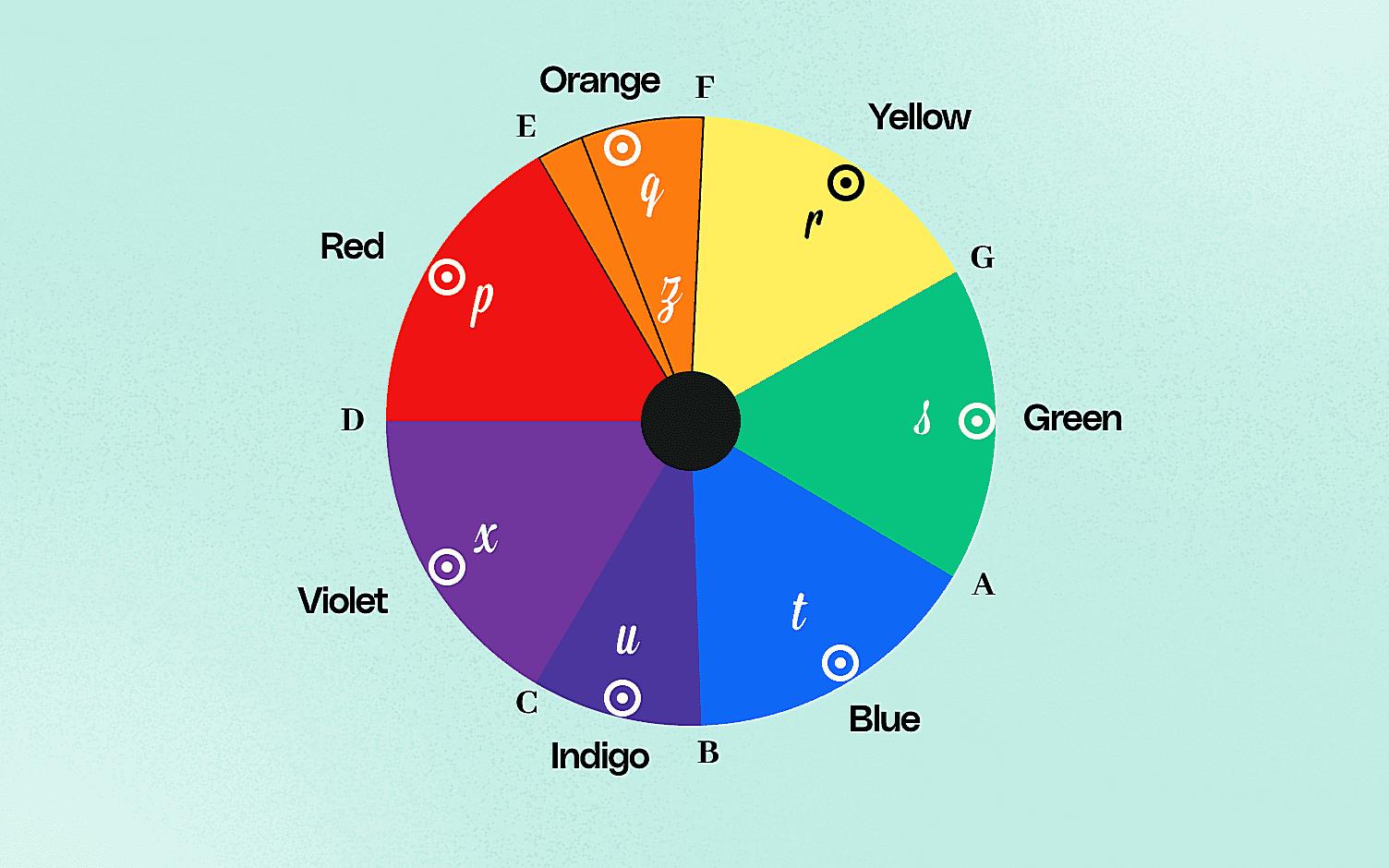
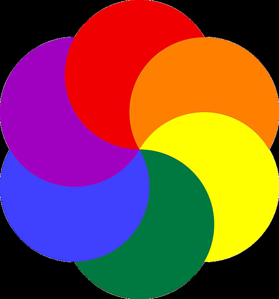
Ever stopped to think about the sheer power of color? Imagine a world devoid of it – gray, bland, and utterly uninspiring. Color splashes our lives with vibrancy, influencing our moods, our choices, and even our memories. But have you ever wondered what the real basic colors are? Many people think of the rainbow, but the story is a bit more nuanced than ROYGBIV.We’re kicking things off by tackling the big question head-on: What are the basic colors? The answer, while seemingly simple, often gets tangled up with the popular image of the rainbow. While the rainbow is a beautiful and awe-inspiring display of color, its seven hues (Red, Orange, Yellow, Green, Blue, Indigo, and Violet) don’t represent the true primary colors in the way that artists and scientists understand them.
Diving into Color Theory: The Foundation of Color Understanding
Before we can truly understand what the basic colors are, we need to talk a little bit about color theory. Think of color theory as the instruction manual for how color works. It’s a blend of science and art, explaining the properties of color and how they interact with each other. At its core, color theory helps us understand how we perceive color, how to mix colors effectively, and how to create visually appealing color palettes.
The science part of color theory gets into the physics of light. Light, as you probably know, travels in waves. These waves have different lengths, and each wavelength corresponds to a different color. When light hits an object, some wavelengths are absorbed, and others are reflected. The reflected wavelengths are what we perceive as the color of that object. Our eyes have special cells called cones that detect these different wavelengths and send signals to our brains, which interpret them as color. Pretty amazing, right?
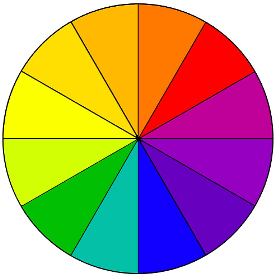
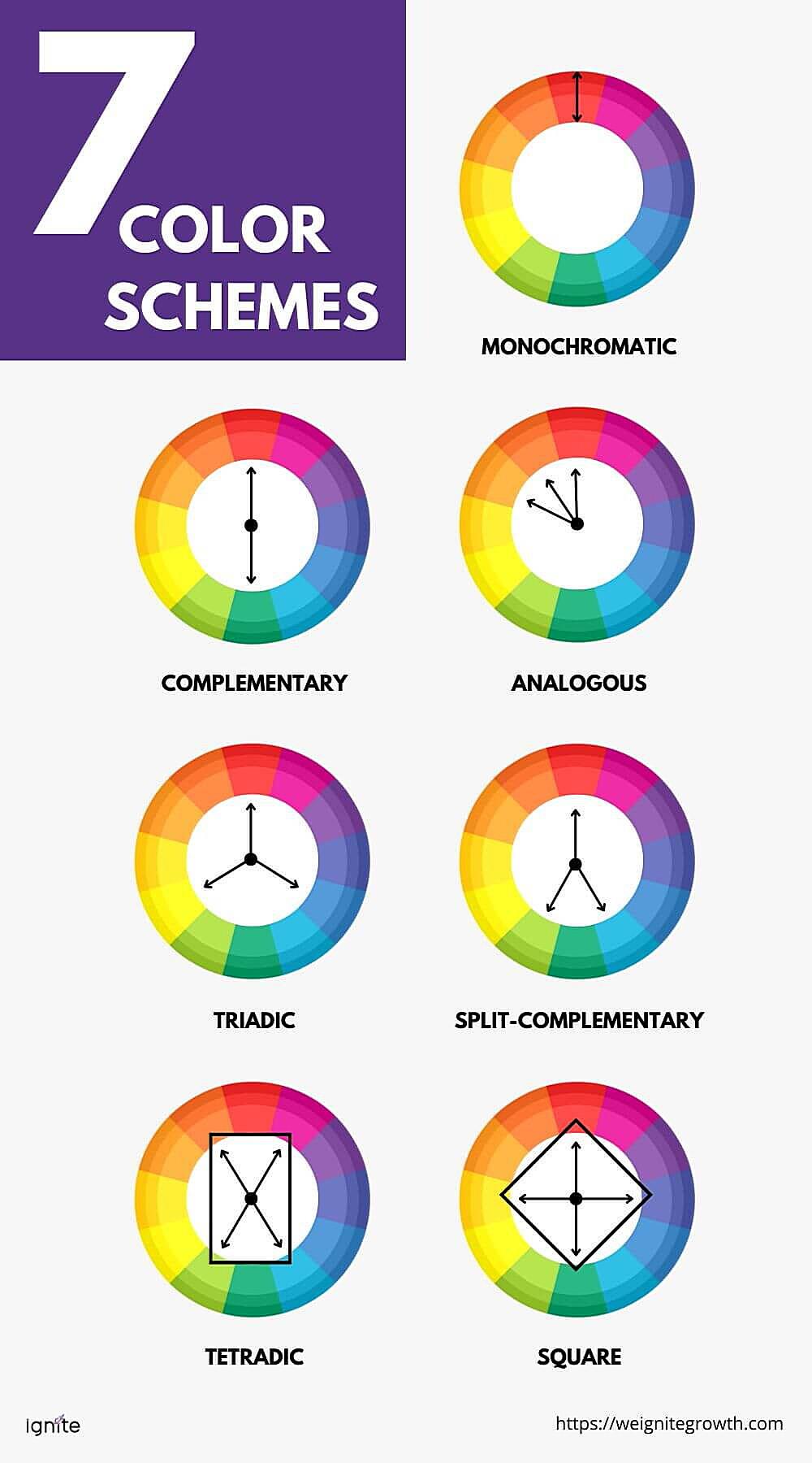
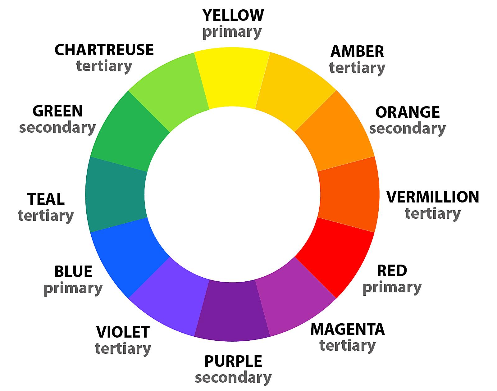
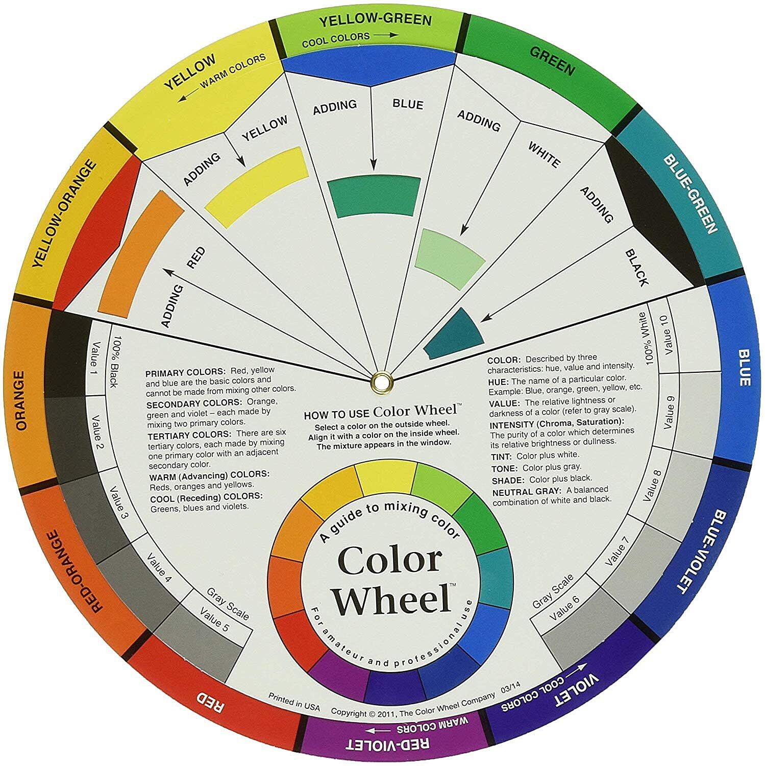
Now, let’s talk about the color wheel. The color wheel is a visual representation of colors arranged according to their chromatic relationships. It’s a handy tool for understanding how colors relate to each other and for creating color harmonies. Imagine a circle with all the colors of the rainbow (and many more!) neatly arranged around it. Adjacent colors are similar, while colors opposite each other are contrasting.
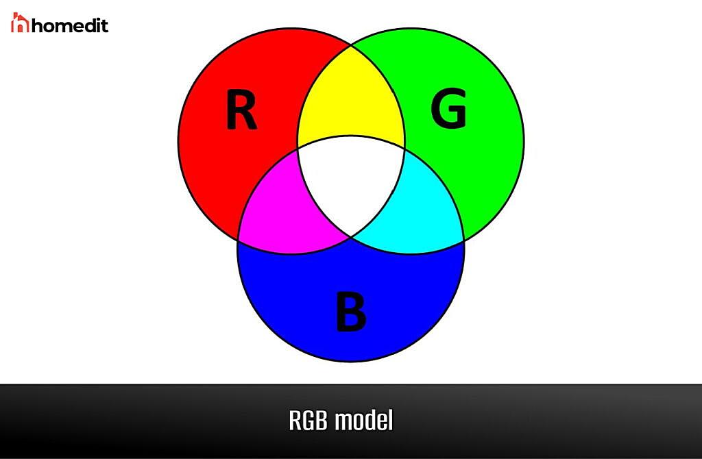
Another important concept in color theory is the difference between additive and subtractive color models. Additive color mixing, used in screens like your phone or computer monitor, deals with light. The primary colors in this model are Red, Green, and Blue (RGB). When you mix all three of these colors together, you get white light. Subtractive color mixing, on the other hand, deals with pigments, like paints or inks. The primary colors in this model are Red, Yellow, and Blue (RYB). When you mix all three of these colors together, you get black (or a very dark brown). Since we’re talking about basic colors in the context of art and pigment mixing, we’ll be focusing on the subtractive color model.
What are the Real Primary Colors? Beyond the Rainbow
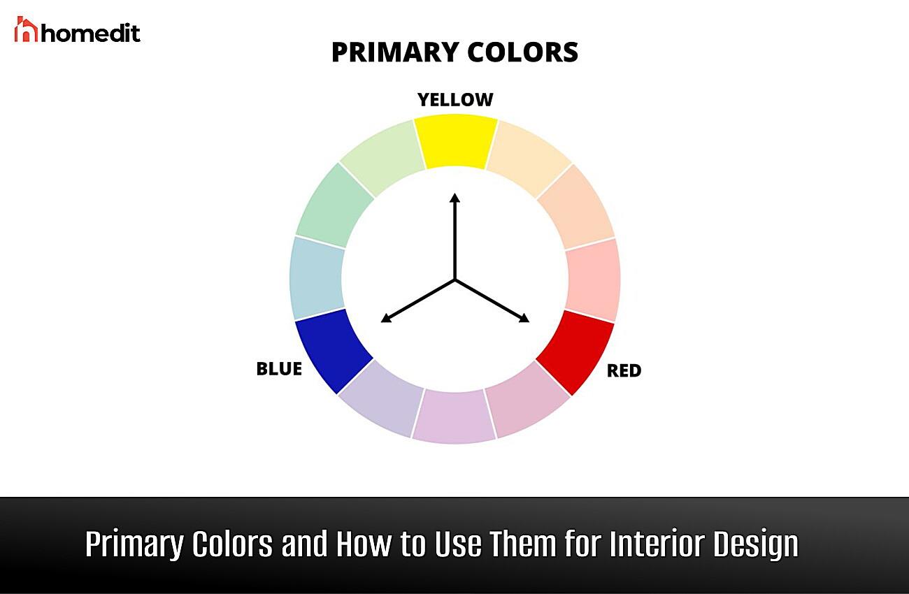
Okay, now for the big reveal! We’ve talked about color theory, light waves, and color models. So, what are the real primary colors? As mentioned earlier, in the subtractive color model (the one we use for mixing pigments), the primary colors are Red, Yellow, and Blue. These three colors are considered primary because they cannot be created by mixing other colors. They are the foundational building blocks of all other colors. Think of them as the Adam and Eve of the color world!
Why is this so important? Because understanding the primary colors is crucial for any artist, designer, or anyone who wants to work with color effectively. By knowing how to mix these three colors, you can create a vast range of other hues. It’s like having a magic palette at your fingertips! You might be thinking, “But what about the rainbow? Isn’t Indigo a basic color?” We’ll address that misconception in a later section. For now, just remember: Red, Yellow, and Blue are the true primary colors.
Think of it this way: you can mix red and yellow to get orange, or blue and yellow to get green. But you can’t mix other colors to create pure red, yellow, or blue. They are the originals, the unmixable, the foundation. This is what makes them so special and so essential to understanding color.
Expanding the Spectrum: The Secondary Colors
Now that we’ve covered the primary colors, let’s move on to their offspring: the secondary colors. Secondary colors are created by mixing two primary colors together. There are three secondary colors, and they each perfectly complement their primary color “parents” on the color wheel. These are the colors that bridge the gap between the primaries and add more complexity to the spectrum.
So, what are these crucial secondary colors? They are:
- Orange: A vibrant and energetic hue, orange is created by mixing red and yellow. Think of sunsets, autumn leaves, and, well, oranges!
- Green: The color of nature, growth, and tranquility, green is made by mixing blue and yellow. Imagine lush forests, fresh grass, and emeralds.
- Purple (or Violet): A regal and mysterious color, purple is created by mixing red and blue. Picture deep twilight skies, lavender fields, and amethyst crystals.
These three secondary colors are just as important as the primary colors. They expand the range of hues available to artists and designers, allowing for more nuanced and vibrant color palettes. They also play a crucial role in color harmony, creating visually pleasing combinations when paired with their complementary colors (the primary color they don’t contain). For example, orange looks fantastic next to blue (its complement), and green harmonizes beautifully with red.
The Nuances of Color: Exploring Tertiary Colors
We’ve covered primary and secondary colors, the foundational building blocks and their direct offspring. Now, let’s delve into the more subtle and complex realm of tertiary colors. These colors are created by mixing a primary color with a neighboring secondary color on the color wheel. Think of them as the grandchildren of the primary colors, adding even more richness and complexity to the color spectrum. They are the subtle shades that bring depth and sophistication to any color palette.
Because tertiary colors are a blend of a primary and a secondary, they often have hyphenated names that clearly indicate their parent colors. This makes it easy to understand how they are created. Here are the six common tertiary colors:
- Red-Orange: A warm and vibrant hue, sitting between red and orange on the color wheel. Think of a fiery sunset or a ripe persimmon.
- Yellow-Orange: A cheerful and sunny color, bridging the gap between yellow and orange. Imagine the yolk of an egg or a golden marigold.
- Yellow-Green: A fresh and lively color, positioned between yellow and green. Picture spring leaves or a chartreuse lime.
- Blue-Green (or Teal/Cyan): A cool and calming color, residing between blue and green. Think of the ocean’s depths or a turquoise gemstone.
- Blue-Violet: A sophisticated and mysterious color, nestled between blue and violet. Imagine a twilight sky or an iris flower.
- Red-Violet (or Magenta): A rich and passionate color, located between red and violet. Picture a vibrant orchid or a deep burgundy wine.
Tertiary colors are essential for creating nuanced and sophisticated color schemes. They add depth and visual interest, preventing color palettes from feeling flat or simplistic. By understanding how to create and use tertiary colors, artists and designers can achieve a greater level of control over their color choices and create truly captivating works of art. They are the secret ingredient to taking your color skills to the next level!
Addressing the Myth: Are There Really 7 Basic Colors?
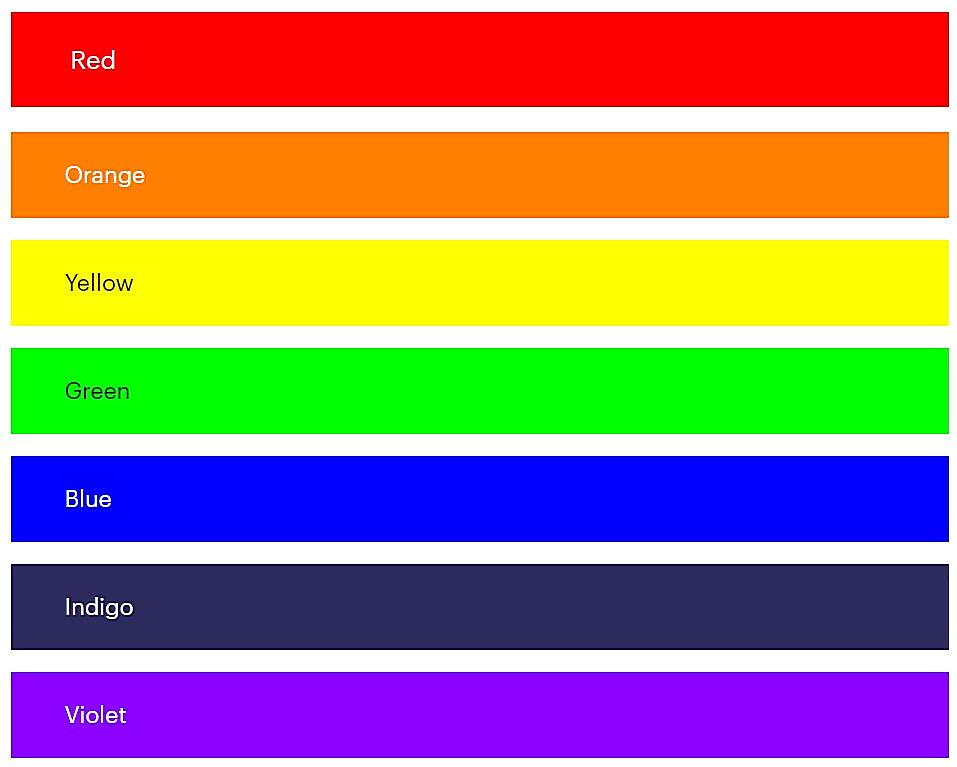
Now, let’s tackle the elephant in the room – or rather, the rainbow in the sky. Many people are taught that there are 7 basic colors, corresponding to the colors of the rainbow: Red, Orange, Yellow, Green, Blue, Indigo, and Violet (ROYGBIV). This is a common misconception, and while the rainbow is a beautiful and inspiring natural phenomenon, its seven colors don’t align perfectly with the scientific and artistic definition of primary colors.
The seven colors of the rainbow are more of a historical and cultural construct. Sir Isaac Newton, in his groundbreaking work on optics, divided the visible spectrum into seven colors, likely influenced by the ancient Greek concept of the seven musical notes and the seven known planets at the time. While the rainbow is a stunning demonstration of how white light is refracted and separated into its constituent colors, it’s important to remember that these are just segments of a continuous spectrum. There are countless shades and hues between each of the rainbow’s colors.
Indigo, in particular, is often debated. It’s a relatively narrow band of color between blue and violet, and some argue that it could easily be considered a shade of blue or violet. In fact, in many other cultures, the rainbow is described as having only six colors.
So, while the mnemonic ROYGBIV is a helpful way to remember the order of colors in the rainbow, it’s crucial to understand that these seven colors are not the primary colors in the artistic or scientific sense. The real primary colors, as we’ve discussed, are Red, Yellow, and Blue. These are the foundational colors that cannot be created by mixing other colors, and they are the basis for all other hues. The rainbow is a beautiful example of color in nature, but it’s not the definitive guide to understanding the basic colors.
The Power of Color: Exploring Color Psychology
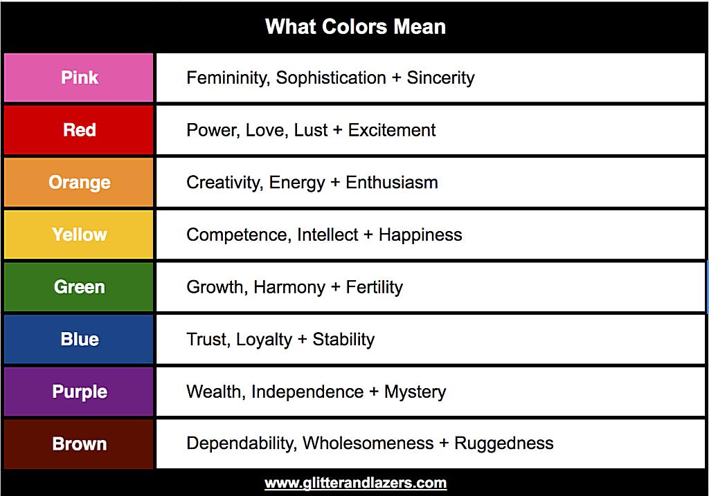
Color isn’t just about light waves and pigments; it’s also about emotion, psychology, and meaning. Colors have a profound impact on our feelings, our perceptions, and even our behavior. Think about how a calming blue room can make you feel relaxed, or how a vibrant red logo can grab your attention. This is the power of color psychology at play.
Different colors are often associated with specific emotions and meanings, although these associations can vary slightly across cultures. Here are some common examples:
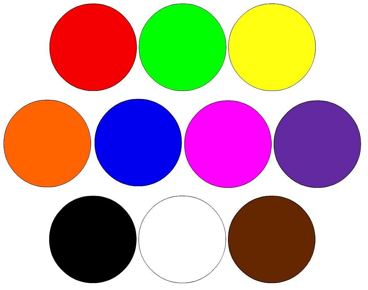
- Red: Often associated with energy, passion, excitement, and love. It can also symbolize danger or aggression. Think of a red sports car or a red stop sign.
- Blue: Generally associated with calmness, trust, stability, and intelligence. It can also represent sadness or coldness. Think of a blue sky or a corporate logo.
- Green: Often associated with nature, growth, health, and tranquility. It can also symbolize jealousy or envy. Think of a green field or a health food store.
- Yellow: Typically associated with happiness, optimism, joy, and creativity. It can also represent caution or cowardice. Think of a sunflower or a yellow traffic light.
- Orange: A blend of red and yellow, orange combines the energy of red with the happiness of yellow. It’s often associated with enthusiasm, warmth, and playfulness. Think of a vibrant sunset or a Halloween pumpkin.
- Purple: Often associated with royalty, luxury, mystery, and spirituality. It can also represent wisdom or mourning. Think of a purple robe or a lavender field.
- Black: Often associated with power, elegance, sophistication, and mystery. It can also symbolize death or mourning. Think of a black suit or a black cat.
- White: Typically associated with purity, innocence, peace, and cleanliness. It can also represent coldness or sterility. Think of a white wedding dress or a white dove.
Understanding color psychology is incredibly valuable for artists, designers, marketers, and anyone who wants to use color effectively. By carefully choosing colors, you can evoke specific emotions, create certain moods, and communicate messages powerfully. For example, a website for a children’s toy company might use bright, playful colors like yellow and orange, while a website for a financial institution might use calming blues and greens. Color speaks volumes, even when words don’t.
