You May Also Like :
Pantone’s Palette: Defining the Fabric of Fashion
The Genesis of Color Standardization
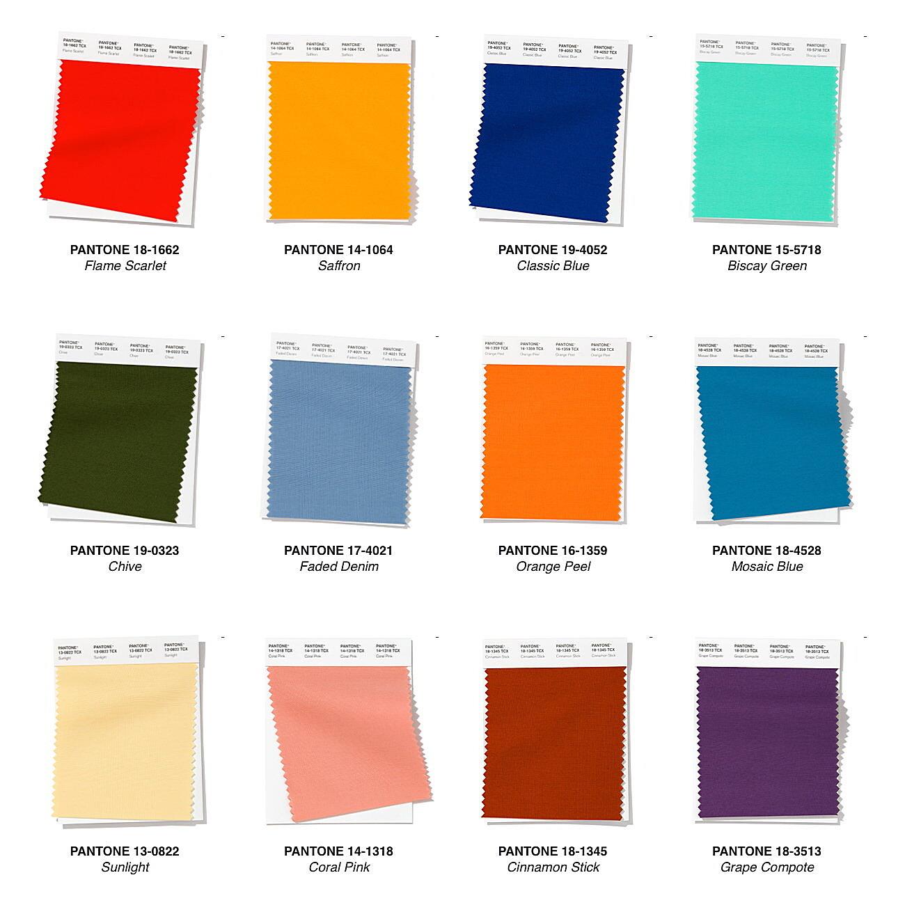
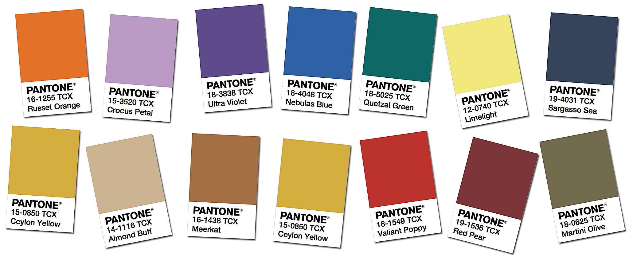
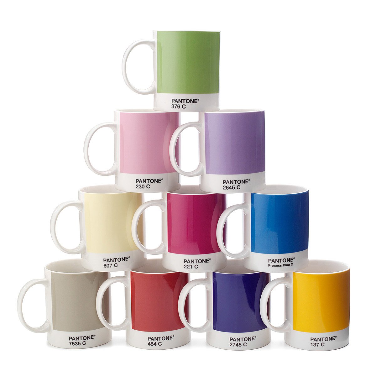
Within fashion’s dynamic world, where trends dance with each season’s whim, a stable point is necessary. That’s where Pantone comes in, the ultimate color authority, a name that means consistent and precise hues. But what is Pantone, really, and how did it become so important in fashion? It’s more than a simple color chart; it’s a shared language, a system that lets designers, manufacturers, and shops talk about color accurately. Imagine trying to explain the exact color of a sunset; Pantone does that, but for every color you can think of. It’s the difference between a “kind of blue” and “Pantone 19-4052 Classic Blue.” A rather big difference, don’t you think?
The Pantone Color Matching System (PMS) began in the 1960s for the graphics industry. But it quickly became important in other areas, like textiles, plastics, and, importantly, fashion. This system gives a unique number to each color, making sure a shade stays the same across different materials and production. This is very important in an industry where color changes can really change how a product looks and sells. Think of a designer in Italy working with a textile factory in India; Pantone is how they understand each other, ensuring the color they want is made without any confusion.
This standardization helps more than just how things look. It makes the whole supply chain work better, reducing mistakes and waste. By having a clear reference, Pantone reduces the chance of color problems that can lead to expensive fixes or product returns. This precision isn’t just about getting the color right; it’s about being efficient, saving money, and keeping quality high. In a world where speed and accuracy are key, Pantone is a vital tool for handling color.
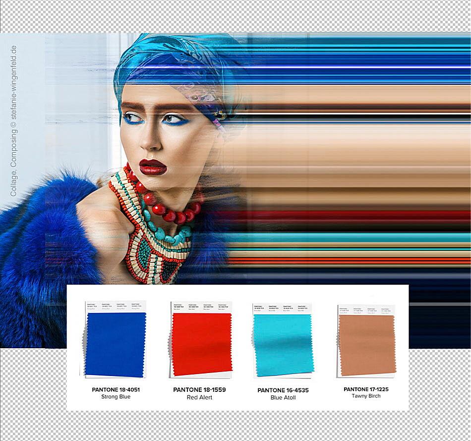
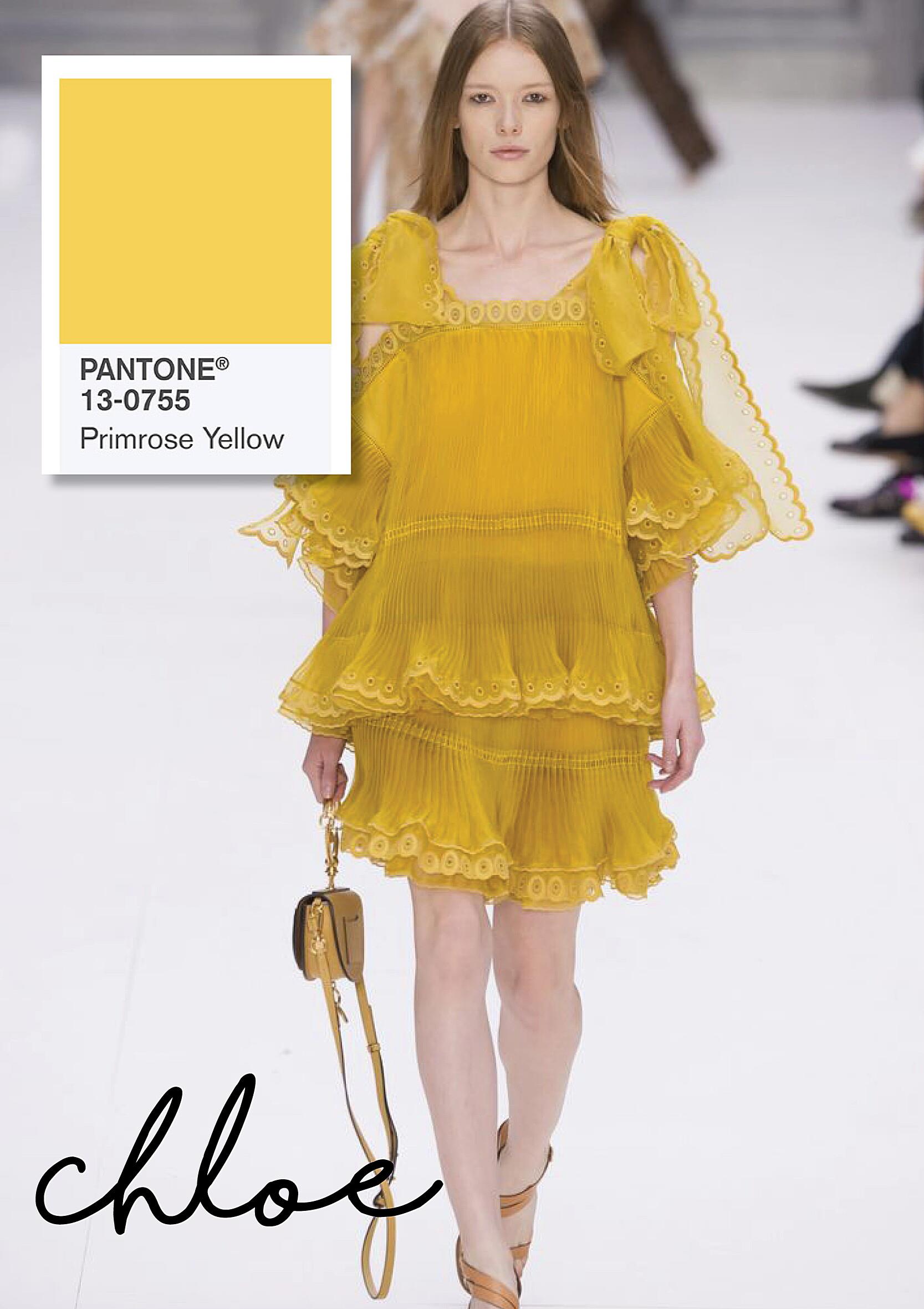
Also, Pantone’s influence goes beyond the technical side of production. It also shapes the creative direction of fashion. The annual Pantone Color of the Year, a much-awaited announcement, sets the tone for design in many areas, including fashion. This choice, based on a lot of research into global trends, shows the current cultural mood and affects everything from clothes to accessories. It’s a cultural sign, a design influencer, and a big marketing event all at once.
Decoding the Pantone Color of the Year: A Fashion Oracle
The Annual Color Ritual
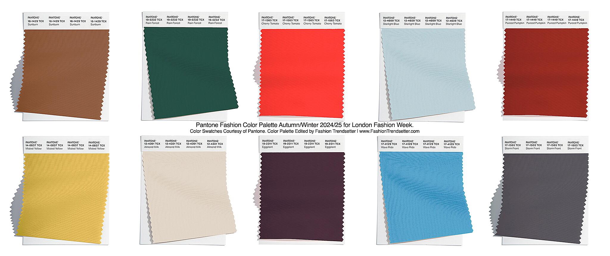
Each year, the fashion world waits for the Pantone Color of the Year. This yearly announcement is more than just marketing; it’s a cultural moment, a reflection of what’s happening now. Pantone’s color experts, after looking at global trends, pick a color they think captures the spirit of the times. This color then spreads through fashion, affecting everything from high-end to everyday clothes. It’s like having a fashion guide, isn’t it?
The selection process is a mix of art and science. Pantone’s experts look at many cultural things, from social media to politics, to find new color preferences. They think about the emotional effect of colors, picking a shade that connects with people. This process isn’t just about guessing trends; it’s about understanding the cultural things that shape what we like. It’s a bit like reading society’s signs, but with a color chart.
Once the Color of the Year is announced, its influence is fast and wide. Designers use it in their collections, stores show it in their displays, and people like it as a symbol of modern style. The color becomes a common thread, connecting different fashion styles. This influence goes beyond clothes, affecting accessories, shoes, and even makeup. It’s a wave of color that changes the fashion scene. The color isn’t just a trend; it’s a cultural event.
The Color of the Year is also a useful marketing tool for brands. By using the chosen color, companies can connect with what customers want and improve their brand. This is a smart move, a way to stay in tune with changing tastes. This connection isn’t just about using a trend; it’s about showing an understanding of the cultural world the brand is in. It’s a smart play in the competitive fashion world.
Pantone’s Role in Textile Production: Ensuring Color Consistency
From Dye to Design
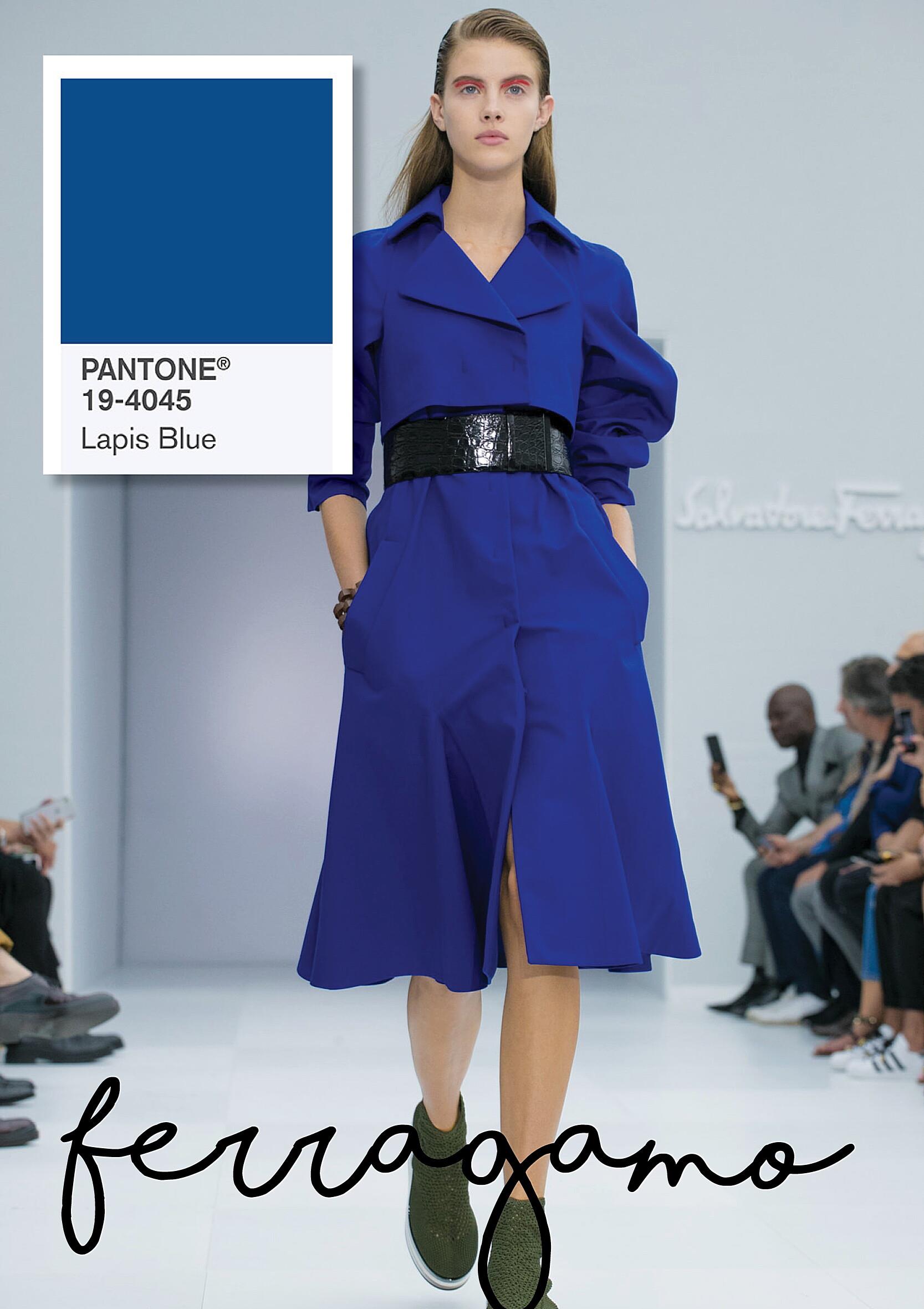
In making textiles, color consistency is very important. Pantone helps make sure the right color is used on different fabrics and production methods. This consistency is needed to keep brand integrity and meet customer expectations. Imagine ordering a dress online and getting a different color; Pantone reduces these problems.
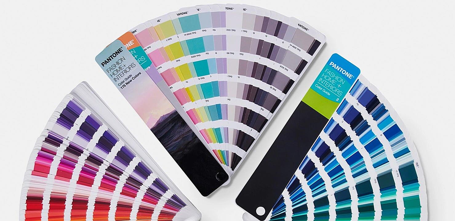
The Pantone Textile Color System has a large library of colors for textiles. This system includes samples and digital data that let designers and manufacturers specify color accurately. It’s a careful process, with precise measurements and testing to make sure the color stays the same under different lights and fabrics. This attention to detail makes Pantone essential for the textile industry.
Using Pantone in textile production is more than just matching colors. It also helps designers, suppliers, and manufacturers communicate better. By having a common language, Pantone makes production smoother, reducing errors and delays. This efficiency is very important in an industry where time is crucial. It’s a tool for collaboration, connecting creative ideas with production realities.
Also, Pantone’s influence extends to new textile technologies. As the industry changes, Pantone adapts its systems to fit new materials and methods. This adaptability keeps the system relevant, providing a reliable standard for color management in the changing textile world. It’s a dynamic system, growing with the industry, and staying up-to-date.
Pantone and Digital Fashion: Bridging the Physical and Virtual
Color in the Digital Age
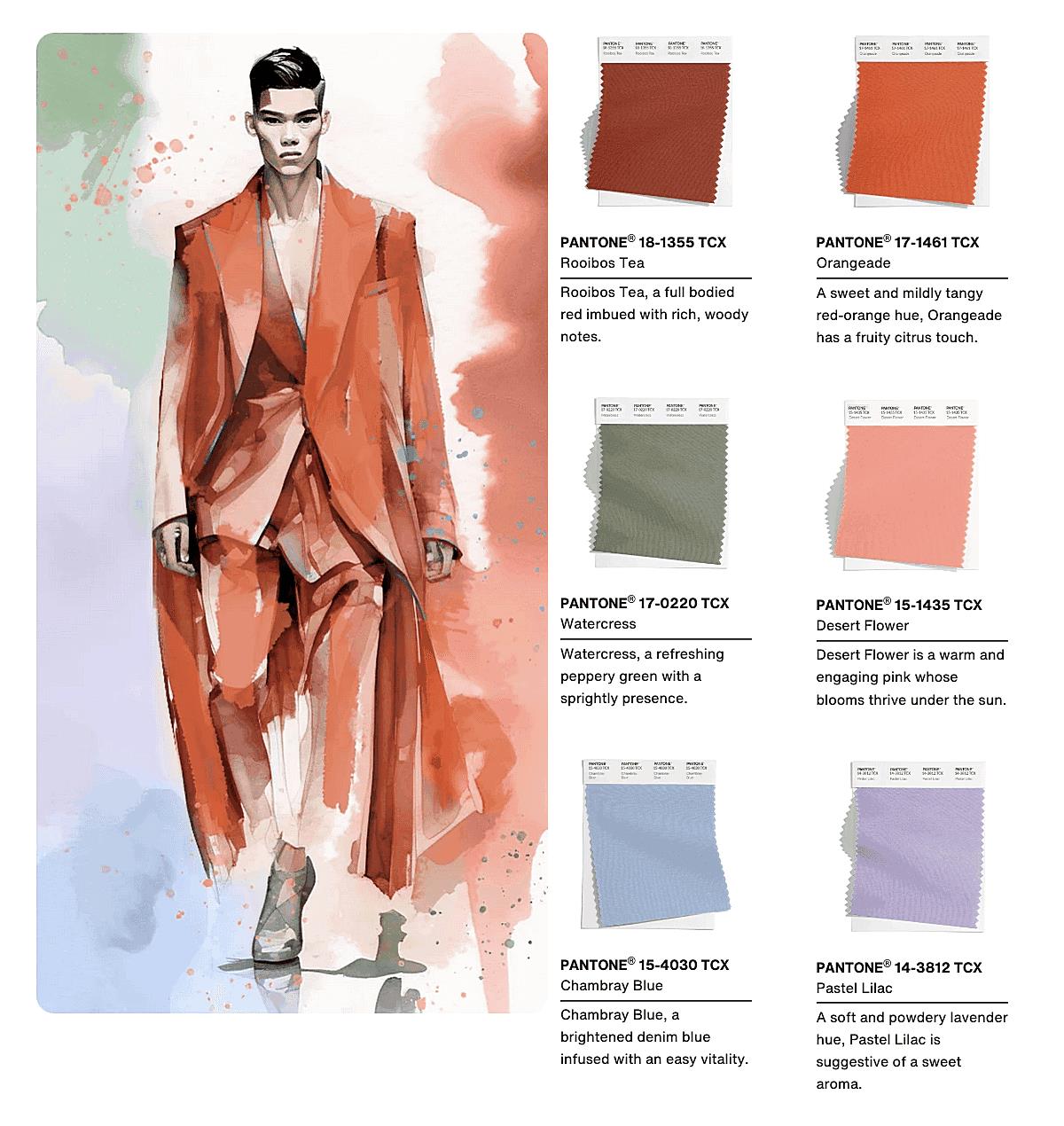
Digital fashion has brought new challenges for color management. Pantone has adapted to this, providing digital tools that help show colors accurately in virtual spaces. This integration of Pantone into digital work makes sure the colors on screen match the real products, connecting the virtual and real. It’s like having a digital color passport, ensuring consistency across platforms.
Pantone’s digital color libraries and software let designers create and see colors in digital formats. This is important for digital fashion design, where virtual prototypes show clothes and accessories. By providing accurate color data, Pantone lets designers make realistic digital versions of their designs. This accuracy is key in the digital age, where visual accuracy is important for customer engagement.
Pantone’s use in e-commerce also helps keep colors consistent. By providing accurate color information, shops can reduce customer disappointment from color differences. This consistency is important for building trust and keeping customers. It’s about meeting expectations, making sure what you see is what you get.
Also, Pantone’s influence extends to AR and VR in fashion. These technologies offer new ways for immersive shopping, letting people see clothes in virtual environments. Pantone’s accurate colors make these experiences realistic, making them more engaging. It’s about blending the real and virtual, for a smooth color experience.
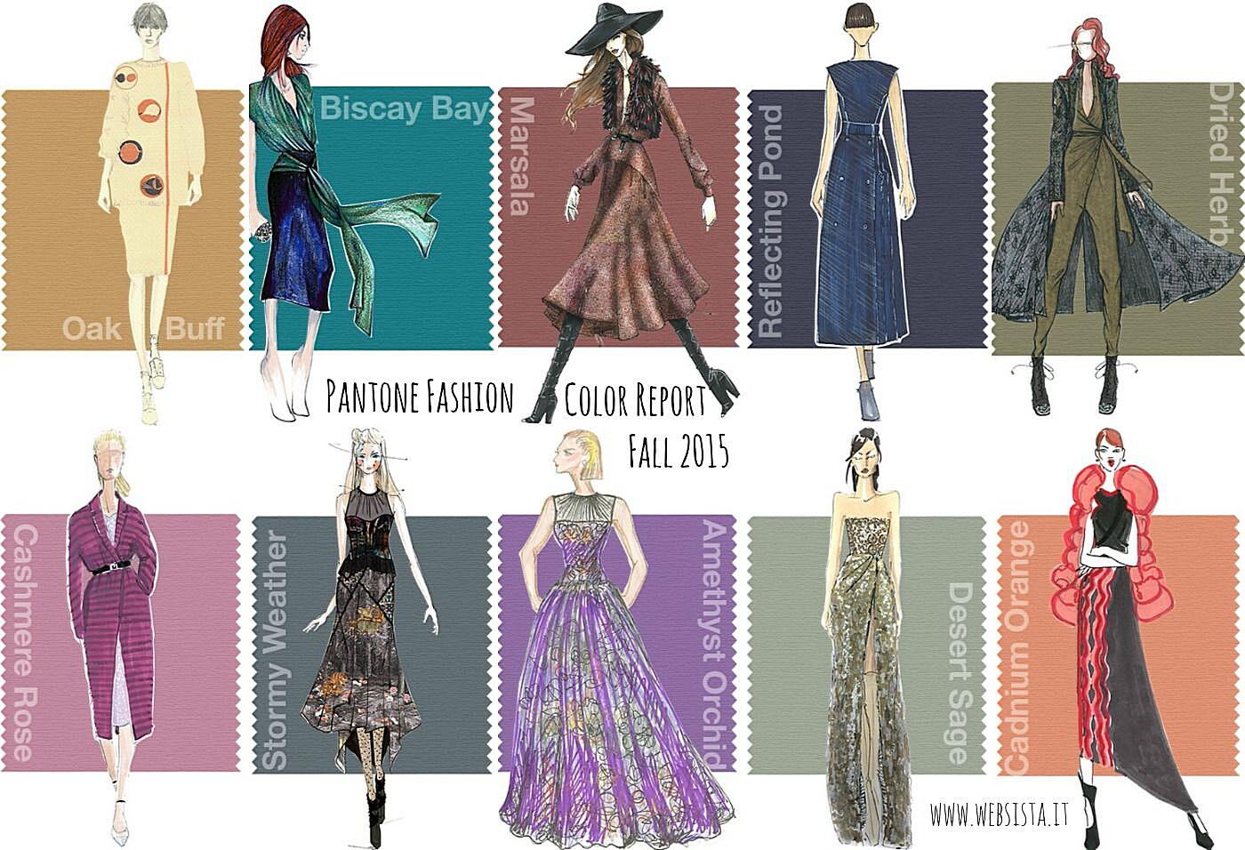
Pantone’s Impact on Fashion Branding and Marketing
Color as a Brand Identity
Color is a strong tool in branding, and Pantone helps fashion brands create a consistent visual identity. By providing a standard system for color, Pantone makes sure brand colors are accurately used in marketing and products. This consistency is needed to build brand recognition and customer loyalty. It’s like having a unique brand color fingerprint.
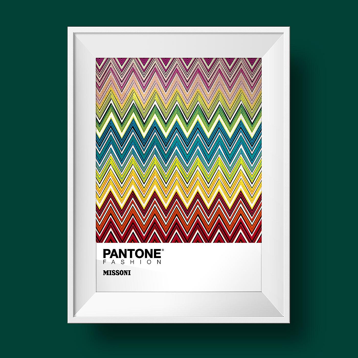
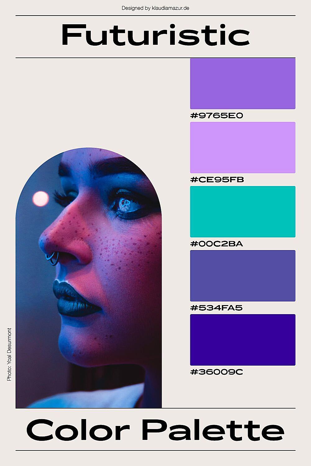
Pantone’s influence is in creating brand color palettes. Fashion brands use Pantone colors to make unique color schemes that show their brand personality. These palettes are carefully chosen to create specific feelings, adding to the brand’s image. This use of color is part of brand storytelling, a way to show brand values through visuals. It’s about creating a color story that connects with customers.
Using Pantone in marketing helps increase brand visibility. By using Pantone colors in ads and social media, brands can create attractive campaigns that get attention. This visual consistency strengthens brand recognition. It’s about creating a visual impact, a lasting impression.
Also, Pantone influences packaging and displays. By using Pantone colors, brands can make their products look consistent and attractive. This consistency helps build a strong brand image and keeps customers loyal. It’s about creating a unified brand experience.
