Is Pantone No Longer In Illustrator
Related Posts
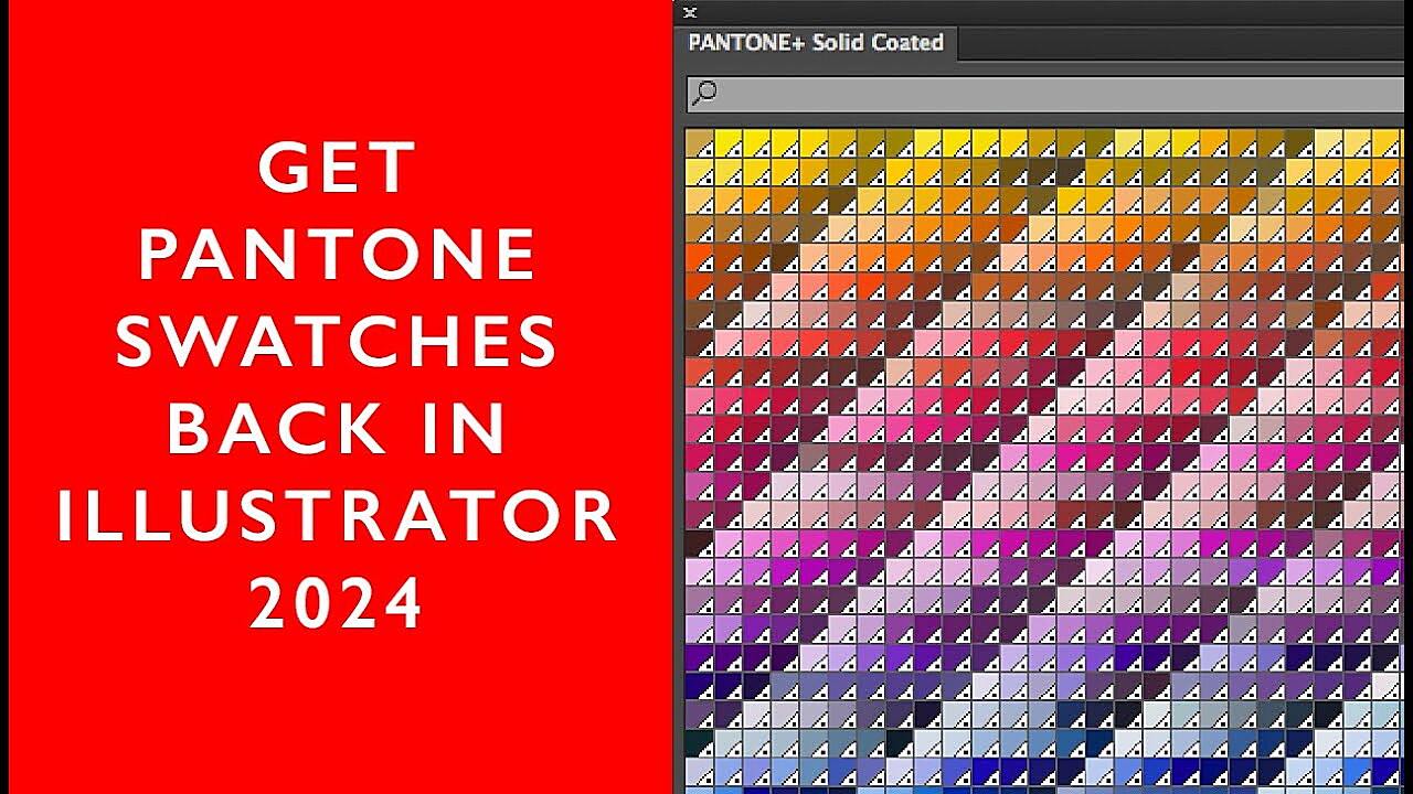
Hey there, fellow design enthusiasts! Ever found yourself staring blankly at your screen, desperately searching for that perfect Pantone Solid Coated color in Illustrator, only to come up empty-handed? It’s a designer’s worst nightmare, right up there with a client asking for “something eye-catching” with no other direction. Well, you’re not alone. This is a surprisingly common issue, and thankfully, it’s usually fixable.
How Pantone Libraries Work in Illustrator
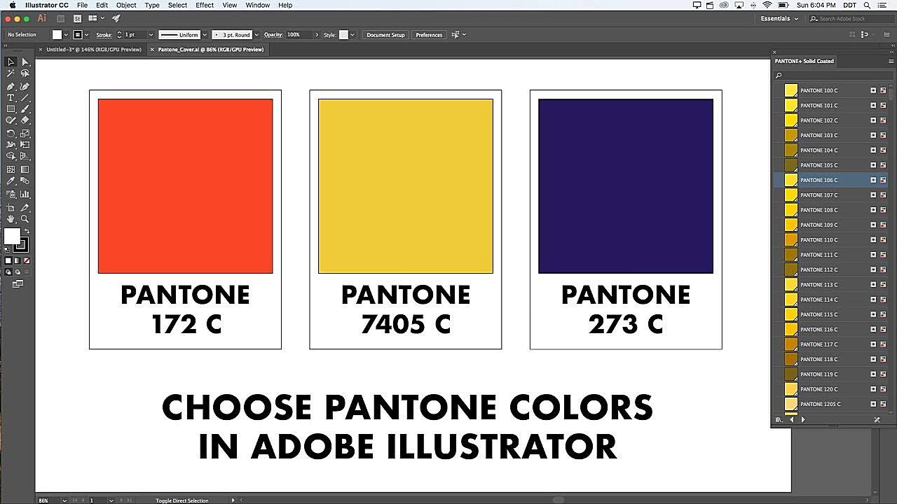
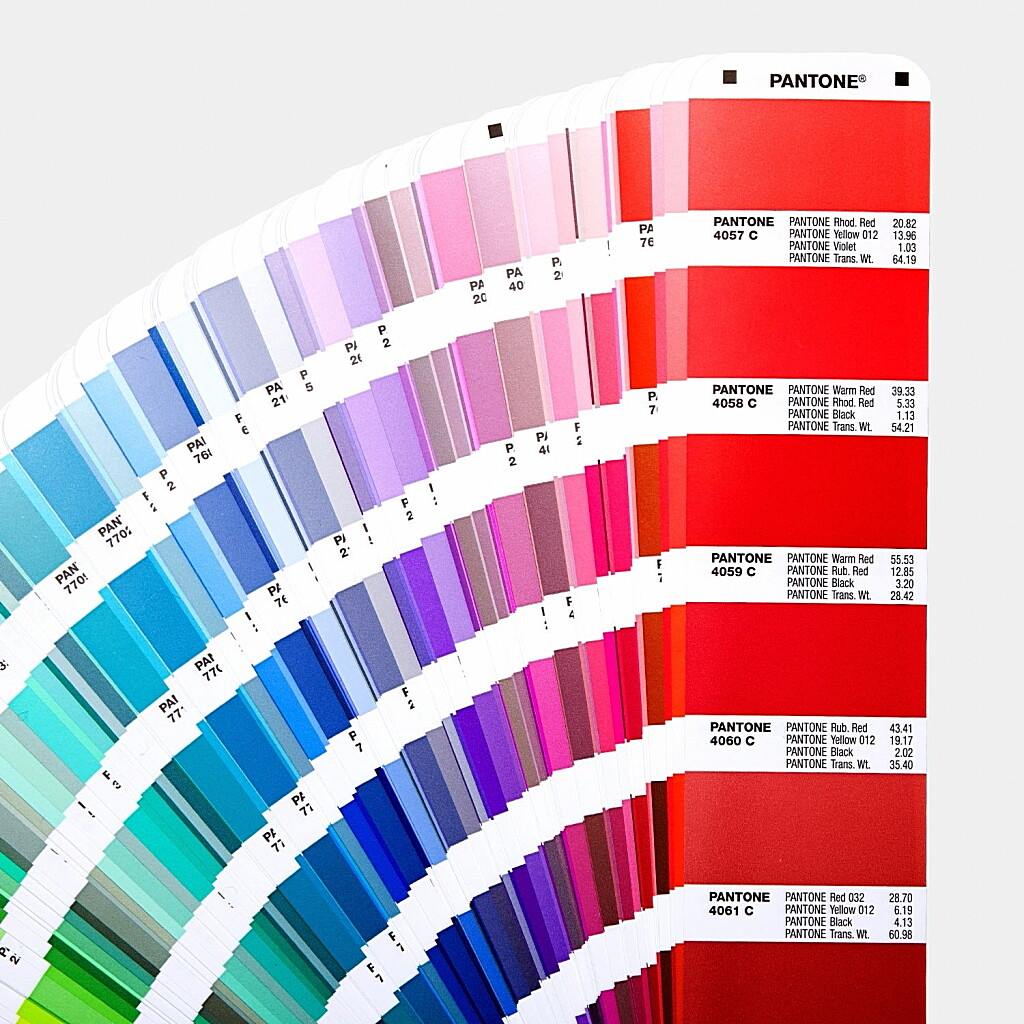
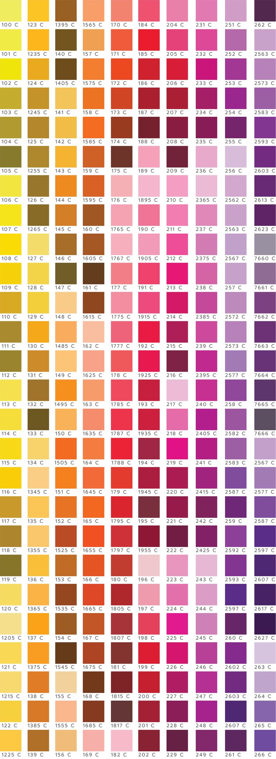
Before we jump into troubleshooting, let’s talk a little bit about how Pantone colors and Illustrator actually play together. Think of Pantone as the gold standard of color consistency. They’ve created a universal language for color, ensuring that the “fire engine red” you see on your screen is the exact same “fire engine red” that gets printed on your business cards, packaging, or that super cool t-shirt design. Pantone achieves this through its meticulously cataloged color system, each shade assigned a unique number (like Pantone 185 C for, you guessed it, a vibrant red).
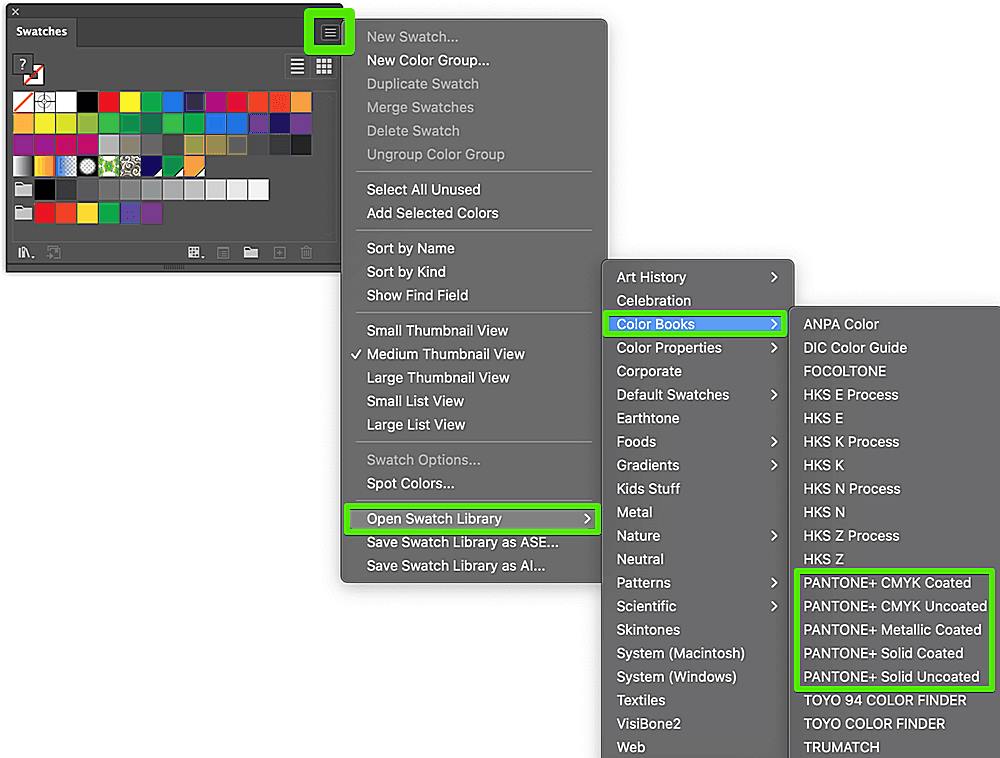
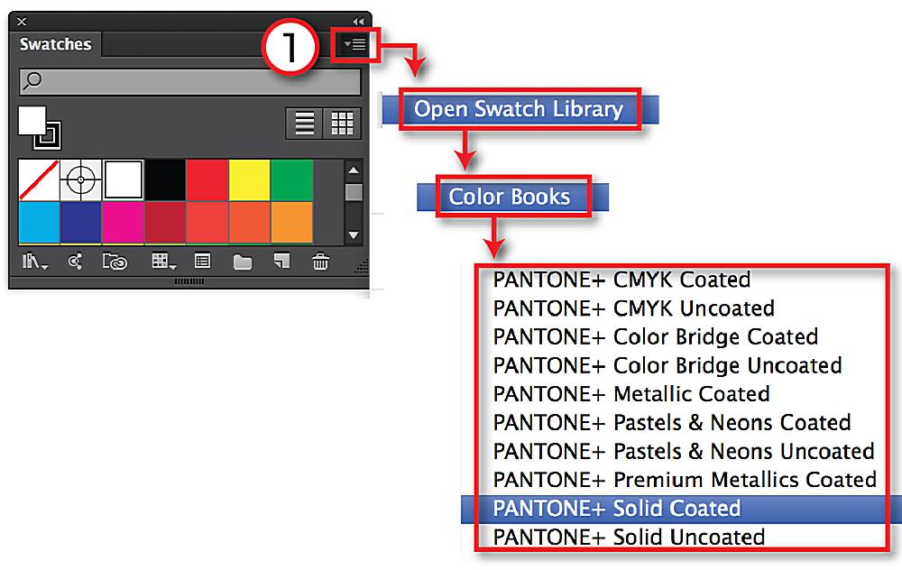
Illustrator, being the industry-standard design software it is, incorporates these Pantone color libraries. These libraries are essentially digital versions of Pantone’s physical color books. They allow you to access and apply Pantone colors directly within your Illustrator artwork. Now, here’s where things can get a little tricky. Illustrator typically offers various Pantone libraries, including Solid Coated, Solid Uncoated, and others. Solid Coated is the one we’re focusing on today, and it’s the most commonly used for printed materials on coated paper (think magazines, brochures, etc.). Coated paper makes colors appear more vibrant.
These digital libraries are crucial because they ensure accurate color representation. Instead of just eyeballing a color on your screen, you’re using a standardized, globally recognized color that will translate correctly to print. This is super important for branding, where color consistency is paramount. Imagine a company’s logo being a slightly different shade of blue on every piece of marketing material – not a good look!
So, in a nutshell, Pantone provides the color standards, and Illustrator provides the tools to use them. When it works, it’s a beautiful partnership. But when those Pantone Solid Coated colors go missing… well, that’s where we come in.
Why Your Pantone Solid Coated Colors Might Be Missing
Alright, let’s get down to the nitty-gritty. Why are those precious Pantone Solid Coated colors playing hide-and-seek in your Illustrator files? Here are the most common culprits:
Is Your Illustrator Up-to-Date?
Think of Illustrator like your trusty design sidekick. But just like any sidekick, it needs regular maintenance. Older versions of Illustrator might have outdated or incomplete Pantone libraries. It’s like having a superhero with a rotary phone – they’re not going to be as effective as they could be. Keeping your Illustrator software up-to-date is crucial, not just for accessing the latest features, but also for ensuring compatibility with the most recent Pantone color libraries. Adobe frequently releases updates that include refreshed color palettes, bug fixes, and performance improvements. So, if you’re rocking a version from the Jurassic period, it’s time for an upgrade!
Checking for Missing or Corrupted Libraries
Sometimes, those digital Pantone libraries can go rogue. They might get accidentally deleted, become corrupted during an update, or just decide to take a vacation without telling you. It happens. Luckily, you can often reinstall or restore these libraries. Think of it like re-downloading your favorite music playlist after accidentally deleting it – annoying, but fixable. Also, it’s worth mentioning the Pantone Connect plugin here. This handy tool can help manage and access Pantone colors within Illustrator, and we’ll be discussing it in more detail later.
Are You in the Right Color Mode?
This is a big one, so pay attention! CMYK and RGB are like two different languages of color. RGB (Red, Green, Blue) is the language of screens – your computer monitor, your phone, your TV. CMYK (Cyan, Magenta, Yellow, Key/Black) is the language of print. Pantone Solid Coated colors are primarily designed for print, which means they’re typically associated with the CMYK color mode. If you’re working in RGB, you might not see the full range of Pantone Solid Coated options. It’s like trying to order Italian food in a French restaurant – the menu just isn’t going to match. Switching to CMYK mode in Illustrator is essential for accessing those Pantone colors.
Document Profiles and Pantone Colors
Similar to color modes, document profiles can also influence color availability. A document profile is like a set of instructions that tells Illustrator how to interpret and display colors. Different profiles are optimized for different purposes (e.g., web, print). Sometimes, an incorrect document profile can limit your access to certain Pantone colors. Think of it as trying to unlock a door with the wrong key – you might need to find the right profile to get those colors to show up.
Troubleshooting Pantone Connect
If you’re using the Pantone Connect plugin (which, by the way, is a great idea!), you might encounter some plugin-specific issues. Maybe the plugin isn’t installed correctly, or your login credentials aren’t working, or perhaps it’s just having a bad day. Troubleshooting these plugin issues is crucial for seamless Pantone color access.
Pantone Licensing and Access
While less common, it’s worth briefly mentioning the licensing aspect of Pantone colors. Accessing and using Pantone colors, especially in a commercial setting, sometimes involves licensing considerations. This is a bit of a gray area, and it’s best to check Pantone’s website for the most up-to-date information on licensing.
How to Find Those Elusive Pantone Colors
Now that we’ve diagnosed the potential problems, let’s get to the solutions! Here’s your troubleshooting toolkit for retrieving those missing Pantone Solid Coated colors:
The Importance of Updates: Updating Illustrator
We can’t stress this enough: updates are your friend. They’re like vitamins for your design software, keeping it healthy and strong. Updating Illustrator is often the simplest and most effective way to resolve Pantone color issues. Here’s how to do it:
- Open the Creative Cloud desktop app: This is your central hub for managing Adobe applications.
- Go to the “Apps” tab: You’ll see a list of your installed Adobe software.
- Find Illustrator: Locate Illustrator in the list.
- Check for updates: If an update is available, you’ll see a button that says “Update.” Click it!
- Wait for the magic to happen: Illustrator will download and install the latest updates. This might take a few minutes, so grab a coffee or do a quick stretch.
- Restart Illustrator: Once the update is complete, restart Illustrator to ensure the changes take effect.
Reinstalling for Success: Reinstalling or Restoring Pantone Libraries
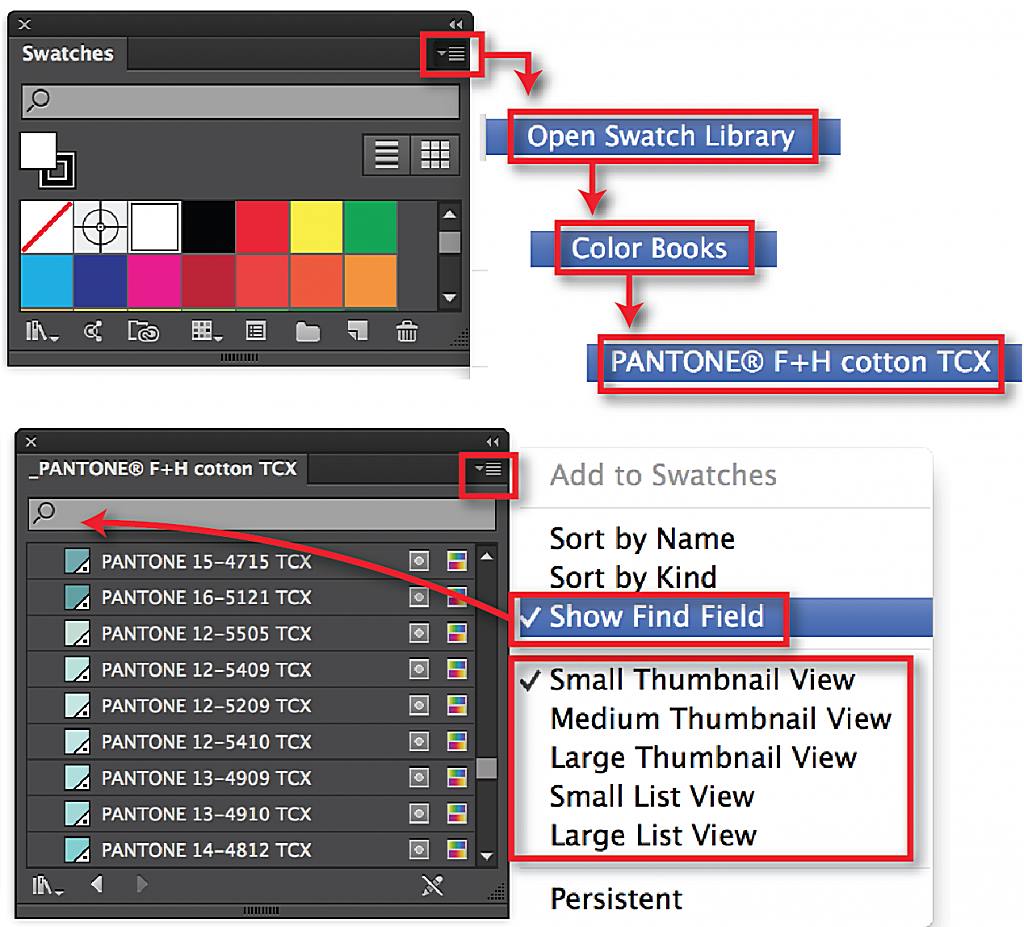
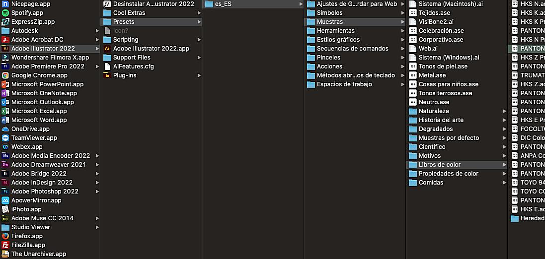
If updating Illustrator doesn’t do the trick, you might need to reinstall or restore the Pantone libraries themselves. This is like giving your color palette a fresh start. Unfortunately, the exact method for this can vary a bit depending on your Illustrator version and whether you’re using the Pantone Connect plugin. Generally, you’ll want to look within Illustrator’s preferences or settings for options related to color libraries or color books. You might need to consult Adobe’s support documentation or search online for specific instructions related to your Illustrator version.
Connecting with Pantone Connect: Using the Pantone Connect Plugin
The Pantone Connect plugin is a game-changer for working with Pantone colors in Illustrator. It provides a centralized platform for accessing and managing Pantone libraries, ensuring you have the most up-to-date colors at your fingertips. Here’s the lowdown:
- Download the plugin: You can usually find the Pantone Connect plugin on the Pantone website or through the Adobe Exchange.
- Install the plugin: Follow the on-screen instructions to install the plugin in Illustrator.
- Sign in or create an account: You’ll likely need a Pantone Connect account to access the full range of features.
- Access Pantone colors: Once installed and signed in, the Pantone Connect plugin will integrate seamlessly with Illustrator, allowing you to browse, search, and apply Pantone colors directly to your artwork.
Color Mode and Profile Deep Dive: Checking and Adjusting Color Mode and Document Profile
Remember our earlier discussion about CMYK and RGB? Let’s make sure you’re in the right mode:
- Open your Illustrator document: Or create a new one.
- Go to File > Document Color Mode: You’ll see two options: CMYK Color and RGB Color.
- Select CMYK Color: If it’s not already selected, choose CMYK.
Now, let’s check your document profile:
- Go to Edit > Color Settings: This will open the Color Settings dialog box.
- Examine the “Working CMYK” setting: This shows your current CMYK document profile.
- Choose an appropriate profile: If you’re unsure which profile to use, a common choice is “U.S. Web Coated (SWOP) v2” for print projects. However, it’s always best to consult with your print provider for their recommended profile.
Exploring Other Libraries: Searching for Alternative Pantone Libraries
In some cases, you might find older or custom Pantone libraries available online. However, proceed with caution! Using unofficial libraries can lead to color inaccuracies and inconsistencies. It’s always best to rely on the official Pantone libraries provided through Illustrator or the Pantone Connect plugin.
When All Else Fails: Contacting Adobe Support
If you’ve tried all of the above and you’re still banging your head against the wall, it’s time to call in the pros. Adobe support can provide personalized assistance and help you troubleshoot more complex issues. Don’t hesitate to reach out – they’re there to help!
Working Smart with Pantone: Best Practices
Now that you’ve got those Pantone colors back in your grasp, let’s talk about some best practices for working with them in Illustrator. These tips will help you maintain color accuracy, streamline your workflow, and avoid future Pantone-related headaches.
The Key to Consistency: Maintaining Consistent Color Management
Color management is like the conductor of an orchestra, ensuring all the different instruments (colors) play in harmony. Consistent color management throughout your design process is crucial for accurate and predictable color reproduction. This involves calibrating your monitor, using consistent color profiles, and working in the correct color mode. Think of it as setting the stage for a perfect color performance.
Collaboration Made Easy: Using Pantone Connect for Collaboration
Pantone Connect isn’t just for accessing colors; it’s also a fantastic tool for collaboration. It allows you to share Pantone palettes with colleagues and clients, ensuring everyone is on the same page (or, should we say, the same color). This is especially helpful for large projects where multiple designers are involved. No more guessing or miscommunication about which shade of blue is actually the right one.
Always Double-Check: Double-Checking Color Accuracy
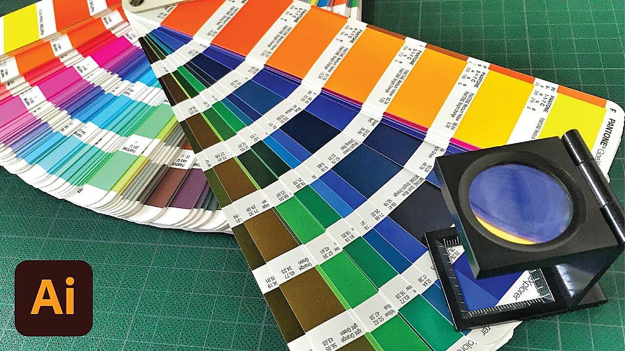
Before you send your design off to the printer, always double-check the accuracy of your Pantone colors. This is like proofreading your work before hitting “send” on an important email. You can use a Pantone color book or a calibrated spectrophotometer to verify that the colors in your digital file match the physical Pantone standards. It’s better to catch any discrepancies early on than to have a print job come back with unexpected color shifts. Trust us, your clients (and your sanity) will thank you.
Finding Your Pantone Colors – A Recap
Let’s do a quick recap of what we’ve covered. Finding those elusive Pantone Solid Coated colors in Illustrator can sometimes feel like a treasure hunt, but it doesn’t have to be. The most common reasons for missing Pantone colors include outdated software, missing or corrupted libraries, incorrect color modes, and document profile issues. The solutions typically involve updating Illustrator, reinstalling Pantone libraries, using the Pantone Connect plugin, and adjusting your color settings. By following the best practices we’ve discussed, you can ensure accurate and consistent color representation in all your design projects.
Frequently Asked Questions
We’ve covered a lot of ground, so let’s address some frequently asked questions that might still be lingering:
- Are Pantone colors free in Illustrator? Access to some Pantone libraries might require a subscription or license, especially for commercial use. It’s best to check Pantone’s website for the most up-to-date licensing information.
- How do I know if my Pantone colors are accurate? The best way to verify color accuracy is by using a physical Pantone color book or a calibrated spectrophotometer.
- Can I use Pantone colors in RGB mode? While you might find some Pantone colors in RGB, they are primarily designed for CMYK printing. For accurate representation, it’s best to work in CMYK mode when using Pantone Solid Coated colors.
- What is the difference between Pantone Solid Coated and Uncoated? Solid Coated colors are designed for use on coated paper, which has a smooth surface that makes colors appear more vibrant. Solid Uncoated colors are for use on uncoated paper, which has a more textured surface and can make colors appear slightly muted.
So, there you have it! Everything you need to know about finding and working with Pantone Solid Coated colors in Illustrator. We hope this guide has been helpful. Now go forth and create some beautifully colorful designs!

